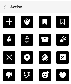
Assets panel should reflect background color of page

Scenario:
I normally keep all my components on a separate page and I like to NOT organize them into frames but use a plugin to group and sort them by name.

Problem:
However, when designing for a dark UI it’s very frustrating to use the assets panel as most components are close to invisible. Often a component itself has no background color so the bright foreground elements are displayed on a light grey rectalngle in the assets panel.

Solution:
Instead of this light grey background, the assets panel should use the background color of the page a master component is located.

When designing for a dark UI it’s not uncommon to also set the background color to a darker grey to make it easier on the eye. So this solution would also work if you do not keep your components in one single page but across the entire document. And if one likes to organize them in frames, then the frame’s color could still kick in.

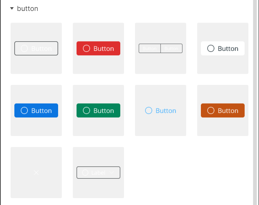
2 Likes

Im not sure what the method is for selecting the background color for assets, some of mine have black while others have none, frustrating.

1 Like

+100

We have the same problem. Sometimes it’s clunky and adds unnecessary hierarchy to put a bunch of white components inside frame, for the sole purpose of changing their assets panel background color.

(Our icon library has more than 400 icons organized in pages, definitely don’t want to add an extra layer of hierarchy inside each page).

If the assets panel can “read” the color of their container frame, it should be technically easy to also read the canvas color when they’re placed directly on the canvas.

2 Likes

Ok, my little hack here:

  1. Open the web-inspector (Mac: alt-cmd-I, PC: don’t know). It even works in the desktop app!
  2. Select the background element in the assets panel (Mac: Shift-cmd-C)
  3. In the CSS definitions find the following class: .library_item_tile--thumbWrapper--UOgvP (the last 5 letters seem random and may vary)
  4. Change the background-color to your likings.
  5. Et Voilá! (close web-inspector with same key command)

Of course, this only lasts until you close the file but it’s better than nothing, for me at least… :sunglasses:

If you find this useful, spread the word.

1 Like

You should be able to add a frame with a background to contain the components, then refresh the page (or simply draw a frame anywhere then delete), then you should be able to see the background color reflected in the assets panel. If the components are in variants group frame, you will need to add background to that as well.

My problem is it is not working when adding image background (e.g. add watermark).

Yes, thank you for your help. I know the solution with putting everything into a frame, but I like to organize my components page with a plugin so this won’t be an option for me. The other tip (“or simply draw a frame anywhere then delete”) sounded interesting but didn’t work – or what exactly did you mean by that?

The other tip “or simply draw a frame anywhere then delete” is not another solution but an alternative way to make the background show up in the components, instead of refresh the page.

UPDATED: 01/13/2022
Much of what I wrote below is actually incorrect; or, at least, beside the point.

After a couple days of being excited about the result of my fix, I moved the group of components (all with no background color themselves), back into the frame from which they came. The next time I published, it reverted all the assets panel swatches to the color I was trying to eliminate.

It turns out @z-wang already offered the solution above about adding a frame behind the components.

Latest Hypothesis
The background swatch of an asset seems to be a calculated value based on the background of whichever container holds them. This could be the canvas or any frame on the canvas.
The ultimate solution to my issue turns out to be much simpler than I originally made it out to be.

New Solution
Simply change the background color of the frame in which the main components are contained (or move them to a frame and change the color to one that will provide the proper contrast once in the assets panel.


I have a more permanent solution that may seem a bit radical in its method, but does fix the asset background swatch completely.

Issue
The color of the asset swatch background appears to be based on the background at the time of the component creation. In our case, the components are icons that we want to swap in and out of button components. Unfortunately, the icons had been created initially inside a frame that was a color which ultimately is intended for many of the icons. The result is that these icons are entirely invisible in the Assets Panel now.

Solution
You can remove the background association by cutting the main component (+x) from the library and pasting it into a different project file/library; presumable, you would paste it onto a background color you prefer.

This pasting process effectively moves the component to a new library and severs its links to whatever structure anchored it to the offending background swatch color and assigns a new background swatch color based on its new library location.

In our case, we have a single main components project file library. We simply cut/pasted everything from the original library into the new library and republished.

Caveat
The component must remain in the new library. You can’t just copy it back to the original library over a new background. If you try this, it will reclaim its mysterious link to the original background swatch color.

Hi Scott, thanks for posting this. It sounds interesting but didn’t work for me. Here’s what I did:

  1. My canvas color is set to #e5e5e5
  2. Created an icon colored #eeeeee and turned it into a component. The component itself has no BG color.
  3. The component is faintly visible against the canvas BG but nearly invisible in the assets panel. The BG color used in there is not the same a my canvas color.
  4. Cut the component
  5. Created new file and set canvas to #333
  6. Pasted component
  7. Published the file and subscribed to it in the original file.
  8. The icon from the lib file is still nearly invisible in the assets pane.

Question is: what did I get wrong? :sunglasses:

@wgo

Please accept my apologies. It seems I posted too hastily. Today, I found that my asset background swatch colors had reverted.

My issue is also with a components that have a transparent background.
As it turns out, the background swatch color in the Assets Panel may be merely a calculated value based on the background of whatever container holds the main component

Please see my updated post above.

Digging deeper into the thread, it looks like someone already suggested this and you’ve already found it to be an unsatisfactory solution.

Sorry to have gotten your hopes up. I should have done a better job reading the thread before I posted.

Hi @Scott_Ehly , easy :smiley:, I just thought I was getting it wrong somehow.

And yes, I know the solution with the enclosing container frame that has an appropriate background color. However I used to keep all me components directly on the canvas and have them sorted and arranged in groups by a plugin, but maybe I’ll have to adjust my workflow. :sunglasses:

Unfortunately not many Figmates seem to be bothered by that (9 votes!), so I guess we won’t see any updates from the developers on this issue.

1 Like

I would be happy to see the change, my dark mode design assets look like this

Yes… That would be really helpful if Figma can propose a way to select an Asset tile color. Thuse improving the experience of using a Library by team members.

1 Like


+1

2 Likes

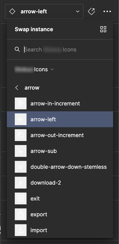
I work in dark theme so my components are white. Any time I do a search for components, either on the layer panel or the swap instance, the thumbnails that appear are white on light gray. I’m constantly struggling to see thumbnail. Would love if this got fixed.

1 Like

Hey @James_McLain1 ,
Others in the community have requested something similar! i’ve gone head and merged this with an existing topic to reduce duplicates here.

Feel free to add additional context over there.

Can someone from Figma actually describe the logic behind this? One time it’s grabbing BG color from frame / section. Other time it’s not. I’ve achieved dark backgrounds before and now I’m having troubles to recreate it.
imageimage

I use white icons as a default since we use a dark theme for our app, but because of this, the swap instance dropdown thumbnails are very difficult to see. Is there any way to change the thumbnail background?
(This is similar to a prior request for the review modal that I don’t think was addressed. It seems this could also be addressed by using the background canvas behind the component.)

1 Like

Hi Michael79, Thanks for writing in! I found the other community members asking for something similar here. So I merged your post to have all the feedback in one place.

Feel free to vote and add additional comment!
Thanks,

I had my symbols/icons grouped into auto layouts by type (without a fill). I changed the fill to #000000 and this fixed my issue. Thanks! Apparently, the canvas color doesn’t seem to matter in this regard though. I wonder why…?