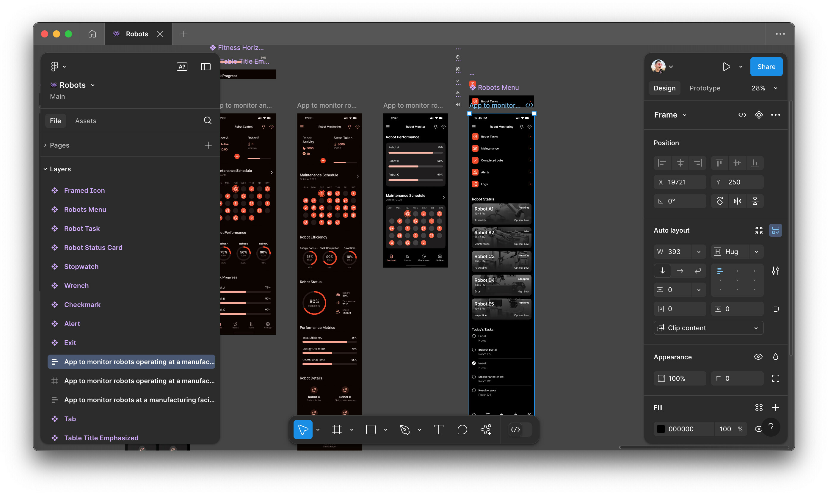
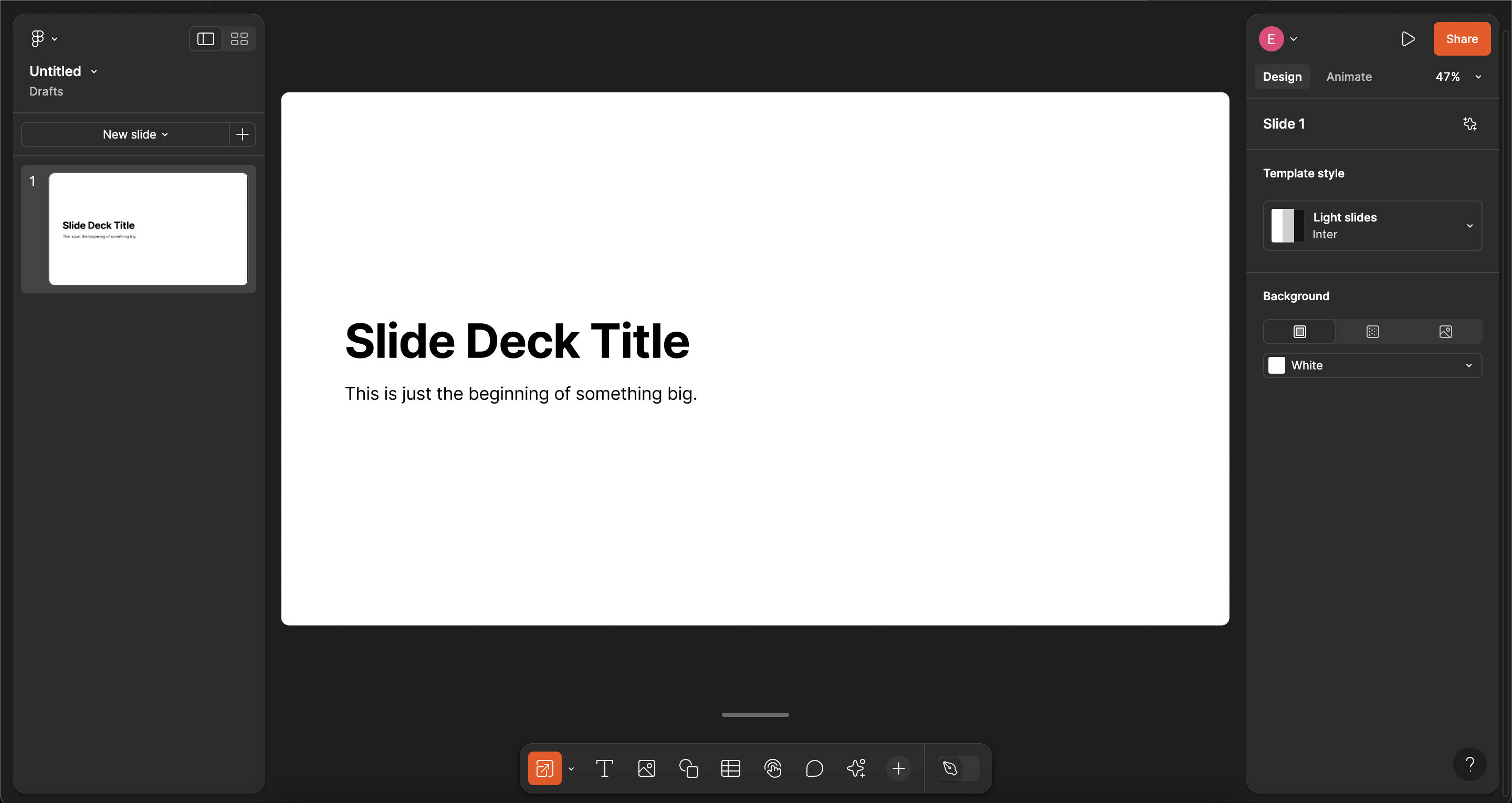
Please increase contrast in dark mode everything blends together and overall ends up looking like the previous UI. In addition, the help icon is also difficult to notice as well until it was pointed out to me by someone on light mode. Also the orange and black looks very similar to a halloween theme which is fun but personally would prefer other colours.
Enter your E-mail address. We'll send you an e-mail with instructions to reset your password.


