I feel like this is a must-have feature as it has been quite an issue in my project for me… especially being somewhat new to figma.
I’ve seen workarounds with adding a line at an angle using responsive layout, but it’s just a workaround and has quite a few limits.
People work with images and this is super necessary in those cases. If I set my image container to a 16:9 aspect ratio when it’s 160x90px, I’d obviously expect it to be 320x180px when I scale it to twice the width, not 320x90px.
A big +1 from our team as well.
Aspect ratio lock needed in auto layout and constraints, so block does not change proportions during scaling.
There is nothing to add here…
Agreed, have this problem with SVGs in an auto layout. Sometimes have to resort to images, which makes hand off not as easy because devs should be using the SVG in code. Also have certain UI elements like charts I want to show in designs and the only way for them not to break is to copy as images which then means you lose the ability to inspect etc. Leads to a lot of busy work to find other means of communicating to engineers!
Incredibly important feature that’s missing! Are there any plans to add this?
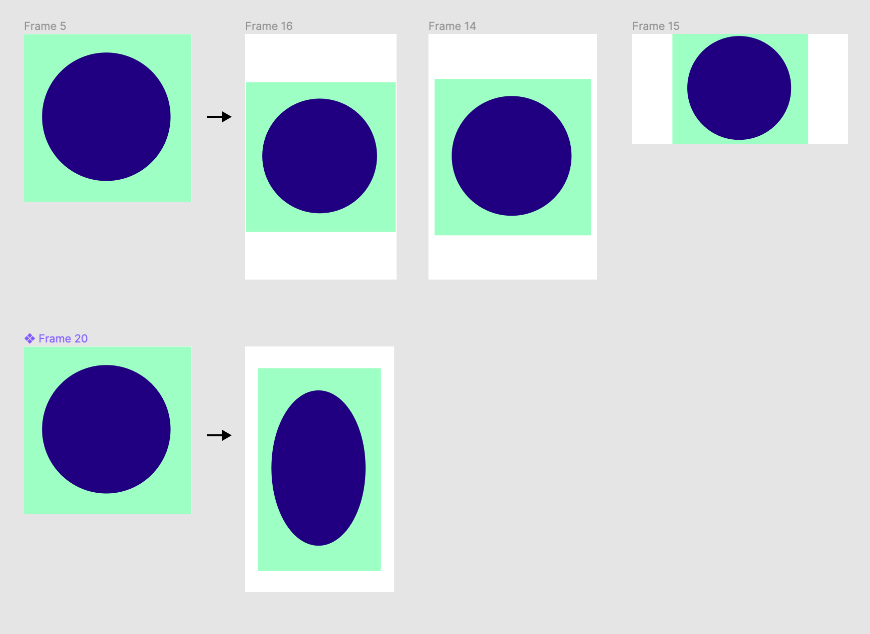
Right now, it is not possible to make a square frame that resizes via parent frame. It always distorts into a rectangle.
Even with “constrain proportions” toggle selected, it does not constrain the proportions. To make matters even worse, the toggle only “works” when changing the numeric fields of height/width, which then breaks snap-to-pixel-grid. But then when holding shift and dragging a corner of the frame, it constrains proportions and maintains the snap-to-pixel grid functionality.
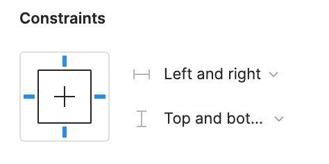
I believe a toggle/option in the constraints panel (example: width = fill container, height = maintain proportions) could do the trick.
This is critical for responsive components and is a frequent barrier for the team, is this on the roadmap @Figma ?
It’d be great if there was a toggle I could check that would keep the same aspect ratio for a component inside auto layout. Meaning if the width changes, so does the height while keeping the same aspect ratio.
Hi everyone, I’ve made a tutorial on how to achieve true aspect lock with just 1 AL Frame, I discovered it two months back and have put it to the test, it works perfectly, 100% bug-free, → Check it out ←
It is not “true aspect” lock. I see it still crops or lets background to be seen at some aspect ratios. Am I doing it wrong? Also almost always brakes if you make it a component.
Okay, It is the closest to true aspect lock Figma lets you achieve, let’s put it that way, and for your second question, I haven’t shared publicly how this works on components, but it is quite easy and works the same way, it just needs one bit of additional work. But let me provide some context:
Yes, please Figma-Team, can we have the aspect-ratio-lock behave like the OP suggested? As much as I love all the smart little details in Figma, this current behavior is an absolute strange oddity within all design software out there. Probably every other app does this right(er) than Figma.
When the lock is closed, the aspect ratio of an element should stay the same, no matter from which side or how it is scaled. When in an AL container and set to “Fill container”, the last chosen setting (horizontal or vertical) overrules any other setting. But elements should not be distorted when the lock is closed.
This seems so basic and after 1½ years of using Figma I still can’t figure out why you did it the way it is. And this can’t be that hard to implement, right? So Fimga-Team members, if you are reading this, please reconsider this thing and make it one of the smart details. I even give you all my thank-yous in advance… 😎
This is a missing feature to make truly responsive designs. A lot of websites and apps have a page with a grid of thumbnails with fixed aspect ratio. Currently there is no way to have these thumbnails keep their aspect ratio with auto layout, so the only way to do so is by using some tricks like this: https://www.figma.com/community/file/873125264217713781/Fixed-aspect-ratio-in-Figma-Auto-Layout
Yes please. It just seems like it’s doing nothing right now. Would help immensely in doing responsive UI.
Problem is, 136 votes might not be enough for them to take action… 😢
Is everybody else happy with the current behaviour then?
This seems to be a pretty important feature.
To me it’s happening the exact opposite. I want to deform the image and I can’t.
We need this feature! Commenting here to upvote the topic so as to make it a feature. Thank you Adam!
I’ve spent hours trying to figure out how to make an icon scale proportionally within a frame. Not sure if I should be …
- Relieved: I wasn’t stupidly overlooking this feature … since it doesn’t exist in Figma.
- Grateful: I could’ve spent hours more, looking for a feature that doesn’t exist in Figma.
- Concerned: that folks have, for a year and a half, been asking for a “pretty important” feature that still doesn’t exist in Figma.
I’ve worked with Sketch and XD and am a recent convert to Figma. Love it! But I’m surprised that the aspect lock feature is missing. Would be great to see that sometime soon. Thanks!
The big problem here is that when we have a component with autolayout variables and the variants change the size, the content does not fit proportionally because that is only done manually. There has to be a way where the scale is proportional for the variants to work and adapt to the part that contains them
Just reiterating here, odd that it doesn’t provide this when scaling is such a common task.
I find it difficult to be perfectly precise and then the image seems just a little off most times
+1 VOTE
 A true aspect ratio lock means two things:
 , the node takes on the smallest of its supposed width and height, and calculates its ratio accordingly.


