Here’s the translation of your text into English:
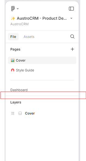
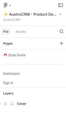
"The page and layer separators need improvement. Even though I create a lot of pages, every time the client wants to review the designs, they don’t realize that more pages have been created below.
For example, maybe a slight fade effect could be added to the bottom of the pages to indicate that there are more pages below.
Additionally, the separator between pages and the separator between pages and layers look very similar, making them hard to distinguish from one another."