Hey everyone,
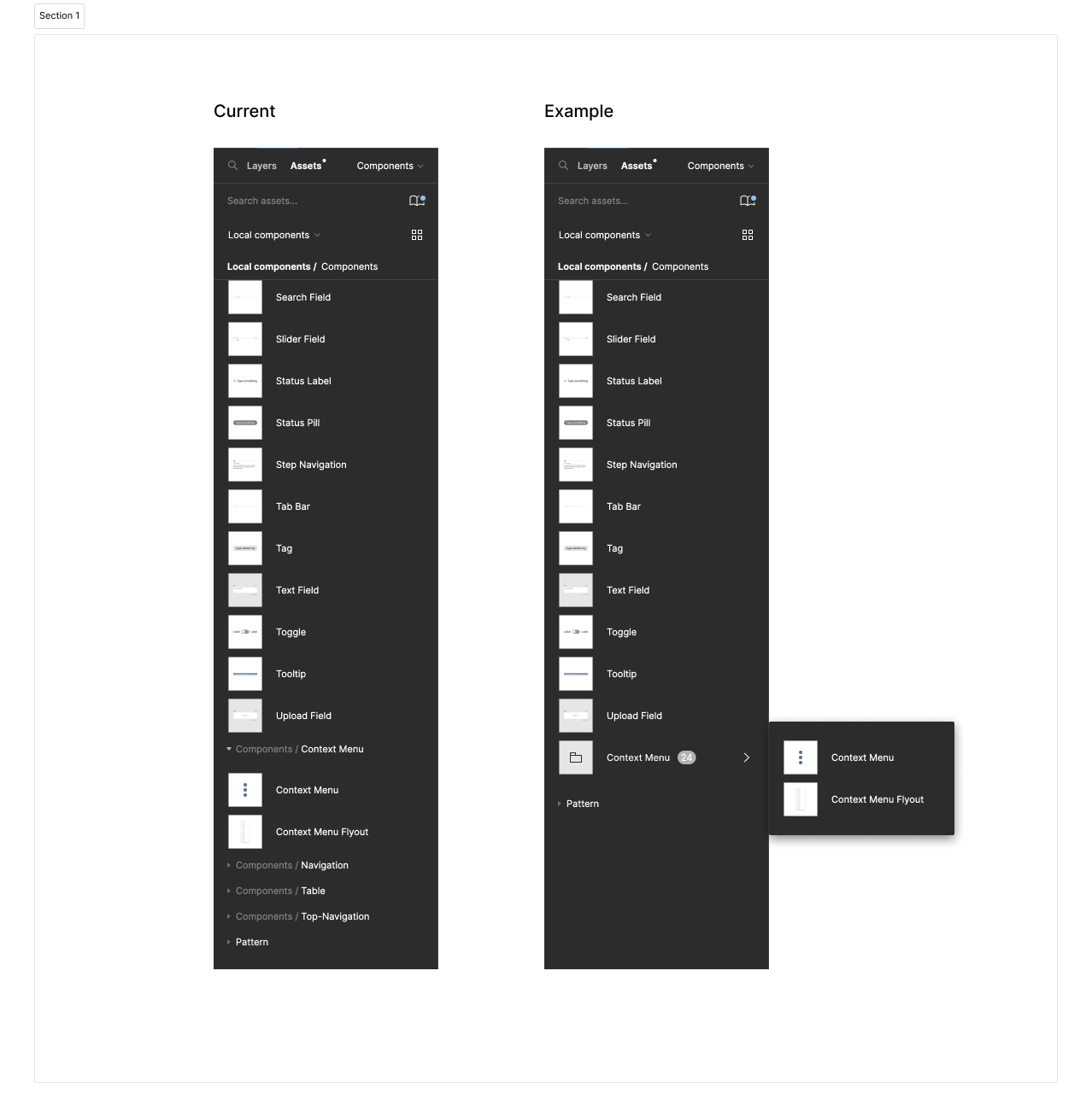
today I had to use the asset/component explorer a bit more than usually and I got very annoyed about how the folders are structured and displayed within it.
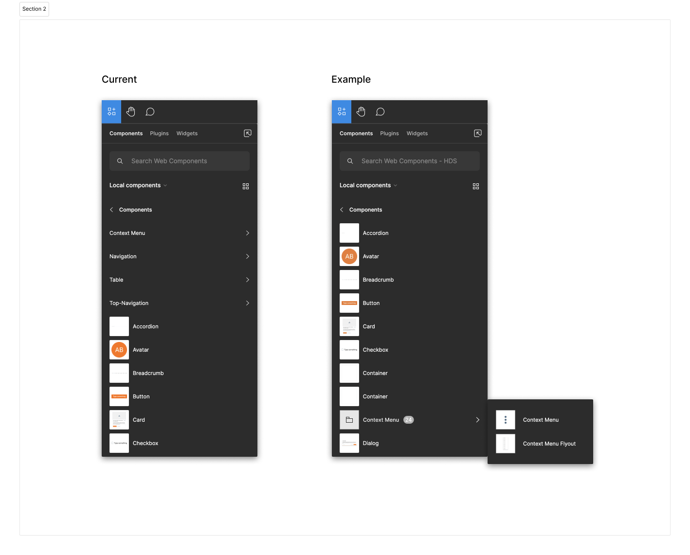
Overall I tried to rethink how folders can be implemented more user friendly in the visual flow of the explorer. Currently the user has to navigate a lot when trying to enter different folders. Also the whole explorer looks messy when there are a lot of component and folders mixed. In the top explorer (second image) the folders are also not sorted within the A to Z structure which makes sense cause that would make things even more messy but it’s still not the best approach in my opinion.
I know that the examples I provided might be a bit tricky when there are 3 or more nested folders.
Here are examples how something like this could look like.
Thank you and best,
Sascha


