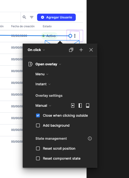
Please, return to the mode where you configure interactions fixed on the right side of the canvas. I’m so stressed with this new version.
Pros of last version:
1.- The configuration was always on the same spot so it’s easy to remember where to click without thinking much.
2.- It didn’t cover the lines that you drag to link them to other section
3.- You had less miss-clicks trying to drag a line to a section because you had a better view of it
This version’s cons:
1.- Buttons aren’t on the same places (as the fixed version)
2.- Configuration pop up covers work space
3.- It’s so much harder to place an item with manual overlay because the configuration takes so much space
Please return to the old version (configuration fixed on top right panel), it was more clean and easy to work with, took less time and clicks.


