
My design concept for the Rulers' Position in Figma's new UI3

  • August 21, 2024
  • 5 replies
  • 155 views

Tim20

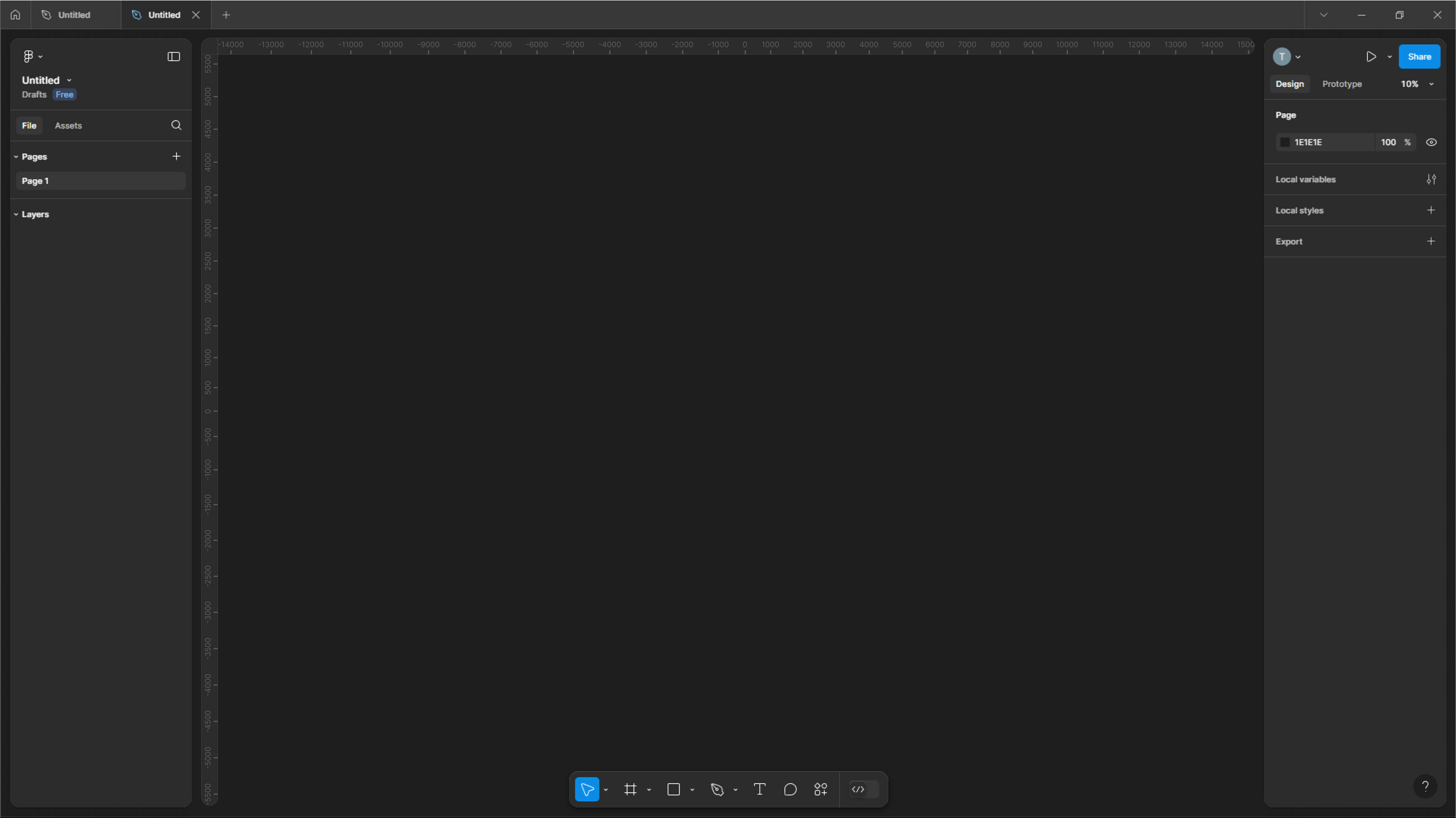
I redesigned the rulers’ position in Figma in a way that feels more logical to me compared to the current solution. In the existing design, enabling the rulers causes the design panel and layers panel to shift, which can be disruptive. My design addresses this issue, ensuring that these elements remain stable, and it integrates smoothly with the new UI. Below, you can see the actual design implementation.

5 replies

It’s very convenient that you made! I think so too


DIORBEATS
  • August 21, 2024

Great idea Tim, now it’s even better!


Celine_
Figmate
  • Community Support
  • August 21, 2024

Hey @Tim20 , that’s an interesting idea, thanks for sharing it here!
We’ll pass this onto the UI3 team for consideration.


Tim20
  • Author
  • New Member
  • August 21, 2024

Thanks for supporting, Celine 😉


Roger_Junior1

The current design is dumb to me… Why would they put the ruler in the furthest left corner?? Great solution, Tim!