Hey there,
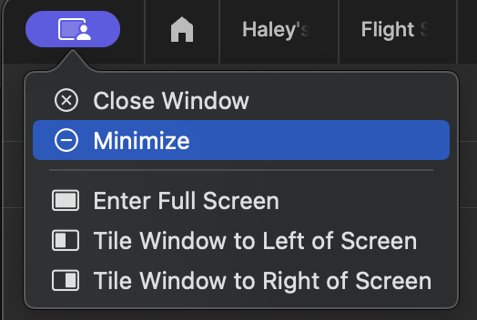
I just wanted to submit some feedback regarding a recent update to the top left of Figma on desktop (mac).
This update places the minimize, close, and other functions behind an additional click. Truly, this change feels fundamentally negative because all mac apps follow the existing paradigm of showing the close, minimize, and maximize functions in the top left.
With this recent update, this makes me scramble to minimize the view during presentations where I’m needing to share my screen.
What is the intention behind this update and isn’t there a better spot in the UI to join in these types of additional functions for split screen mechanics? This feels like a completely unnecessary change.

