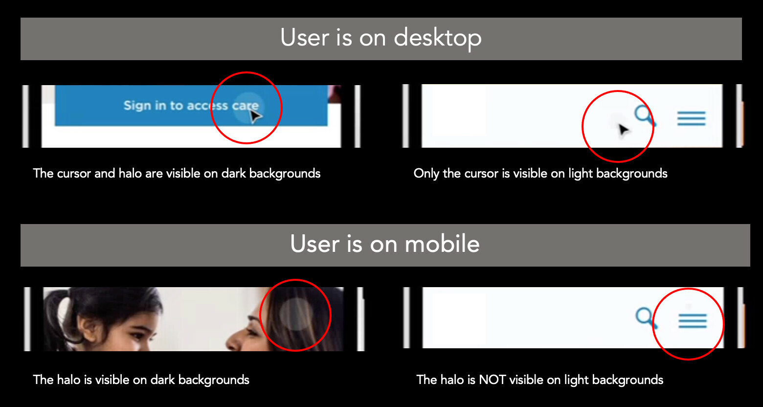
The cursors in Figma’s Presentation View are too faint to be able to consistently observe the scrolls/drags and clicks/taps of others. They’re really only visible when the cursor is over darker backgrounds.
You can’t see the cursor at all on light backgrounds on mobile devices.
(see lower right quadrant in image below)
When watching screen recordings made of the Figma app, the problem is much worse – video compression seems to take out the last remaining traces of the light grey they use for cursors. The screenshots above are from a compressed screen recording.
We already love using Figma for user research / usability testing, but improving this would seal the deal in our hearts forever.
PROPOSAL: Make the cursor more visible and/or allow Figma users to change color / size / etc. via settings and/or CSS

