For many years, I’ve been working as a designer, accumulating over 10 years of experience using almost all Adobe products.
Now, I’ve transitioned to Figma, as it’s an excellent tool not only for prototyping but much more.
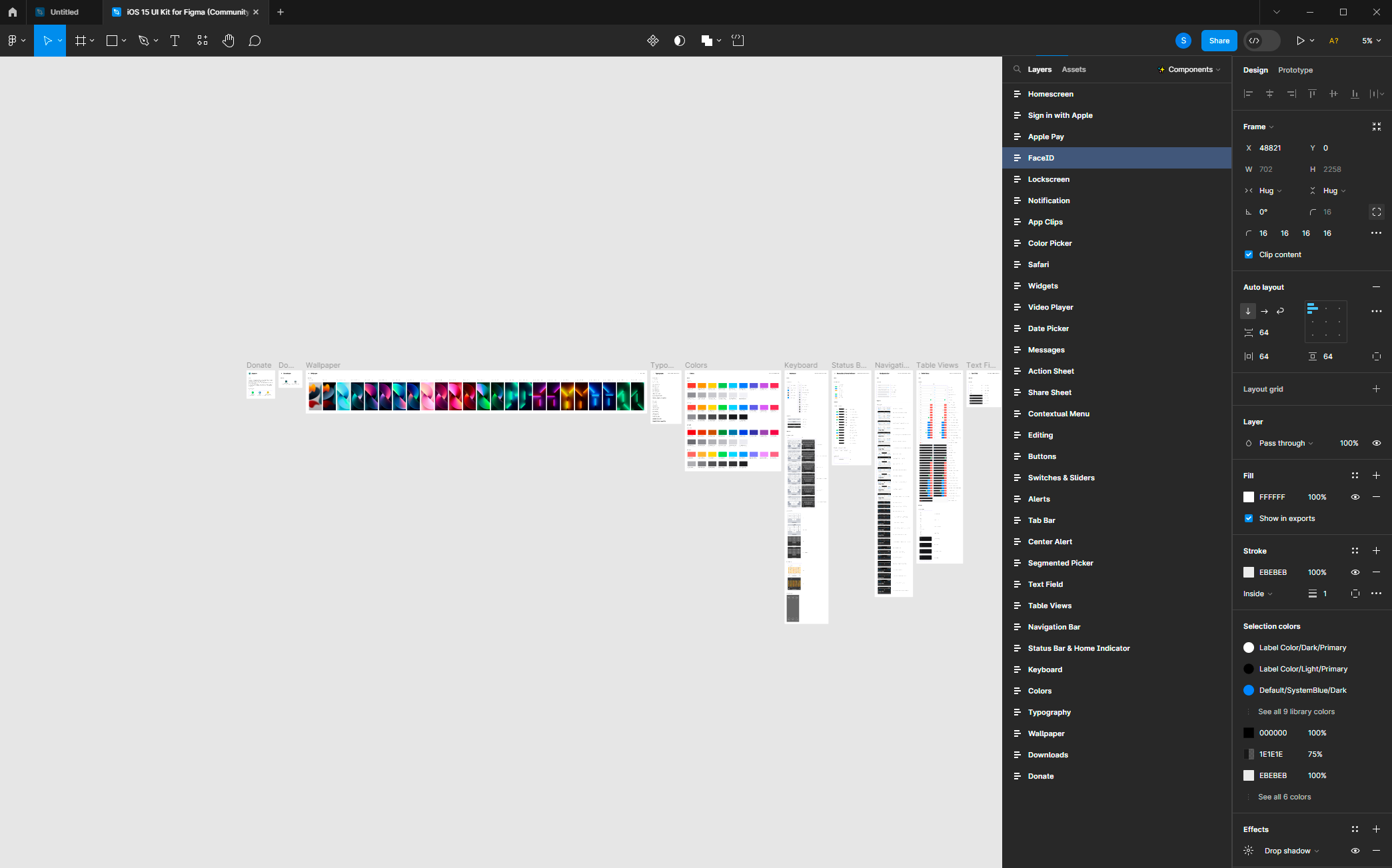
I’ve encountered an issue that might be of concern not just to me, but to others as well. Specifically, it’s about the placement of the two most important panels, namely the “Layers” and “Properties” panels, on opposite sides of the screen.
I have a 34-inch monitor, and Figma is open in full-screen mode. However, when I need to perform actions on a specific set of layers, I find myself moving the cursor across the vast screen from left to right. Now, imagine needing to perform 10 or more consecutive actions like this. A significant portion of time is spent simply moving the cursor back and forth across the screen, along with the physical strain of repeatedly shifting focus and aiming at small buttons. It’s an ordeal and a waste of time on unnecessary actions.
The solution is simple: allow users to move the layers panel to the right side. This way, designers can utilize their time more efficiently without the burden of cursor movement all over the monitor.
A single cursor movement from the left to the right side of the screen takes anywhere from 2 to 4 seconds, not accounting for refocusing the eyes and locating the necessary layer. Over an 8-hour workday, even rounding down to 4 hours of active work, such cursor movements can occur around 200 times on average. This amounts to at least 10 minutes of unproductive cursor movements, and this doesn’t even include the frustration that comes with it.
Here’s an example of a prototype that demonstrates simplicity and convenience, making Figma, already a professional tool, even more user-friendly.
On behalf of all those who have encountered this issue, let’s support this proposal. May the developers enhance Figma further.


