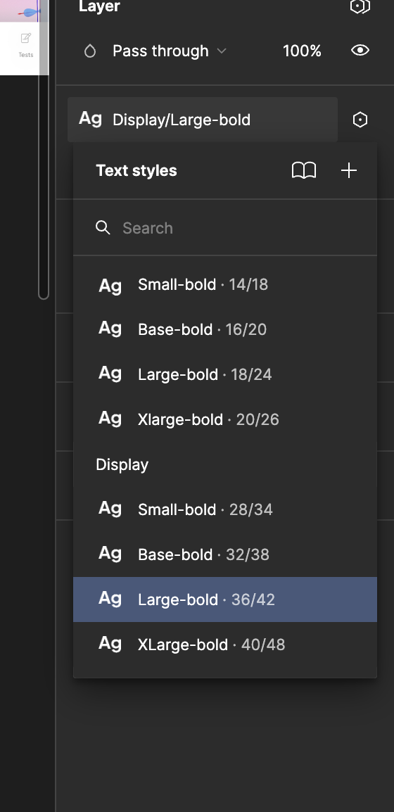
Is Mobile the default mode? I’ve noticed that the styles don’t always seem to stay up to date with the current mode context and will fall back to the default.
yes, mobile is the default one
The behavior you’re describing occurs because Figma’s variables affect the visual representation of text styles dynamically, but they do not override the underlying Text Style name in the side panel. This can indeed be confusing when switching between modes like mobile and desktop. Here are some approaches to address this issue:
Why This Happens
- Text Styles in Figma: The side panel displays the original text style (e.g., “Mobile Body”), which remains constant because it’s linked to the base style applied to the text.
- Variables Impact: Variables dynamically adjust properties such as font size, weight, or line height but don’t update the underlying text style name.
Workarounds to Align Side Panel Information with Visual Changes
1. Use Separate Text Styles for Mobile and Desktop
- Instead of relying solely on variables, create distinct text styles for each mode (e.g.,
Body Mobile
and Body Desktop
).
- When switching between modes, use the “Apply Text Style” action to change the applied style dynamically.
- This approach ensures the correct style name (e.g.,
Body Desktop
) appears in the side panel.
2. Document and Label the Variable System
- In your design system, clarify how the variables work and specify that the side panel will show the base style name, while the visual appearance is controlled by the variables.
- Use tooltips, overlays, or a style guide to explain the behavior to your team.
3. Use Auto Layout with Mode-Specific Frames
- Instead of switching modes within the same frame, create separate frames for desktop and mobile layouts.
- Use Figma’s Auto Layout and components to manage responsiveness between frames, eliminating the need for variable-based text adjustments.
4. Suggest Manual Overrides in Prototyping
- If a variable change doesn’t affect the side panel, guide your team to manually check the prototype mode or inspect the variable name to confirm the current mode.
5. Leverage Feedback Tools
- Share feedback with Figma’s team via their community forum or support page about improving the integration of variable states with the side panel for better clarity.
Long-Term Recommendation
For now, the most robust method is using separate text styles for desktop and mobile. This aligns visual changes with style names in the side panel, preventing confusion for the team.
Let me know if you need help implementing any of these!
The Text Style selector isn’t picking up the variable mode in order to update the metadata shown next to the style, but it should apply your styles appropriately, when viewed in context in your design.
To my knowledge, Styles rarely update their presentation in dropdowns. Color styles might change the color of the circle if a color variable is used within it, but that’s the only case I’m aware of. Variables tend to be contextually aware of modes when presenting themselves in dropdowns, but Styles are less likely to do so.
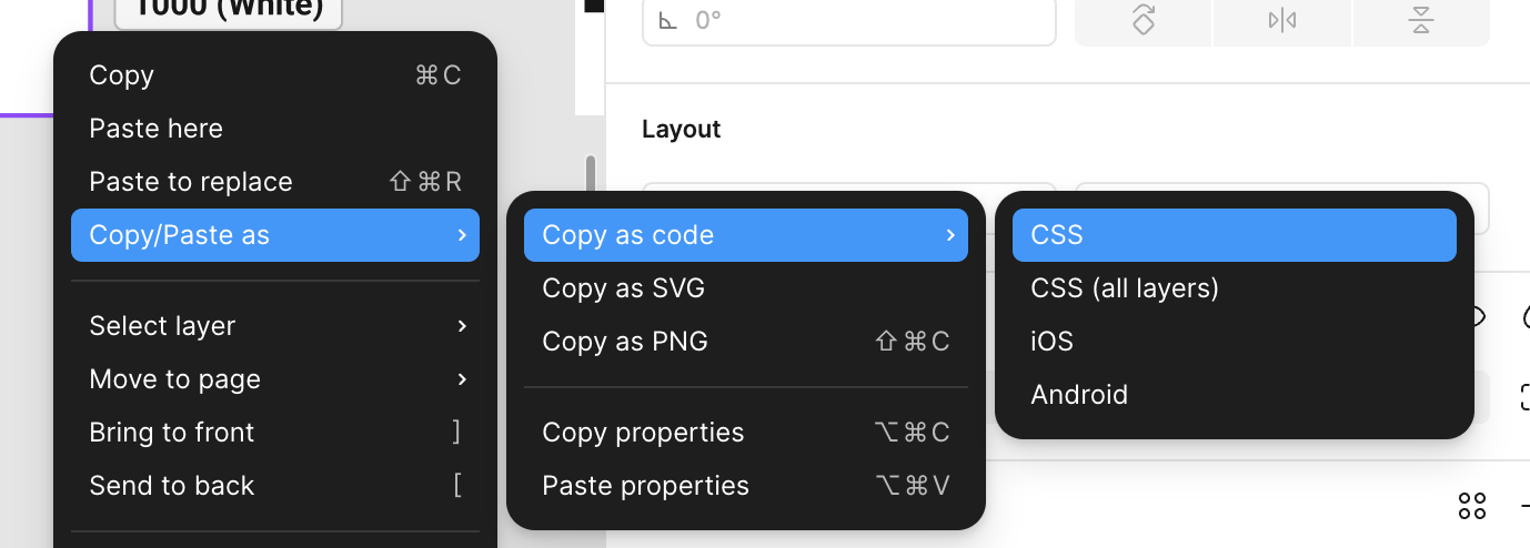
If you have access, you can verify values by checking output in Dev Mode. If you don’t have Dev Mode, you can copy as CSS (see screenshot), paste to a new text layer, and check that way.
Hmm ok… yes it does update the styles when mode is switched from desktop to mobile.
It is therefore very easy to switch and modify mobile designs for desktop.
Some colleagues are ok with this, but others find it disconcerting to see the wrong text size and line height in the side panel.
So temporarily I created a separate Typography library for desktop to cater to that requirement. But this is a hassle as people have to disconnect the typography styles and then connect again to the other library.
Would have been so much easier if the side panel was updated to the Desktop sizes.