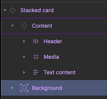
Is there any advantage to having a separate layer for the background inside a component as done in Google Material Design, whereas Figma offers solutions to fill a container with a background color without using an additional layer? Is the approach by Material Design considered a legacy method, or is there a specific rationale behind this concept?


There are quite a few advantages to this. It can be a component you can reuse over and over again in other components of the same kind. Being a component instance makes it supers easy to enable multiple style options. When you have a large system it makes it much easier to maintain that system.


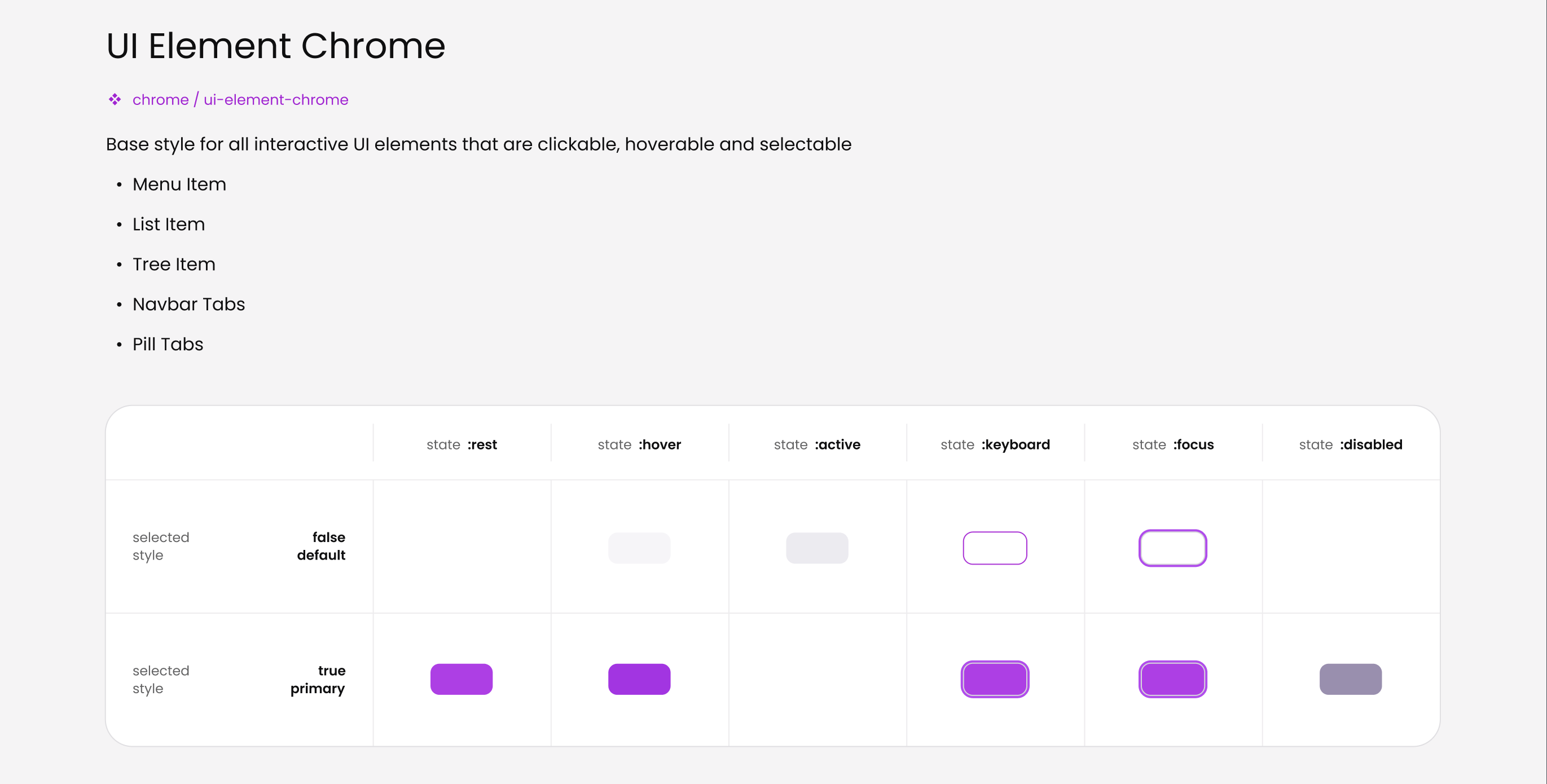
In a way, it’s like a complete style definition for an element. My favourite is the common UI element surface/chrome. It implements very basic visual states which I can reuse however I like


Have a read if you like, I put some thought around it here → Making of true multi-brand design system | by Pavel Kiselev | UX Collective


Thanks for sharing, Pavel!


In the design system I’m working on, we don’t handle multiple brands. I apply the background fill on the parent layer of the component. This method reduces the number of layers. The background fill color value is set through a variable, which makes it easy to manage. This setup also allows adding a theme.


I understand that the method you and Material Design use might have benefits for systems that need to support multiple brands, but my design system doesn’t require this. So, I guess I just haven’t had the challenges and complexities that might need an extra background layer as a solution.


Frankly it’s not only because of the need to support multiple brands. It’s just makes life easier.


Here is a real-life example. I have multiple flavours of a form element. And they share the same style


Basic input


Inset labels


Input group

image


And they all use the same component for visuals. It’s super consistent.


Plus I made a few extra styles, so I don’t need to make extra variants to support alternative visuals. Clear to see it’s way more effective when it comes to memory use.


I like that next time I decide to change something in design for my default form element it would not take lots of effort as I only change a single style component.


And some guys found it to be useful


Figma – 18 Oct 23

Reply