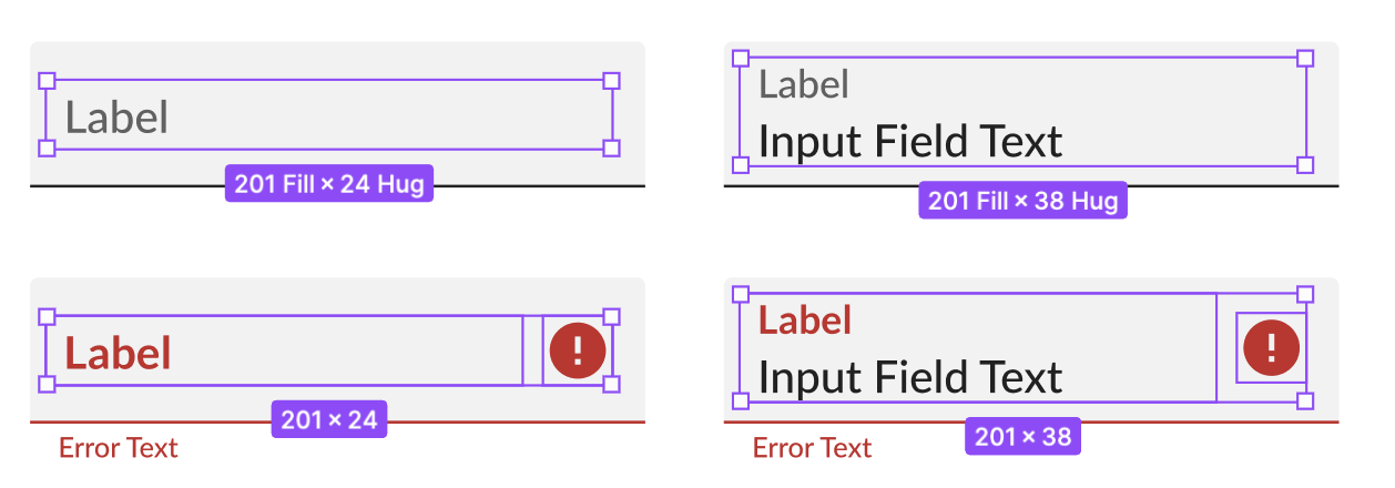
Hi all, I’m looking for suggestions when building new components with icons or nested components that you can turn off and on via boolean properties. How do you make sure your component is always the same height?
Here’s an example:
I have a text box component. I want to create the hover state show a couple of icons with available actions as well as a background. In the default state, there are no icons, just text.
The text height is 18px, the icon box heights are 24px. There should be 4px of padding on top and bottom. The height of the hover state is 32, but since the icons are turned OFF in the default state, the height of the default state is 26px.
I’ve found success using the minimum height that matches the size of the icon boxes. Then I can keep it hug on top and bottom so it can expand with more content. I also make sure the text is center aligned or whatever I need to match. This becomes more complicated if I have other nested components with it, for instance, if there were more textboxes under or over.
Does anyone have any other workarounds? Would love to hear!
Some screenshots:


