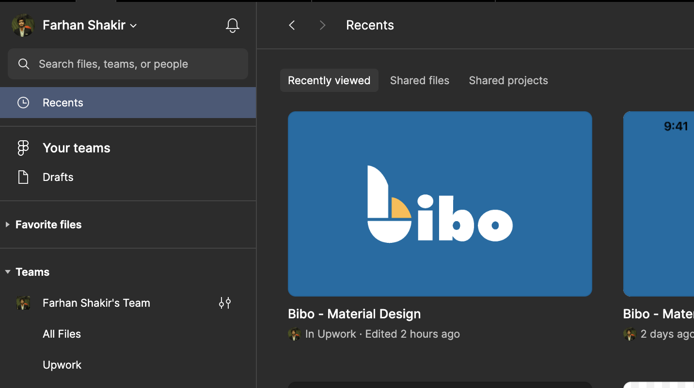
This discussion focuses on improving the user experience related to the placement of the search bar in the new interface compared to the previous version. While acknowledging that the old version’s search bar was better positioned at the top of the list, it is important to highlight that both versions have room for improvement. The proposed suggestion is to prioritize a larger, prominently displayed search bar at the top of the page with maximum width, considering that users often have multiple projects and rely on the search function for quick file retrieval and easy access. This adjustment aims to enhance user convenience and streamline the search experience across the interface.
Page 1 / 1
I agree with this. Same here:
This topic was automatically closed 90 days after the last reply. New replies are no longer allowed.
Enter your E-mail address. We'll send you an e-mail with instructions to reset your password.


