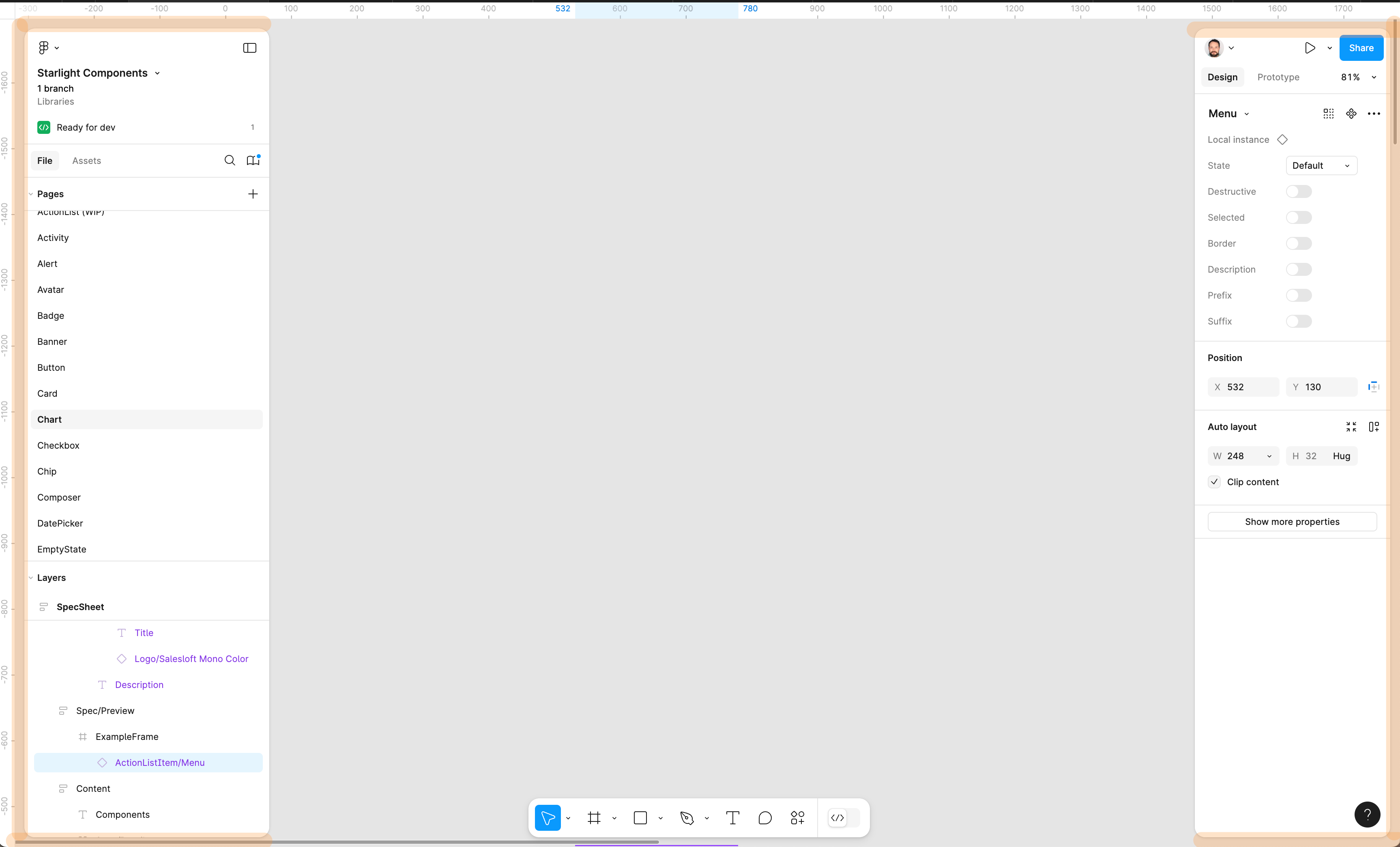
Overall, I feel like placement of controls in UI3 makes a lot of sense. One thing that is absolutely driving me nuts is the panel gaps on the left and right panels.
When I’m working on my laptop and not an external screen, it feels like a huge waste of space. If anything the little bit of content that shows between the panels and the edge of the screen makes the entire UI more cluttered.
Please attach/dock the left and right panels so they are flush against the edges of the screen like they were in UI2.


