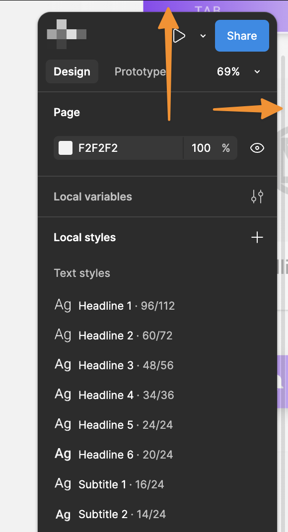
Overall I like a lot of the UI3 changes, but one I struggle with is the undocked appearance of the left and right panels, where work bleeds in around the panel edge.
It is really quite distracting to see your work peeking through this area, especially when scrolling around. I wish we could dock the panels flush to the edge of the browser like in UI2 (maybe there’s a way of doing this, but I couldn’t find it).
I really hope this changes before UI3 becomes permanent!


