Hello.
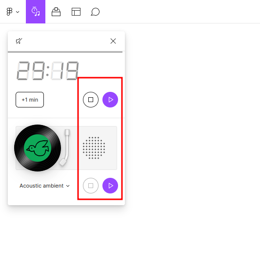
I work intensively and use a timer frequently.
I am distracted by duplicate buttons in the timer interface
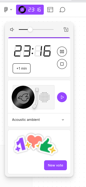
I ask you to refine the design of the timer and when the sound is turned off (the icon on the top left), remove the panel with music.
Thank you.