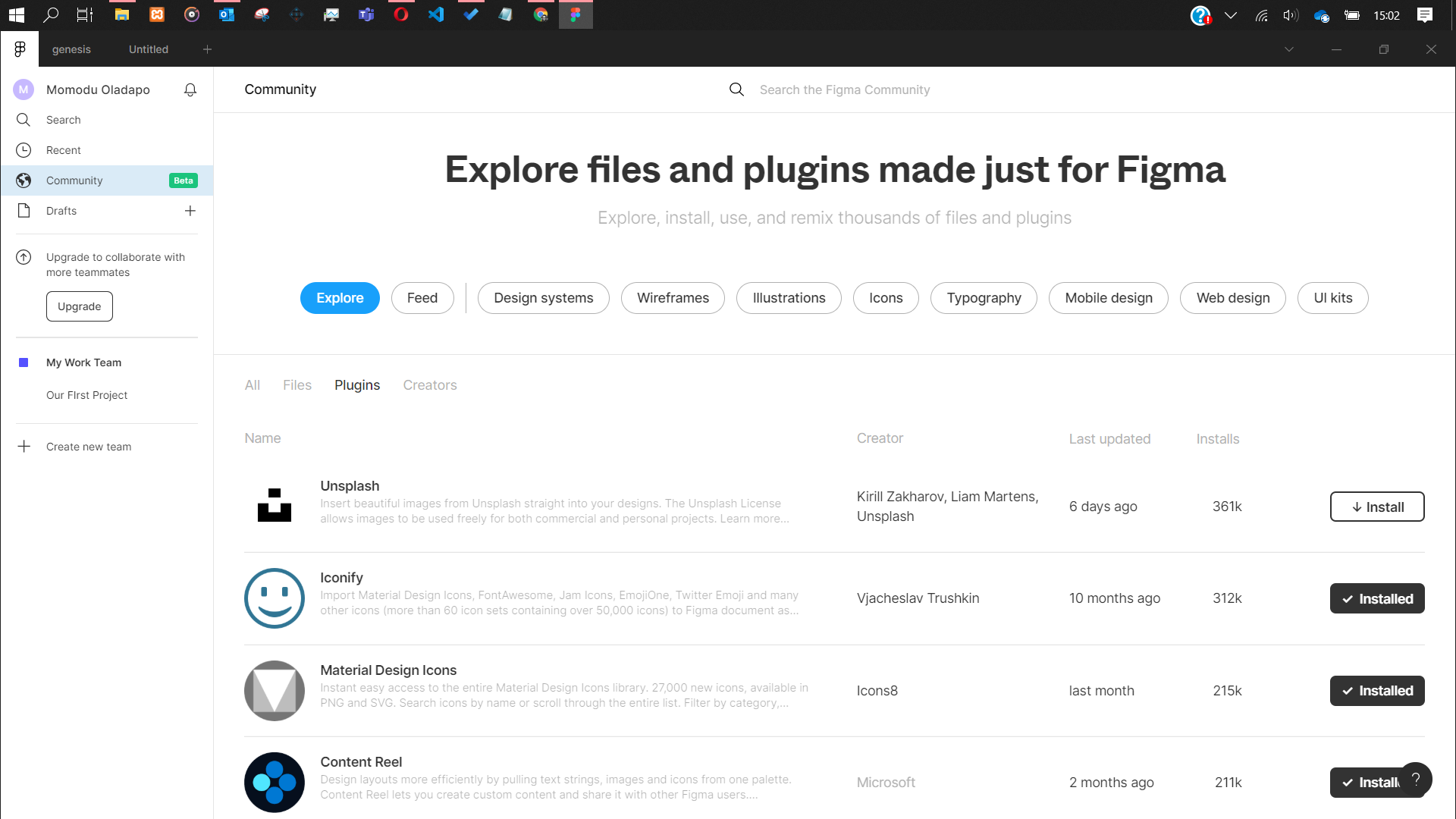
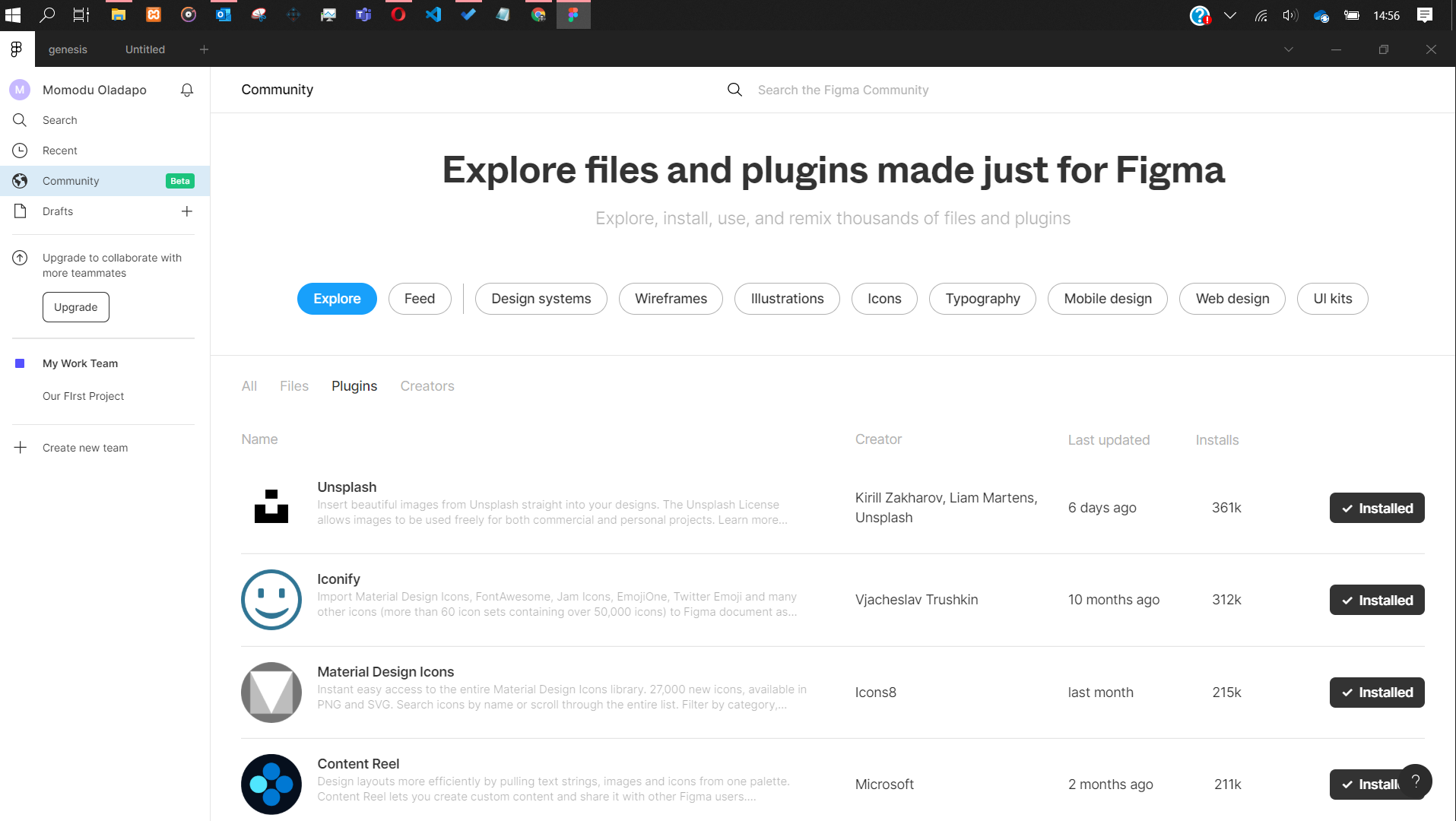
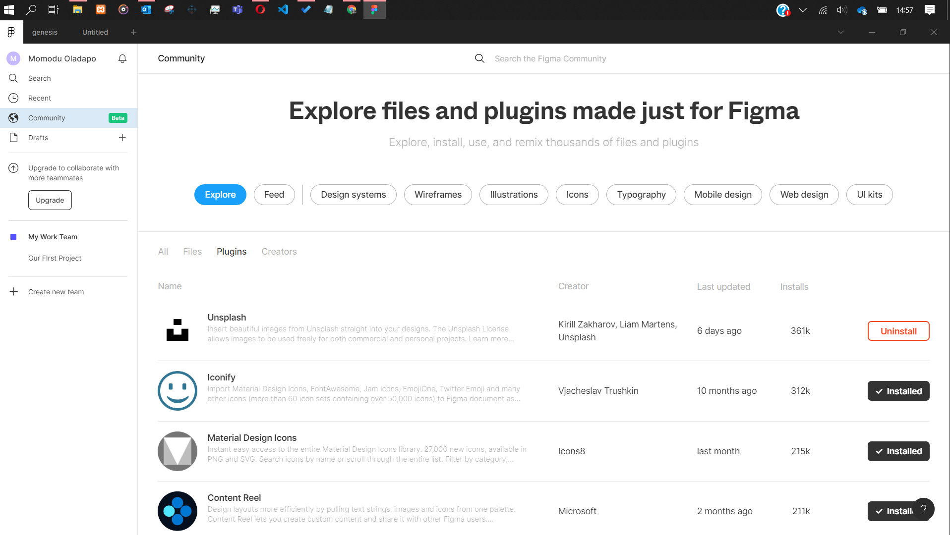
- I was working on developing UI design kits and saw the need to make use of a plugin so I visited the plugin community to install Unsplash. Then I noticed that while I’d clicked on the install button and the notification pop up at the bottom of the screen which I wasn’t aware of and the install button has not changed state, I clicked on the install button again and wondered why the plugin didn’t install.
I eventually decided to go back to my canvas and click the menu button and navigate to the Plugins menu only to discover that the Unsplash plugin was not installed.
At first instance, I thought it was the internet but then took my time to follow the installation process more carefully and this time I discovered what initially was the problem and hence the need for the subject matter.
Note: All through the processes or stages, there has always been a notification at the bottom of the screen.
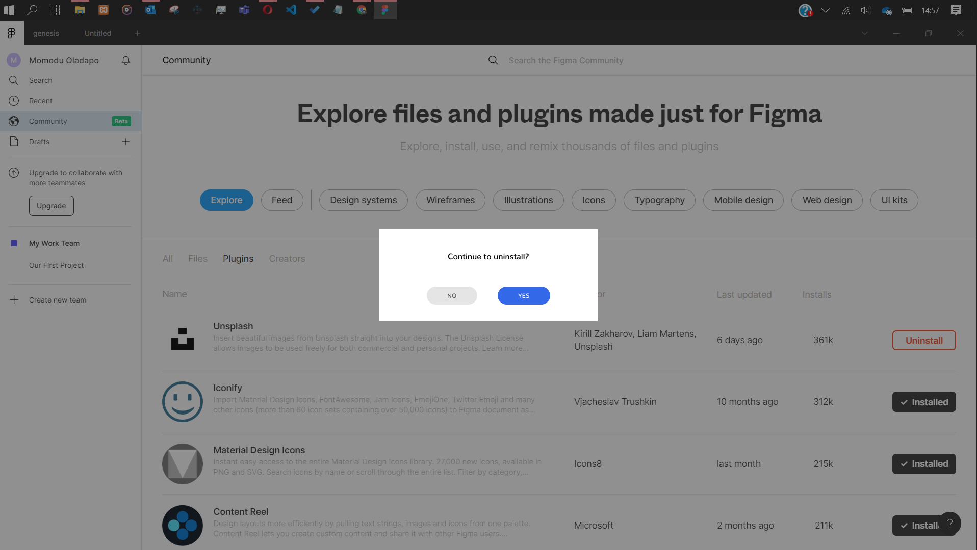
I have quickly made some suggestive mockup solutions that can enhance User Experience and they are attached below.
Is there anyone who has experienced this and seen the need for the confirmation screen before uninstall?
- Do you think this is good UX practice?
- Do you think it will be a cumbersome UX journey in the long run?
- What do you think is a better way to give users a better UX journey?


