How to build a figma button variant component with left or right icons

I manage the design system for my company and I’ve been having trouble with the variants on a button component. We want to offer our designers several core variations on a button, including:

  • Text only
  • Text with icon on the left
  • Text with icon on the right
  • Icon only

image

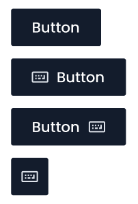
I also have all the standard variants for size, primary/secondary, disabled, hover, etc (216 in all). But I’m having trouble with this ONE thing: I want designers to be able to override the icon and then (for the two variants with icons and text) switch which side of the button the icon appears on. Is there a way to do that?

So far I’ve tried two things:

  1. (What we’re currently doing:) I have two icon placeholders in each variant, one for the right and one for the left. In the left-icon button the right icon is turned off, and in the right-icon vice versa. This way designers can override an icon for either the right or the left and still swap back to a text-only button with no problem. But if they switch from a left icon button to a right icon button they have to re-override the icon.
  2. I created a test where I just move the icon up or down in the variant’s auto-layout layer stack to make the icon be on the right or left side (which is more inline with the behavior that I’d expect Figma would want us to use), but in this test if you override the icon then you can’t choose to go back to a text-only button without clearing the icon override. I don’t know why. Maybe a bug?

Any tips or advice are appreciated.

3 Likes

So I did some testing and your second technique (your test) will work if you use a different strategy for your text-only button. Instead of hiding the icon, just set the width of the icon frame to 0.003, which will convert it to a zero-width frame.

This should preserve the override when swapping variants. =)

Here’s a working proof of concept so you can see how I set it up.

1 Like

Hi @Peter_Bentley, judging by the video, the switching of variants stops working due to the different naming of the layers. That is, when you replace an icon, the name of the icon layer in your button changes as well. To get around this, I would wrap the icon instance in a frame. The structure should look like this:

btn
    text
    icon-container
        icon-instance

Thus, the structure and naming will be the same in all variants.

Also, I would add the missing value to the “icon-position” property, naming it None or N/A, for example.

2 Likes

I’d also like to mention that in tank666’s example, I built our own system’s icons so that within the icon-instance frame all of the icons are structured and named the same in the layers panel. Each icon in our system is made of a single flattened path with the custom name “Vector” which helps us preserve color overrides when we swap different icons in using instance swapping. If all of your icons have different layer composition the overrides won’t be preserved properly. Something to consider.

3 Likes

@ntfromchicago thanks for the suggestion; seems like it could work.

@tank666 Your solution solved it for me. I wrapped each icon instance in a frame and named each one of them the same and now I can override icons. :tada: Thanks for the pointer!

@Brian_Saunders cool! I’ve done the same for our 300+ custom icons using a trick I saw @Rogie explain: each icon has it’s own name (in a separate file) but then within each icon frame I have a “color_fix” union object with just one “Union” object underneath it in the layer stack. Dunno if that hack is still necessary, but it’s working for us.

1 Like

This topic was automatically closed 30 days after the last reply. New replies are no longer allowed.