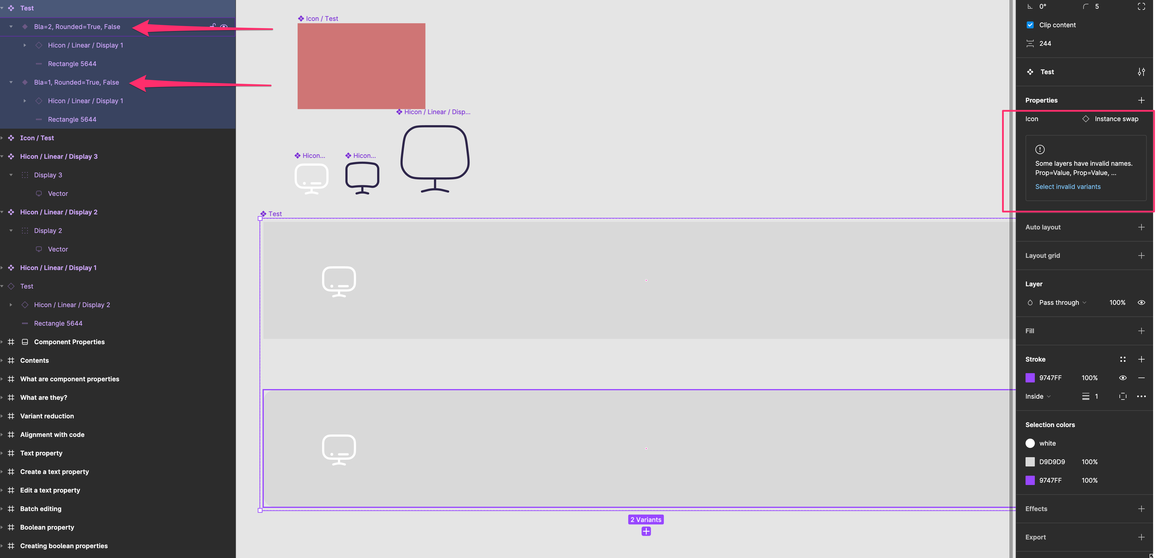
That one is even more frustrating. I have created new Variant and have typed wrong name. I still get the message on the right panel, that some namings are wrong, but i cant see where the problem ist (with Variants in the past, you could see the wrong namings on the sidebar).
So now i have to go manually to the Layer-Panel, finde out which one of them has incorrect name and then rename it.
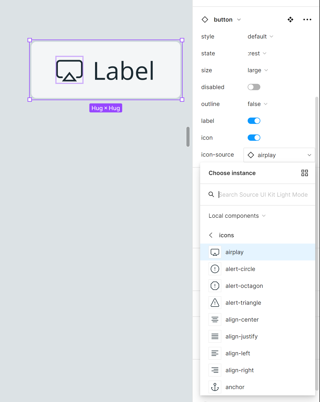
Well, for me the real advantage is to be able to surface component swap so now I can change an icon without drilling down the button
Show/hide works both ways, have you noticed? You can hide element with a toggle or you can use del key to do the same. A component will uncheck the toggle automatically so this way it becomes more predictable and reliable. Before that change you could have the icon set visible in the properties, but not visible in your design because you deleted it manually.
I’m still learning about this feature but so far have found it valuable for design system maintenance and usability. The booleans are good because to a design system user who is using my Button component, they don’t have to dig through the layers panel to understand what is included in the component and what it can do. With instance swapping, designers would previously have to select the icon instance within the button, and then find the instance swap menu (I have found that this is not always intuitive to people who are at different comfort levels with Figma). Now the icon control is surfaced at the top level of the component.
These properties seem to provide a clearer interface for what the component can and can’t do. And it does this while reducing the number of variants I have to maintain for most of the components in our system.
Boolean by itself is pretty powerful, we went from 160 variants down to 80 just by a simple “on/off”. No need to dig into layers, turning the wrong thing off, and the REAL value is for dev hand-off since they treat the icon on/off as a boolean property as well.
Instance swap is handy for making switching icons a lot quicker (again, without needing to “dig” into a component). This is also useful with large design teams so we can surface as much as possible to the components panel and not needing to remember what can be swapped and what requires opening up the component.
Seems in your particular case you don’t need these options. They’re a great addition for my team though, working so closely with devs and a design system it’s going to make their lives easier and implementation faster. 😀
Good point. So its more like for bigger teams who work together in one project/library. My colleagues don’t have to know how the library is build and how the layers were structured. They just can choose the right property on the property window. Make sence.
Thank you
As @Lino_Ramirez says, the biggest advantage I see so far is the boolean - if it works (I’m still trying to figure out how to use it) The idea is that if you hava button with icons left and right, then you only need to create hover variants once and not x3 times. Besides that I see no real value in the other options.
As previous messages said, imo perks of this new features are limited to:
- Surfacing instance swap (ok, cool)
- Surfacing toggles and reducing variant numbers. This is nice but it creates new properties (for an icon, you now need the toggle property AND the swap property). It is also limited to situations where your element can be on and off in every variant. Let me take the canonical button example: if there’s no way you’re allowed to have a button with a right AND a left icon in your Design System (only left OR right), you can’t use properties, because it will allow such a combination. Creating the right variants is the only way.
- Text property is useless imo. Situation where you need to batch edit labels are rare, and plugins like Find / Focus helped with that pretty well already. Maybe for Sketch users it’s a nice addition 😇
In general I don’t think component properties like these are the right way to go for Figma. They should focus on the “Variant” way of working, with conditional properties, cascading properties, and surface control for all children properties.
This all has to do with abstraction. Instead of having to dive into a component to update a node, you can just edit the property at the component surface.
If you have multiple text nodes that all have the same content (say, between variants), then you only need to edit the text in 1 place (component surface) and it will update all linked text nodes, etc.
I’m sure we will have a new plugins that will allow us to bulk edit text properties in no time. So I’m not worried about that.
I guess they could have added enum as a choice but it would defeat the purpose of variants at that point.
Good discussion. huge information .
how do you deal with existing components?
especially with all instances using the redundant variants ?
This topic was automatically closed after 30 days. New replies are no longer allowed.
