Hi there, I am afraid Figma currently do not support such behaviour, in fact, it does not support responsive prototype at all! I was hoping that they will release new prototype features in the Config but unfortunately they didn’t (however they did release prototyping related features like spring animation).
Here are the problems / limitations related to Figma prototypes, firstly they don’t resize your frame at all, they just take your design (parent frame) and slap it in the prototype. So if you make a desktop design and play it in mobile prototype device, it will go out of bounds, and if you make 14 inch macbook sized design and play it in 16 inch macbook prototype device, then it will show black borders.
Now the “Solution” more like a work around they did was to give you options like fit to width, which basically just zooms in your design, which is different than responsive design because stuff that should not resize, resizes like fonts appear larger as they are zoomed in.
Figma prototypes do not support break points, so you could not design a website, and then resize the browser window to see break points in action. It wouldn’t even resize responsively.
Figma prototypes do not support advance scrolling, an example can be sticky scrolling, if you scroll down to a table, then you may want its headers to stick to the top until the user reaches the bottom of the table.
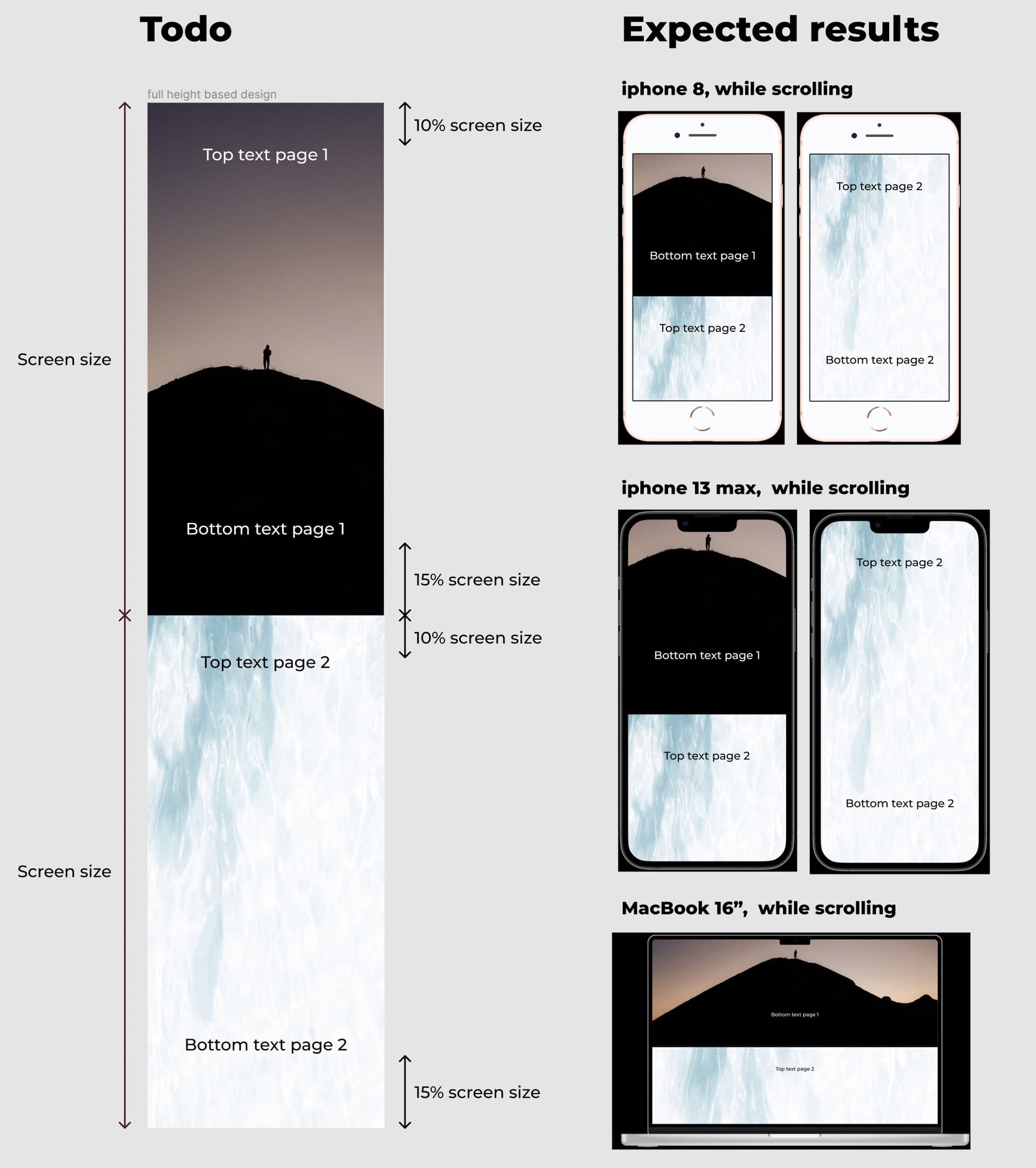
Which brings me to your question, instead of 2 frames scrolling and being the same size as the screen, even a simpler case wouldn’t work. For example, consider a simple calculator with just a basic number keypad at the bottom and a display at top. You can make the calculator design responsive but you still will not be able to show up full screen in different Figma prototype devices (without manually resizing).
Why I took simpler example? Because Figma can do more things with parent frame than with child frame, so even if responsive prototypes become a thing, your problem may still not have an answer (because you may be able to set an calculator to match device height if this feature is released but may not be able to do so match double the device height, or children matching the device height).
One thing I should note is, Figma does not completely ignore device size, for example if you want a floating action button to be 64 pixels from the bottom, even if your parent frame is very long, you can do so by fixing its scroll position and setting constraints to bottom.
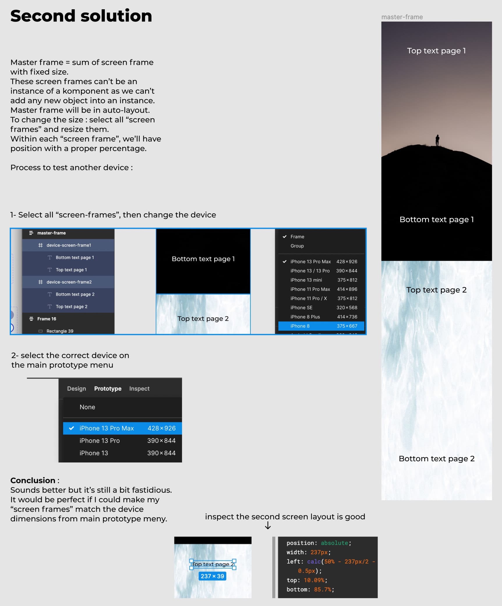
Thats all I have to say, sorry for such long reply, I kind of also wanted to rant a little bit, but I hope it helped. For your question I think the workaround “solution” you found is the best solution in Figma (you can always use more advance prototyping tools).
If anyone know how to solve any of the above problems, please let us know. And I request everyone to vote and demand for responsive prototypes in these forums.