Flattening the source icon doesn’t work.
Can you share a link to the file? Or maybe you can show the layers of the Icon-Base-Regular component?
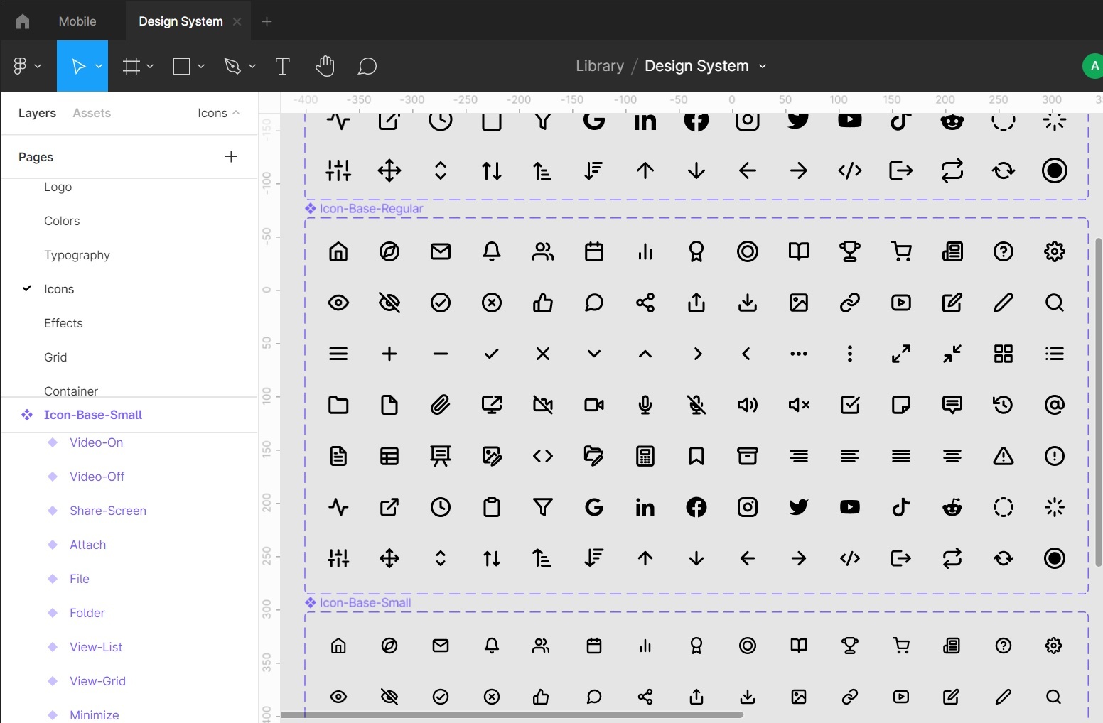
This is pretty much Icon-Base-Regular. Just one component with the different icons as variants.
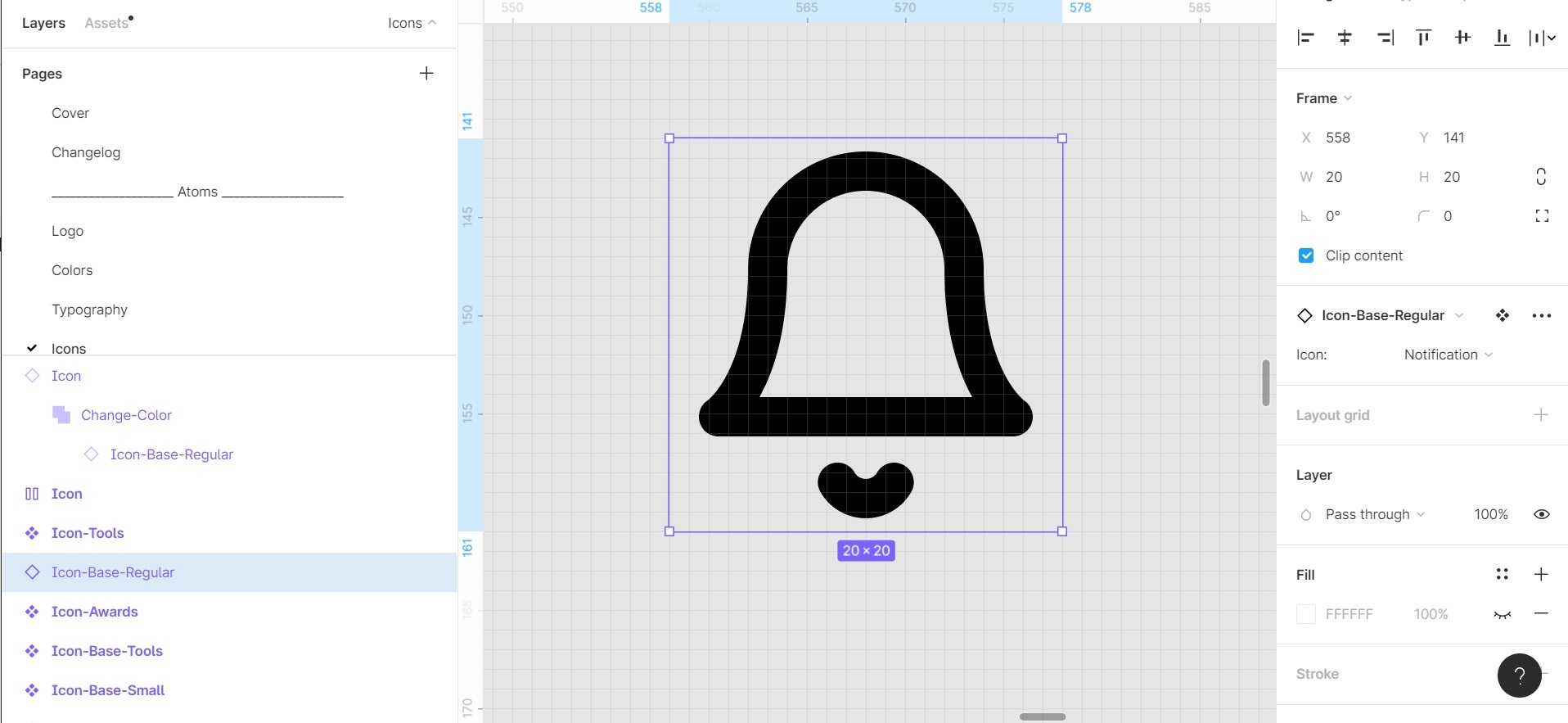
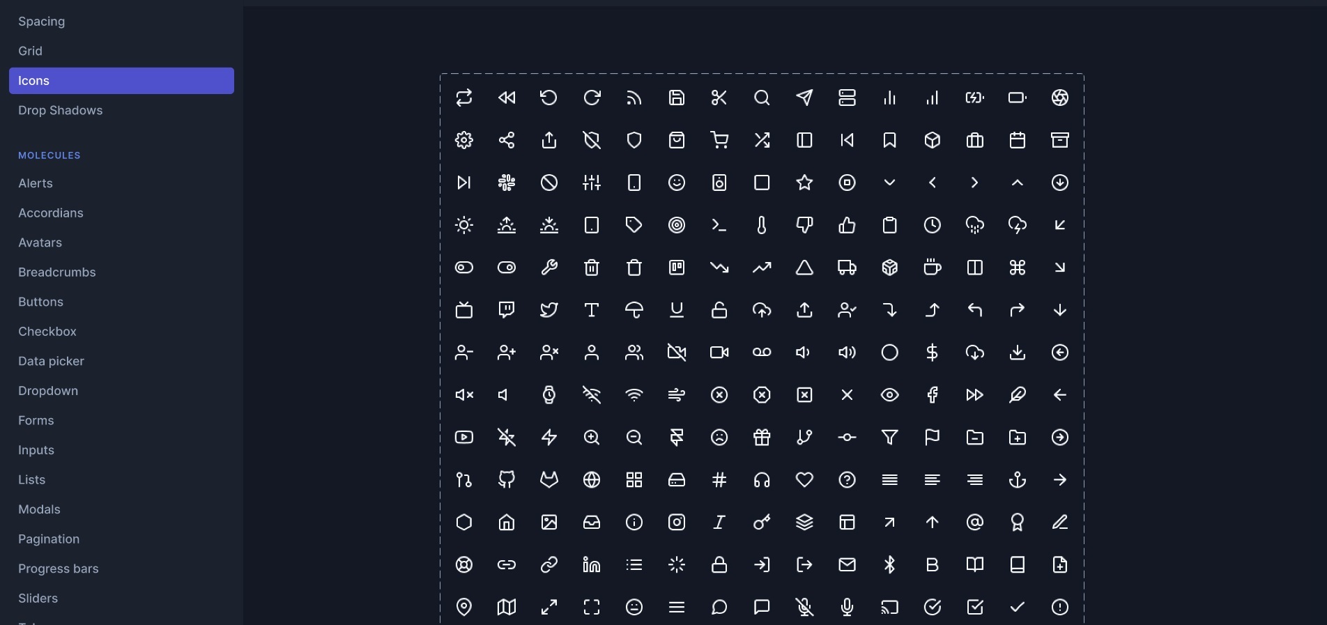
Each icon is enclosed in a frame just to keep the 24 x 24 px ratio. The frame itself is the variant component. And inside the frame are vectors, I stayed it that way so I can adjust the stroke anytime. As you can see here:

Before you say it, I already read your other reply to my post that it was not recommended again, it sucks because I don’t know that it was “what your supposed to do” I just followed this design system where they made one component for different icons.
This is theirs and they’re selling their design system on Gumroad so I thought it was a good way of doing it:
And I made a separate component for each size as you can see on the screenshot
Icon-Base-Regular = 1 component that is 20x20px
Icon-Base-Small - 1 component that is 16x16 px
Icon-Base-Large = 1 component that is 24x24 px
Unfortunately, you haven’t shown what your problematic “Notification bell” icon consists of so that I can reproduce it.
Most likely, the outline of this icon runs over another or breaks altogether, which is why such an effect appeared in the union. Try to flatten this icon. I think this should help.
You’d better have two options for icons:
- Editable;
- Flattened (for design use).
Check out the example I created for you:
Figma – 15 Jul 21
The left part of the file contains icons, in which there from 1 to 4 vector paths (layers).
The right part of the file contains icons, in which there is 1 vector path (layer), obtained by flattening (Cmd / Ctrl + E).
As you can see, the “test” frame has problems with the icons on the left. In them, the stroke thickness of only two of the four vector paths has changed. This is because the “base-icon-1” component contains an icon with only two vector layers, while the “hash” icon has four of them.
Chill out with your wordings:
“Unfortunately, you haven’t shown what your problematic “Notification bell” icon consists of…” that’s so freaking rude. I wasn’t able to share a file because I don’t know how I’m new to Figma.
I already told you, I already tried flattening the icon vectors.
I also tried converting the “Outline stroke”. Still no luck.
I really don’t like bothering people the only time I posted here on the forums is because I’ve wasted so much time already for this that I’m delaying the team.
The icon is directly from Feather Icons https://feathericons.com/?query=notification
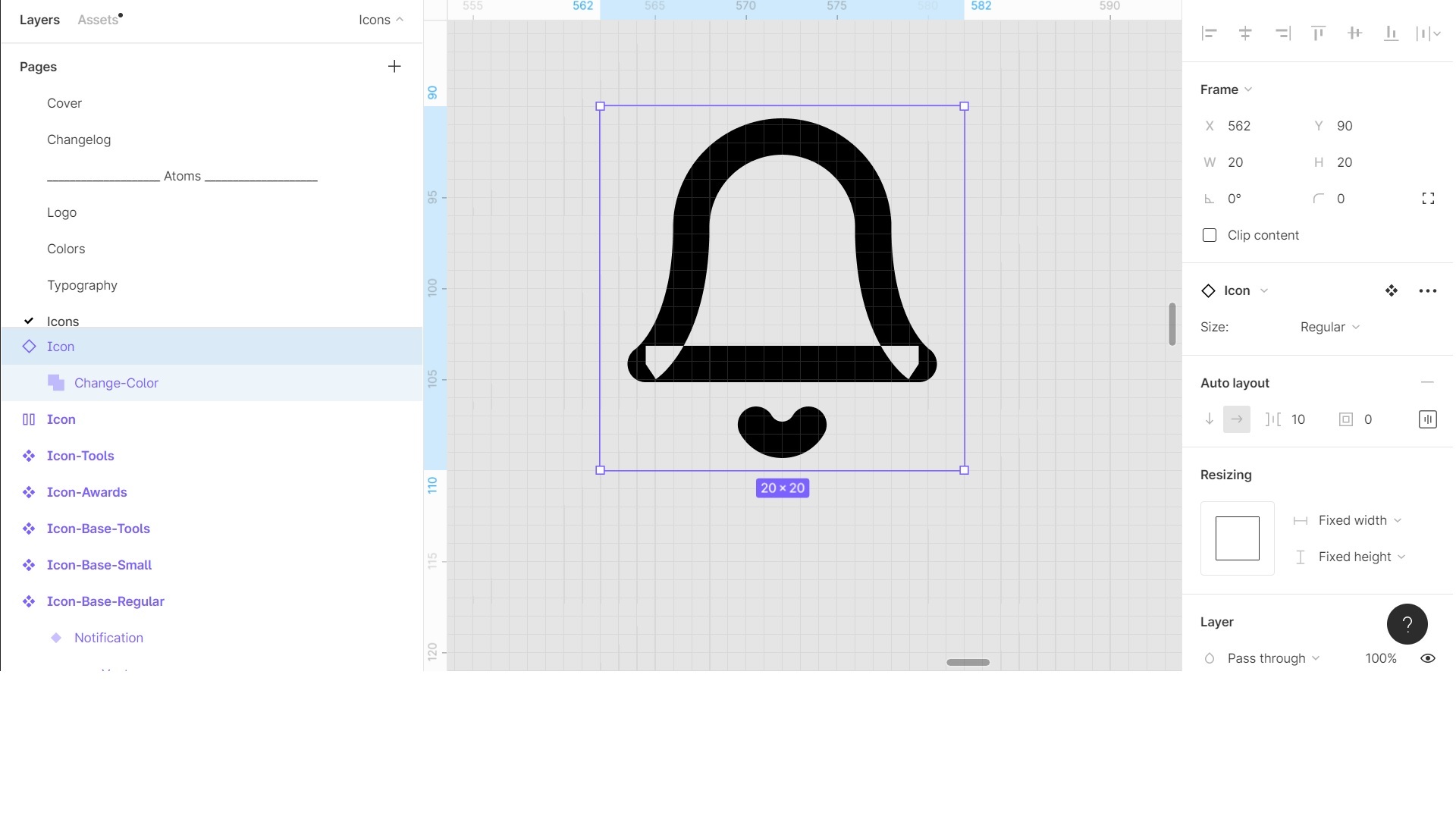
Here’s a Figma file of the icon. https://www.figma.com/file/EQzvLVRGfO66Ecll98nwop/Icon?node-id=0%3A1
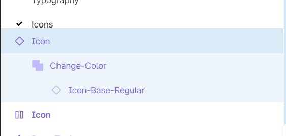
It has 2 components “Icon-Base-Regular” which is nested inside another component “Icon”
Alyssa, thanks a lot for the file. And excuse me if I seemed rude to you. Without this icon, I was unable to recreate this effect.
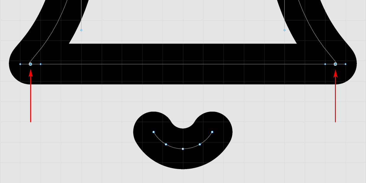
I looked at your file and found a solution, which is to edit the vector path of the icon. Edit the vector nodes (with the Bend tool) shown in the screenshot below.
This topic was automatically closed 30 days after the last reply. New replies are no longer allowed.
