Hello.


I work intensively and use a timer frequently.


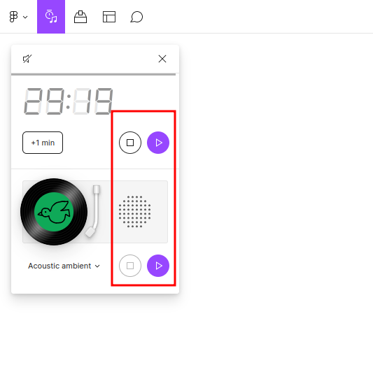
I am distracted by duplicate buttons in the timer interface


I ask you to refine the design of the timer and when the sound is turned off (the icon on the top left), remove the panel with music.


Thank you.

Thanks for the feedback @design27!


We’ll pass this along to the team for consideration. Don’t forget to also Vote, so we can accurately gauge overall interest from the community.


Or provide a setting to remove it. It get’s in the way when timing presenters at a Figma jam


the person responsible for the design of the timer is clearly acting against Figma.

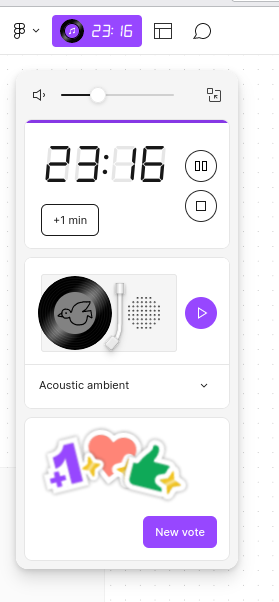
What’s this? Visual mess. The whole design of Figma is beautiful, but this panel gets scarier and scarier with every update. The design is simply missing. And now from a laconic timer we have a completely disgusting panel that we want to close.

But when closing, we now see the icon of the record, which interferes! This is visually knocked out from the design of the top panel. Alien. It looks bad on purpose. Functionally useless.

It is absolutely unthinkable that there would be solutions with such a low design level in the designer’s work tool.


This topic was automatically closed 30 days after the last reply. New replies are no longer allowed.