Maybe it’s because I’m new to Figma and I’m not doing this right, but after hours of trial and error, and searching everywhere I give up.


I need to hover over an item that consists of a few things grouped together, a picture, two text blocks and a background for them, plus an additional text block by itself above the picture.


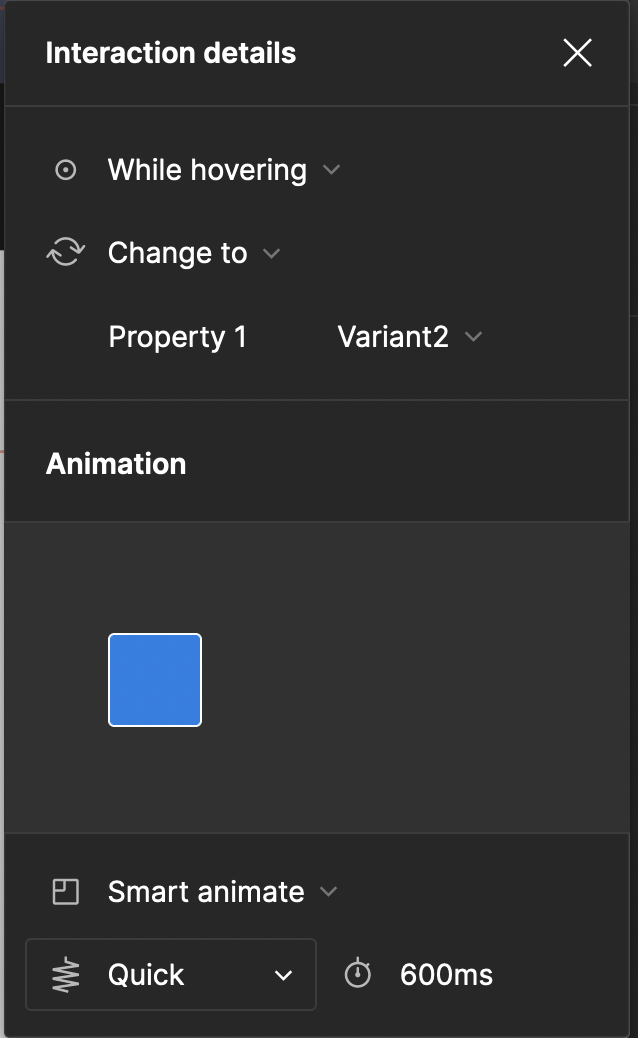
I converted the group into a component, and then added a variant. I scaled up that variant using the Scale tool. Then I added a “While hovering” interaction to the first variant to change to the second variant, and I set Smart Animate to “Quick”.


The problem is, when I test this in the presentation mode, the scaling up always has the top left as the anchor, so it scales up downwards and to the right. I need that to be upwards and centered. But I haven’t found a way to do that, only somebody else with the same problem.


I tried moving the variants around inside the component so the initial one is at the bottom center and the second one above it, also centered, but that didn’t work.


I also tried adding an auto layout to the parent component of the two variants, and setting the graphic to “Bottom Center Alignment”, but nothing.


Adding any auto layout to either of the variants messes them up drastically, so I quickly undid that.


Any suggestions?

I am having the exact same problem; however I noticed in a figma demo (the one with the video) that the interactions do not anchor from the top left, they anchor from center. I have no idea what I am doing wrong:


My tests:


Figma demo (hit play/pause button to see square resize from center)


The figma demo

here’s a link to the playgorund


There are two ways to do this (that I’ve done anyway) and both involve having a same size container frame for each state. Then resize the hover state variant child element any way you want (shit-option-drag, scale tool from center, etc). The key is having identical parent frames for the variants and scaling the hover variant’s child element accordingly relative to its parent (so the size of it exceeds the parent).


Figma – 10 Dec 22

Can you give me step by step what to do to achive scaling from the center?

I want to make icon animate from line icon into colored icon with slight increase in size. I use 2 identical png image (one being line, one colored). But when i make it to component set and use interaction on hover between those 2 it scaled from top left corner not from the center. I already set the constrain of the image to center, the anchor point in scale properties already put in the center but still when i animate it scale from upper left corner


It’s explained above and you can visit the link I provided and duplicate the file.


thank you for the answer i just realized it late,


Thank you! it worked like a charm


Hi, I am prototyping a menu that expand on hover. Classi icon only, and Icon+Text on hover when expanded.

The issue is that, like in the simple blue ball example above, the hover only count as hover on the original size. So if you are still hovering on the expanded component, it will revert back to the original.

Does anyone have a way to fix that?

I tried keeping the original size bigger, and mask it, but the animation and hovering becomes buggy and will never go back.


I may have found the solution to my problem.

Instead of using the ‘hover’ prototyping action, it is necessary to split it into ‘mouse enter’ on the original size and then ‘mouse leave’ on the expanded size.


Thank you 🙂


I had the same problem, and the solution marked as “solved” isn’t the only way. In case your Button is just one color you can just put a border around it, choose the thickness to your liking and you’re done as well.


Thank you very much, it is a very practical tips!

If anyone still don’t know how to do that, you can follow these steps:


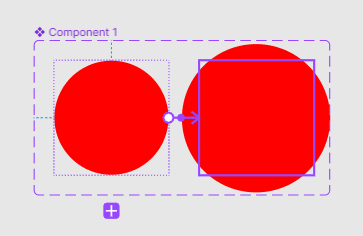
First, create a circle, and “create component”, duplicate the same component, then establish a “variant”.

Second, proceed with enlargement, ensuring to enlarge only the shape (the layer of the circle), not the outer variant frame (which affects the center point and alignment position when switching).


image


Next, create interactions from the small circle.

Select “Change to” and “variant2”, add “smart animate”.


For smooth animation transitions, gradual changes, and seamless frame filling, the names of two interchanging sub-components must be identical, such as image names or pattern names. Otherwise, the animation transitions may appear abrupt and choppy.


Thank you this is bar far the best help 🤩