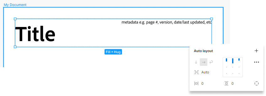
The new update appears to remove spacing modes in favor of using Auto as the gap size between items. While this works for basic situations, its occupancy of the gap size property means users are unable to specify any minimum required gap between items in a space-between auto layout.


Example (click the arrow to expand)

(sorry in advance about issues with images, seems new users are limited to 1 embedded media in a post)


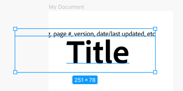
Suppose I want to put some minimum spacing between the two text elements, in the case of narrow documents. Maybe I could use a spacer element with a size of that minimum spacing (specifically in this case, because it’s only 2 elements), or wrap one element in an auto layout and apply padding on one side; but first let’s just see how it works before adding anything else.
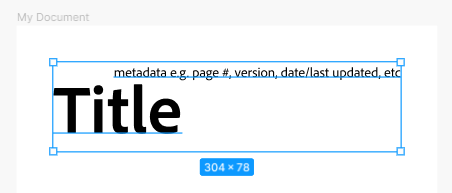


image


oops...

Well, turns out neither of those ideas would work.

In any case, I’d rather see the auto layout overflow but respect the spacing constraints, as I believe it did before with spacing modes and a set spacing/gap, than collapse in the manner seen above.


(incidentally, I wonder what happens when it gets even narrower...)


I’d like to think that reverting the removal of spacing modes would be less technically demanding than implementing a brand new feature (although obviously it would need to updated for how it interacts with all the new features added). While encoding space-between as an Auto item gap is convenient, the abstraction is lossy, and as far as I’m aware doesn’t actually offer any new functionality that spacing modes before didn’t.

(well, couldn’t find a way to edit the post so anyway) do feel free to ignore that first image in the post, was a vestige of testing how to work around the embedded media limit and is identical to the first image in the example hidden in the dropdown


It’s easier to space as desired similiar to Webflow’s Flex


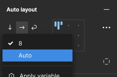
If you’re referring to ‘Spacing mode’ with Space between and Packed, you can now set the gap to ‘Auto’ via its dropdown, or double click the alignment box.


image


i agree, there should be a possibility of having a minimum gap.

In general not sure why they choose to remove “space in between” which ressembled more CSS


I guess a workaround can be to add padding in the child, but ofc not so nice of a solution


The previous implementation was more intuitive. If it works, why change it?


I agree! I enjoy seeing the visual interaction that was there before. This works better with the way I think! Perhaps having both a visual & a word could be helpful. They show this with many of their other interaction demos.


Thanks for your screenshot here, I enjoyed seeing how Figma used to show a visual example of what was to be expected. Those who are just learning, or are more visual, such as myself, find this more intuitive and easier to understand and find while using the tool. I felt seeing “Auto” made it disappear, despite my knowledge of what “Auto” does.


Using the same workaround but would love to be able to define a minimum gap


Hi all, thanks for your feedback! We’ll pass along to our team for consideration.

I’ve merged your topic with this one Restore spacing mode option on auto layouts , so we can gather all feedback in the same place.


This topic was automatically closed 90 days after the last reply. New replies are no longer allowed.