Question: how are you trying to use the SVGs?
I am trying to use them as components, so I can easily switch between them inside other components through simple asset search, like icon on a button, with them all being same size. See example below of another icon component library I have, all standard 16x16 px size.

That’s what I figured. So the way I handled this in our design system was to NOT use the SVGs and to use the typeface because using the typeface makes it dead simple to scale, recolor, and re-style icons. Using SVGs as components is going to bite you in the butt in the long term, for more reasons than the one you’ve encountered.
Here’s a quick file showing how I set up the icon components in our design system. It’s made my life SO easy and I can’t imagine going back to the SVG approach within Figma.
Figma – 18 May 22
Interesting system, thanks a lot! So basically you are manually adding an icon component for every font awesome alternative you need as you go?
Yup! But it truly takes like…two seconds because all I’m doing is duplicating an existing component and changing text versus trying to insert/scale SVGs for each desired size.
It’s also easy to expand your scales with this system too, though it does require a few plugins. For example, the XL scale was added to the system about two weeks ago. All I did was:
- Define the XL size in the base component set
- select all the LG layers for my existing icons (using the Select Layers plugin, which lets you select layers by name)
- duplicate them (which creates new variants within each component set)
- rename size=LG to size=XL using Figma’s native rename function
- Use the Selection Variants plugin to set all of the selected components to use the XL size of the base component set.
Boom! A new size scale added across a few dozen icons in less than ten minutes.
I was just thinking how to add new sizes later on, your guide is really helpful. We’re gonna go with that system, seems pretty robust. Thanks a lot for all the detailed help!
Just catching up on this. We also have a component we’ve built that does a lot of similar things: https://www.figma.com/community/file/994237671938398148
Hi Jory, a question regarding implementation of FA, after downloading the files for desktop and installing them, Figma doesn’t detect the “Light” version of it while all other apps do. Anything you are familiar with?
Hmmm. I haven’t seen this happening per se, but I do know that Font Managers can be finicky sometimes. My suggestion would be (with Figma closed) to delete the Font Awesome files from your manager, and then do a fresh install of new OTFs. Then re-open Figma and see if things are sorted.
I also did want to respond to the initial question here about normalized SVGs. Here’s what we typically recommend:
- Download the “For Desktop Use” files from Font Awesome.
- With a new Figma window open, select your desired SVGs (in a chosen style) in the downloaded folder and drag/drop them onto the Figma window.
- This will import all of the svgs as separate frames into Figma.
- “Select all” and use this plugin to scale all of the icons down to a 16px height (or your preferred size): Scale | Figma Community
- With everything still selected, use this plugin to resize all of the frames to a consistent size (I would suggest either 20 x 20 pixels or 24 x 24 pixels): Frame Resizer | Figma Community
- Now click the little arrow next to the create component icon (the little diamond grid) in the top bar of the Figma window. This will give you a dropdown with the option to “create multiple components”.
- That should do it!
Hi Jory, thanks for a follow up! I tried that approach originally, but the issue I stumbled upon is that some icons are much wider than others.
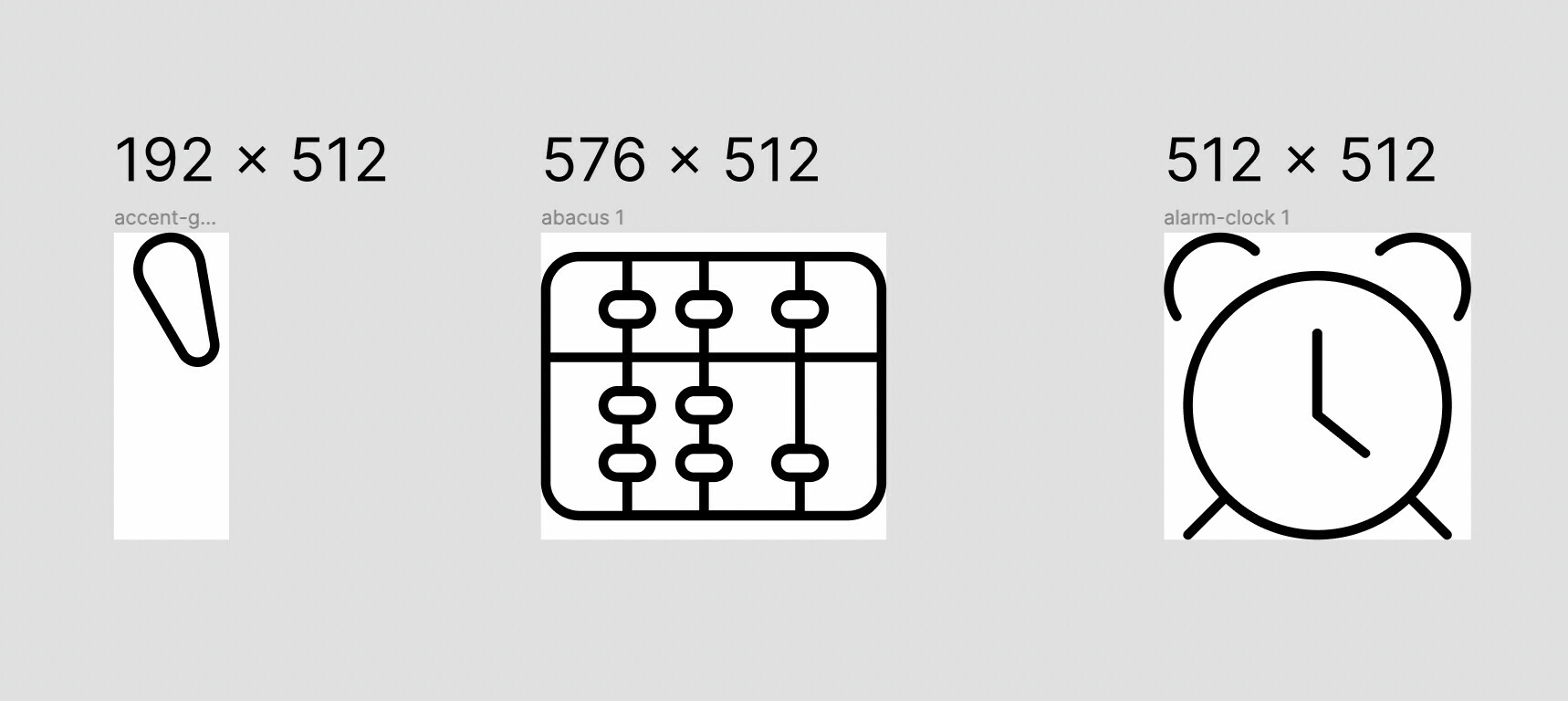
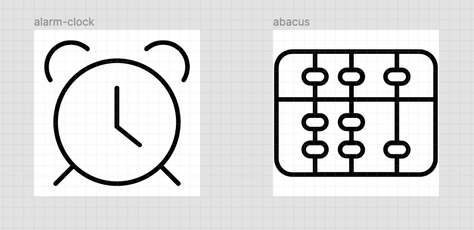
See screenshot in my first post, where “Abacus” is wider than the clock. So when I scale both down to 16px height, clocks becomes 16x16px while abacus is 18x16px. Now if I resize abacus frame, it gets cut off 1px on each side.
How do you suggest handling such cases? I considered to scale all icons down to 14px to compensate for wider ones, but that results in “normal” shaped ones being too small instead with lots of extra padding around so you have a contrast of some icons going to the edge of their bounding box, while othes have 1-2px padding:
So, yes, this is not nearly as straightforward as I would like, and has a bit to do with how Font Awesome came to life originally. Because it started life as a typeface (and ONLY a typeface), the decision was made to have the viewbox widths of each icon match the width of the glyph itself. So the exclamation point icon would be less wide than the truck icon, similar to how an i is less wide than an W in standard typefaces.
Now, when building a typeface, it’s better to have larger source files for vector precisions, which is why the SVGs we provide all are 512px high. Scaling those down to 16px gives you the original height they were designed at.
So the first step in the process I mentioned (scaling heights to 16px) will result in the following:
- Icon heights are all 16 pixels
- Icon widths can vary. They’ll be either 2, 4, 6, 8, 10, 12, 14, 16, 18, or 20 pixels wide.
And that’s why I recommend scaling the height of the icons first, so that all icons retain their original dimensions. Then, if you need the icons to have a consistent “square” frame, I’d use the Frame Resizer plugin to change the height and width to something like 20 pixels. That’ll ensure the icon glyphs remain the same, but the frames will be consistent.
So basically, scale everything down to 16 pixel height (while letting widths resize automatically) and then scale just the frames up to 20 x 20 pixels (or 24 x 24 pixels, if you want a bit more padding).
I’m really hoping to include SVGs in our downloads that have this logic baked in at some point!


