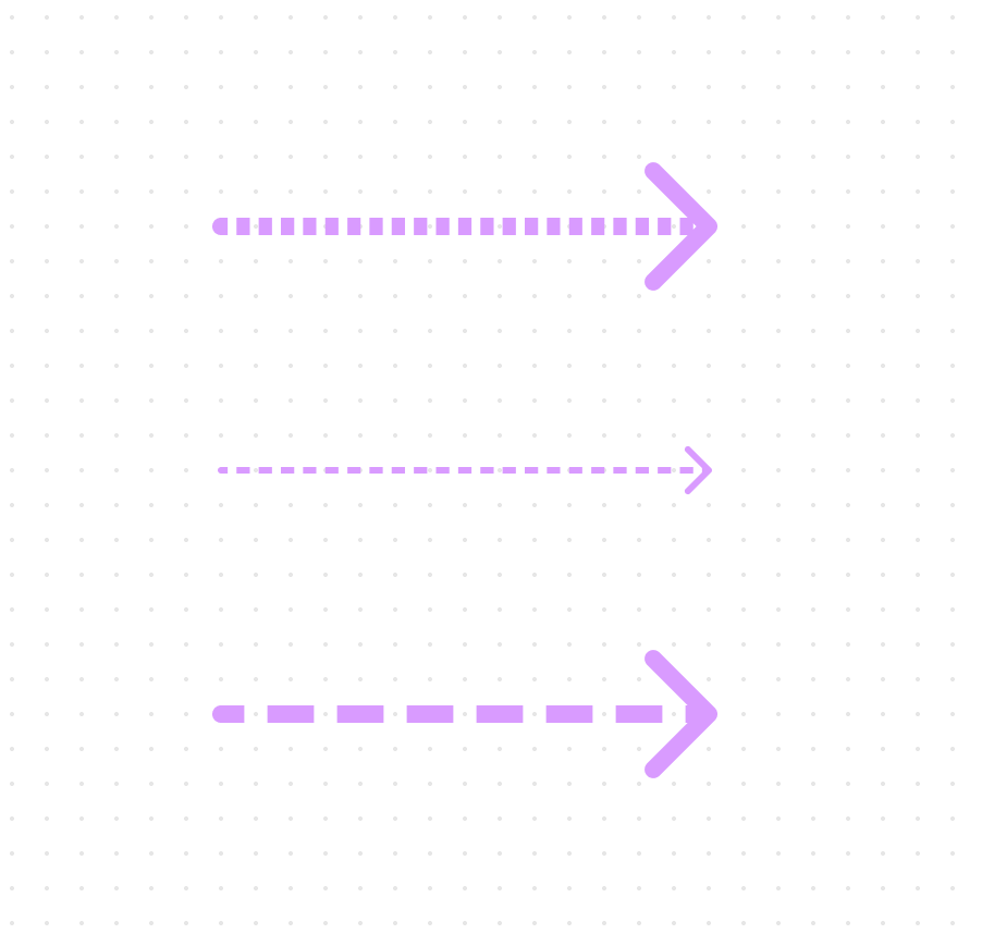
Right now when you select a dashed stroke for the arrow, it’s always the same no matter the thickness. So it looks quite weird on long thick arrows: the dashes are smaller than the line thickness. I suggest to make dashes at least twice as long for thick arrows to be proportional with the slim arrow:
It can also look like this with 20, 10 dashes and gaps, I prefer longer dashes since they look cleaner on long lines:
Alternatively, there could be two dashed stroke modes: one for small and one for long dashes, which would be applicable depending on the sizes you are working with. If you are creating a small diagram, small dashes could be used. If you are drawing a long line across the whole field, longer dashes are better.


