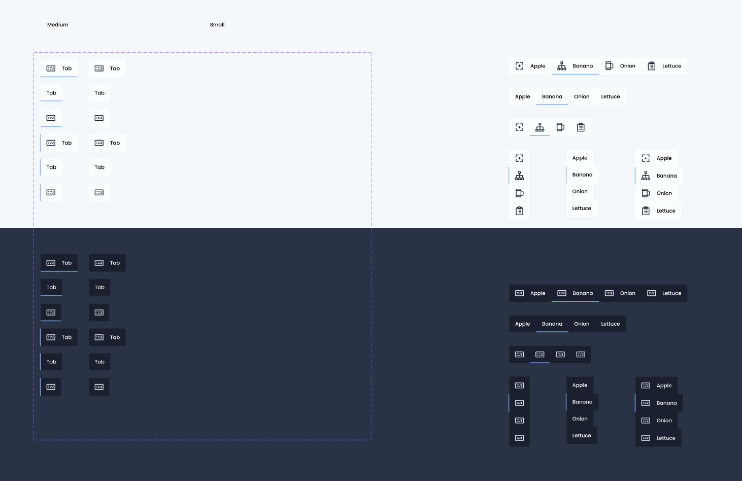
I believe it cannot be done, but I would love to be shown otherwise. Specifically, I want to make a tab component that supports the following variant properties:
- Dark or light theme
- Selected or unselected state
- Options for icon only, text only, or icon+text
- Vertical or horizontal orientation
I’ve rebuilt my tab component from scratch 3-4 times but I cannot get it to work. I discovered that if I do not use a baseTab component it works much better, but I still can’t get it to work right when I switch to dark theme. I want the icon overrides I’ve made on light theme instances to persist when I switch the tab component instances to dark theme, but the overrides won’t stick and I can’t figure out why. Any thoughts appreciated. So far my approach has been to create one component with dark and light theme variants for the icon container, and then include that component in the tab component, but no dice (that seems to be breaking it). I’m aware of and using the workaround for icon themes.


