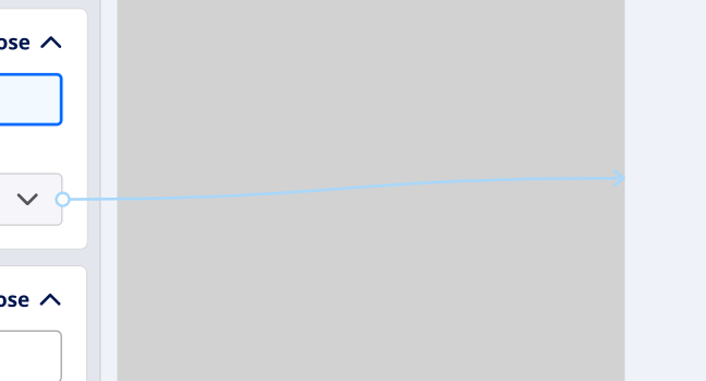
The inactive/unfocused connection link color is very difficult to see when on the default background color. The color contrast is very inaccessible contrast level :\
Is there anywhere to have a feature request or make a bug submission to have this looked at?


