Hello.
Have you found a solution to this?
This is a really tricky and complicated interaction in Figma, but not impossible! @Eden_Gil it’s been over a year since you posted, but I wanted to respond with a possible solution for future visitors of this post like @Velislav_Ivanov (thanks for bumping this, it’s a really interesting dilemma).
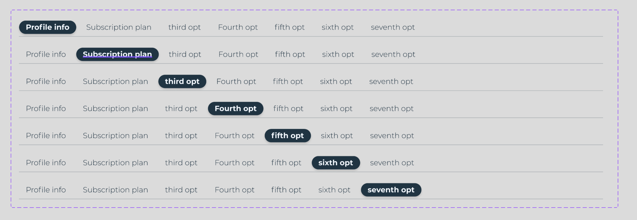
Okay, first, the prototype I was able to produce (here’s view-access to the design file). It’s not the smoothest/slickest, but it communicates the idea. Only the 1st and 3rd tab are interactive (see the “☝️” emojis):
Hopefully I got close to what you were describing. If so, here are the steps to reproduce what I did:
Create a “Tab” component using a single text layer and an auto-layout frame. If you’re working out of a component library, this component would live there. Apply the following properties:
Variant property named “interactive state” with variants representing default, hover, pressing, and focus.
Variant boolean property named “Active” to manage what active VS inactive tabs look like.
A layer visibility component property applied to all the variants’ text layer representing the tab’s label. Make sure these text layers all have the same name to preserve overrides on swap! I suggest naming the layers “Label.”
(Optional) A content component property applied to all the variants’ text layers, allowing you to update content from the design pabel.
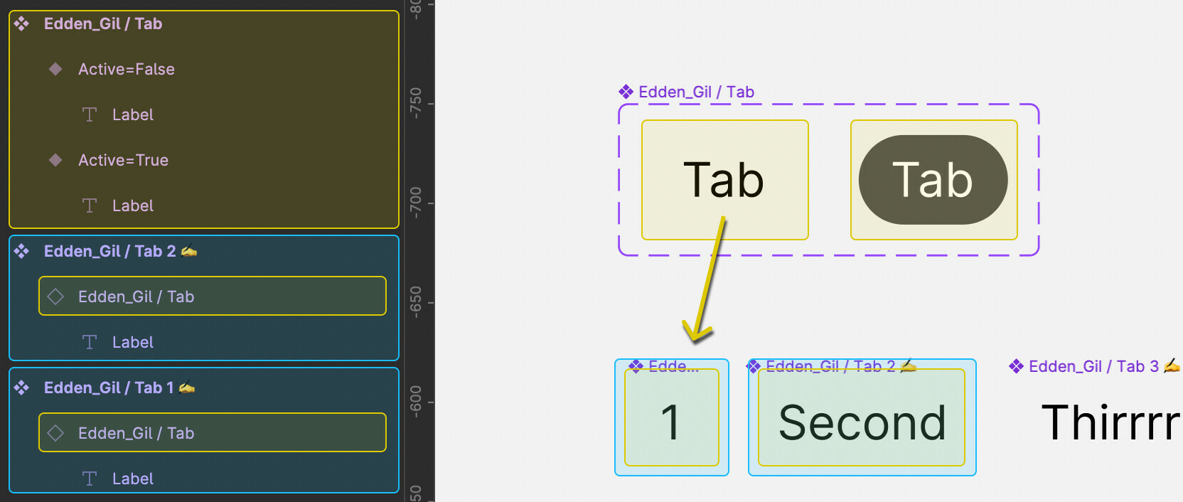
Next you’ll need little “content management components” which is one of 7 different types of components I believe exist but don’t have widely adopted names (I am testing this theory all the time and hoping the rest of the design community will catch on, or maybe help me discover someone else’s better but similar framework). I call these “content carriers ✍️” because their job is to… carry the content! Like a little CMS. And because they’re re-componentized instances of your tabs, they inherit all the styling you set up in step 1.
Create as many instances of your “Tab” component as you have unique tab labels in your design. Override the label text for each one. Name them “Tab N” where “N” is the order they appear in (or you could name them after the label, e.g. “Tab Home”, “Tab Settings”, etc.) I’ll be referring to these as “Tab N” throughout the instructions.
In each of the properties for these all your Tab N’s, exposed nested instance’s properties.
(Qucik note) these “Tab N” content carriers ✍️ would most likely be built in your local file, but I could see a case for keeping them in your library too… so go with whatever makes the most sense to you! Here’s the structure you should have so far:
Now you can start assembling instances of your individual content carrier tabs into a complete tab set using variants for the interactions:
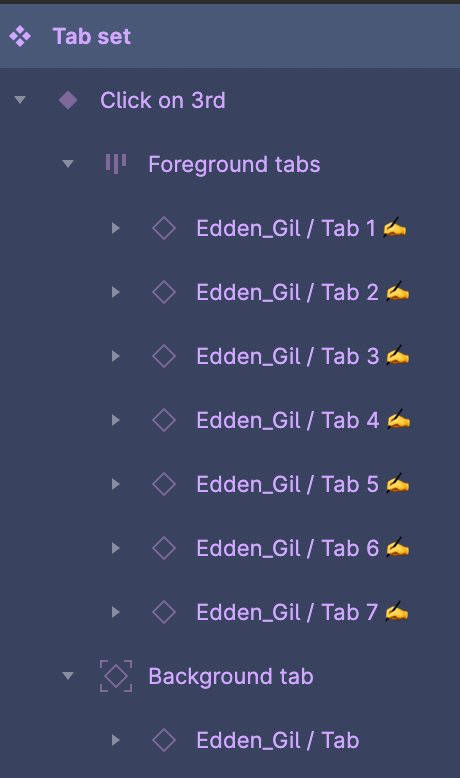
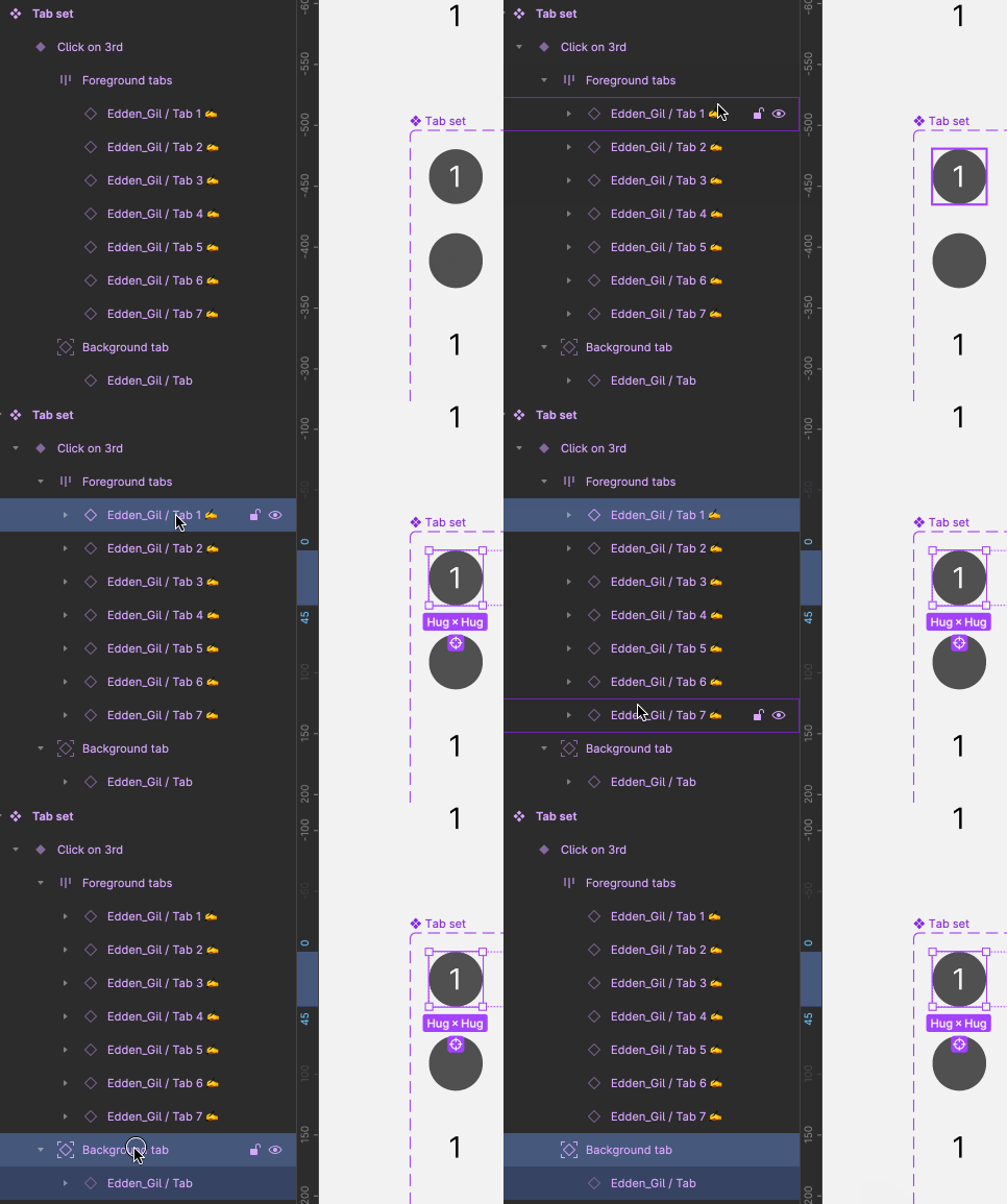
First wrap all your ⬦ content carrier tab instances into an auto layout frame. Name it “Foreground tabs”.
Wrap the “Foreground tabs” frame in another auto layout frame, and turn this into a main component named “Tab set.”
Duplicate the first ⬦ tab instance, and drag it outside the “Foreground tabs” frame, but still within your main component. Name it “Background tab” (!!! this is really important for the animations to work !!!) and turn on absolute positioning for that nested instance.
Add a variant property called “Step.” The name of the first variant should be “First active” (some of my screenshots will say “Click on 1st” which was a confusing name that I changed halfway through writing these instructions). At this point you should have something like this:
With your first variant selected, open the advanced auto layout settings and make sure it’s set to “First on top” (this will make the layer panel match what’s happening on the canvas with absolute positioned instance).
Make sure “Background tab” has the same X and Y coordinates as the first content carrier instance within “Foreground tabs”:

Within “Foreground tabs” make sure the first Tab N instance has the following property settings: Active=True, Label=True. This should create a tab set that looks the user is currently viewing the first tab.
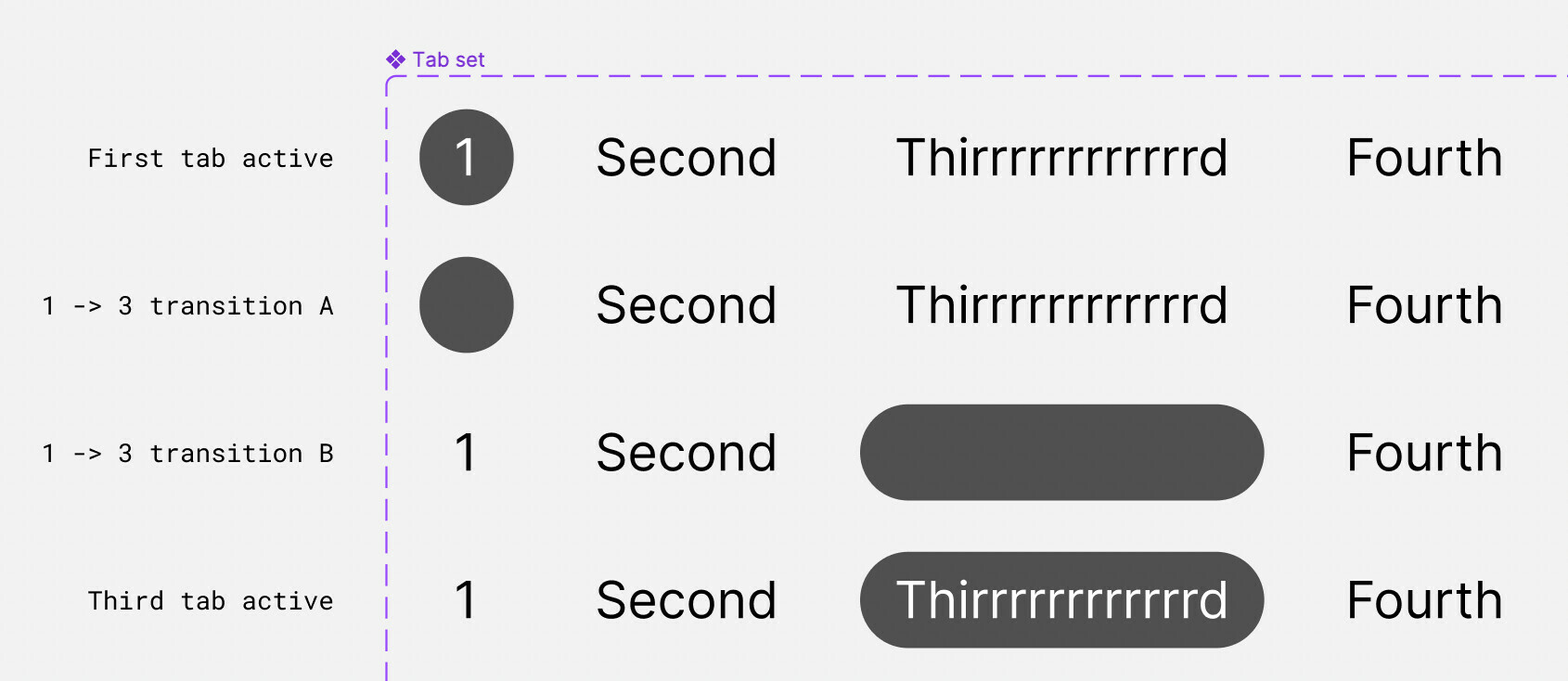
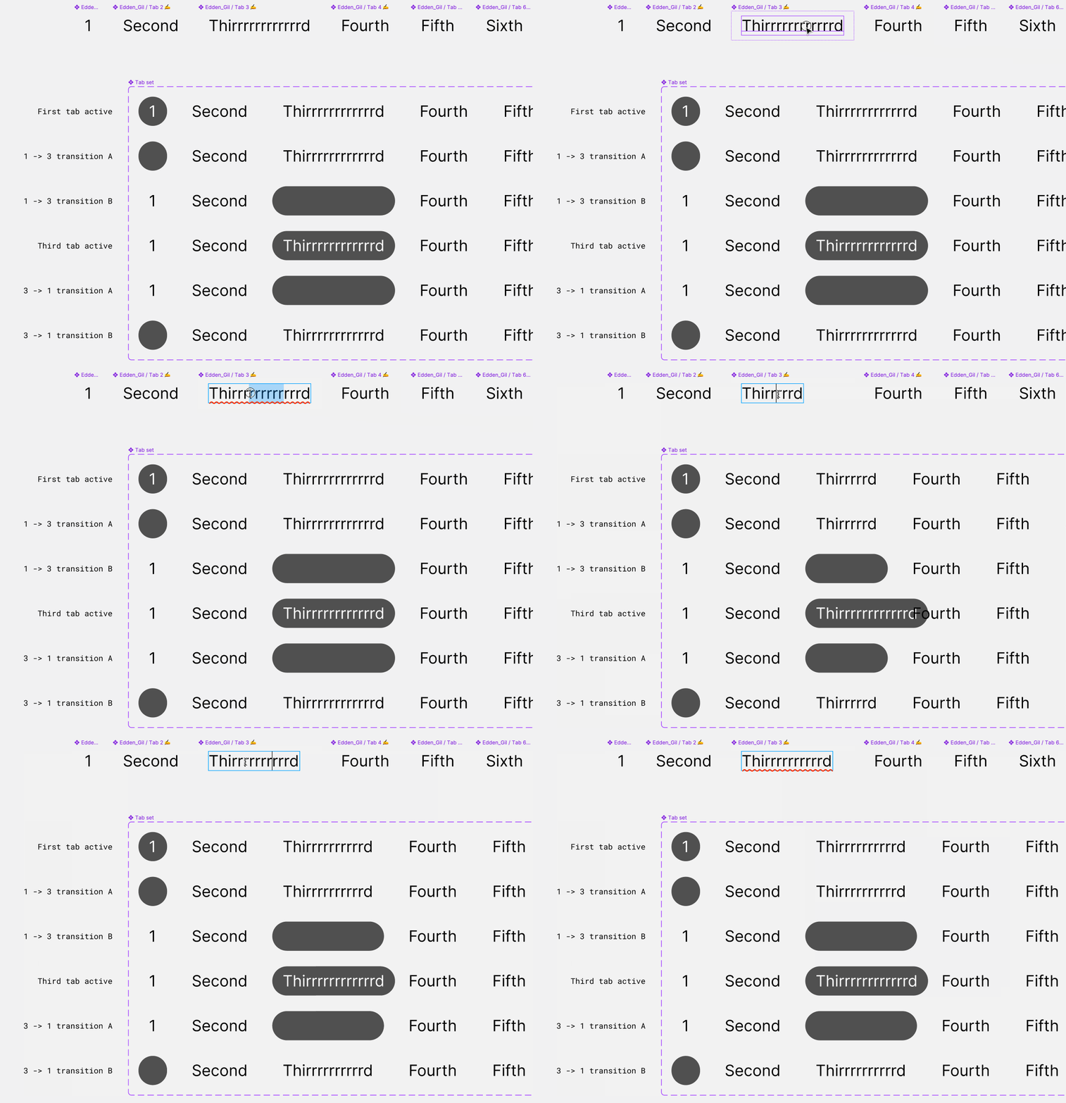
Create a second variant in your Tab set component. Name it “1 → 3 transition A.”
Within “1 → 3 transition A.”'s “Foreground tabs” frame, make sure the first Tab N instance has the following property settings: Active=False, Label=False. Additionally, make sure the absolute-positioned “Background tab” variant has the following property settings: Active=True, Label=False
Create a third variant in your Tab set component. Name it “1 → 3 transition B.”
Within “1 → 3 transition B.”'s “Foreground tabs” frame, make sure the first Tab N instance has the following property settings: Active=False, Label=True.
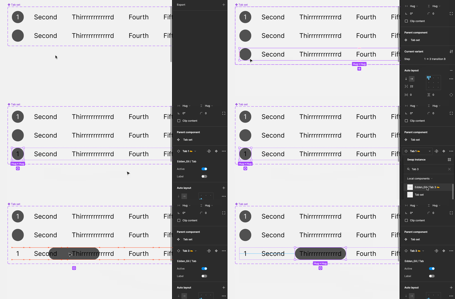
Select “1 → 3 transition B.”'s “Background tab” instance and swap it for the “Tab N” that matches the third tab in your tab set. Manually nudge it to be sitting behind the third tab in your “Foreground tabs” auto layout container. This is a weird step to explain only through writing, so here’s a GIF: 
Select the third “Tab N” in “Foreground tabs” inside of “1 → 3 transition B” and apply these property settings: Active=false, Label=False.
Create a 4th variant, name it “Third Active.”
In “Third Active”'s “Foreground tabs”, select the third Tab N instance and set the properties like so: Active=True, Label=True. By now you should have something like this:
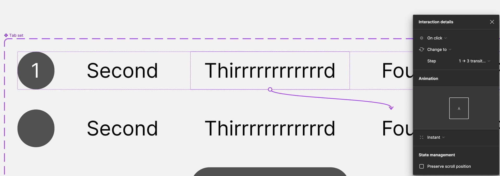
Phew. Nearly done. Now you just set up prototyping connections! We’ll go from top to bottom:
- “First tab active” → “1 → 3 transition A” should be an instant “on click” interaction that is triggered by clicking on the third Tab N instance in “Foreground tabs”
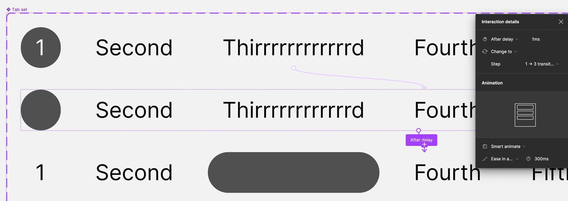
- “1 → 3 transition A” → “1 → 3 transition B” should be an “after delay” transition set on the variant-level that happens after 1ms, uses Smart animate, and runs for whatever duration feels right to you (I kept the default 300ms).
- “1 → 3 transition B” → “Third tab active” should be an “after delay” transition set on the variant-level that happens after 1ms and happens instantly.
And that’s it 😅 that’s how you transition from one tab to another. To go back from the third tab to the first you’d have to add in 2 additional variants that bring you back to “First tab active.” Similarly, if you wanted to be able to any tab from any tab, you’ll need to manually build those transitions as well.
After doing this, my impression is that this may not be worth building in a large-scale prototype where these unique tab sets on various screens. I see in the original post there are 7 tabs in a set. A single tab set that let’s you click on any tab and get this animation effect would take 35 variants.
But what if your tab copy changes?
Well, that’s what the content carriers ✍️ are for! But oddly not all of the nested instances in the Tab set component seem to listen to their main component for changes:

Also my solution doesn’t seem very clean for “bouncy” animations. The label has to wait for the animation to end before reappearing. So if you want those a different approach may be needed:

I hope this is helpful! Again, if you’d like a copy of the Figma file I used to mock all of this up you can get a copy here.
@AlicePackard Thank you for all the work you put in your example and your detailed guide! I was hoping that there is something that I missed in Figma that will make this function more accessible, but I guess we are still not there yet. I tried so many different things and there was always something that just didn’t work properly. Hopefully this type of prototyping will be easier in the future. 🙂
Thank you, again!
Hope you have a great rest of the week. 🙂
You’re very welcome Velislav! I appreciate the thanks 🙏


