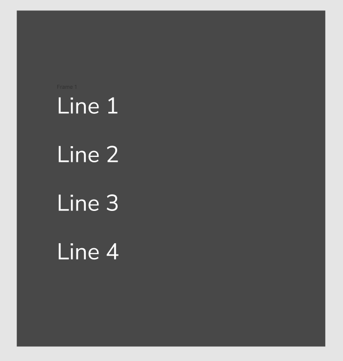
I’m struggling with this component. I’ve created auto-layout with hug contents and packed settings. If I add enough characters to line 1 so that it pushes the rest of the items down, I’d like the gray square to resize itself so that the margins are constant. How can I do this?
1 Like
If I’m understanding your use case, you want the box to grow vertically if you add more lines of text? If so, you just need two things:
-
Your parent frame (the gray box) to be Auto Layout and set to “hug contents” vertically.
-
Your text boxes to be set to “Auto Height” in the font settings.
I see that you have a “Frame 1” in your layout which doesn’t seem necessary and could be causing the trouble you’re seeing. With Auto Layout you can just have the four lines of text separately; no need to put all four in a smaller frame.
1 Like
Thanks so much for the help!
1 Like
This topic was automatically closed 30 days after the last reply. New replies are no longer allowed.
