
ui3 feels like illustrator for babies. the interface is so horrifyingly oversimplified and dumbed down that it makes microsoft paint look like feature-rich professional software. everything has been inexplicably moved around. essential features are buried so deep within cryptic menus that finding a tool feels like trying to find the minotaur at the end of a labyrinth.
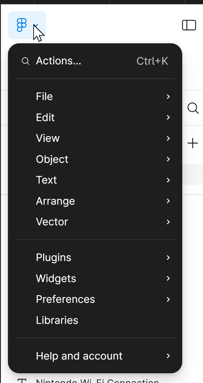
whose idea was it to move 90% of figma’s most useful features into this barely visible menu-thing?
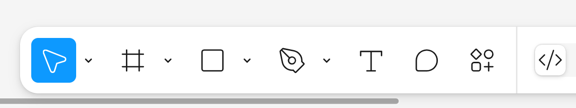
why was the toolbar suddenly moved to the bottom when it was stickied right at the top for at LEAST most of figma’s existence
these design changes feel like they were made by someone who never used figma, or any design software at all, ever, beyond apple notes for ipad.