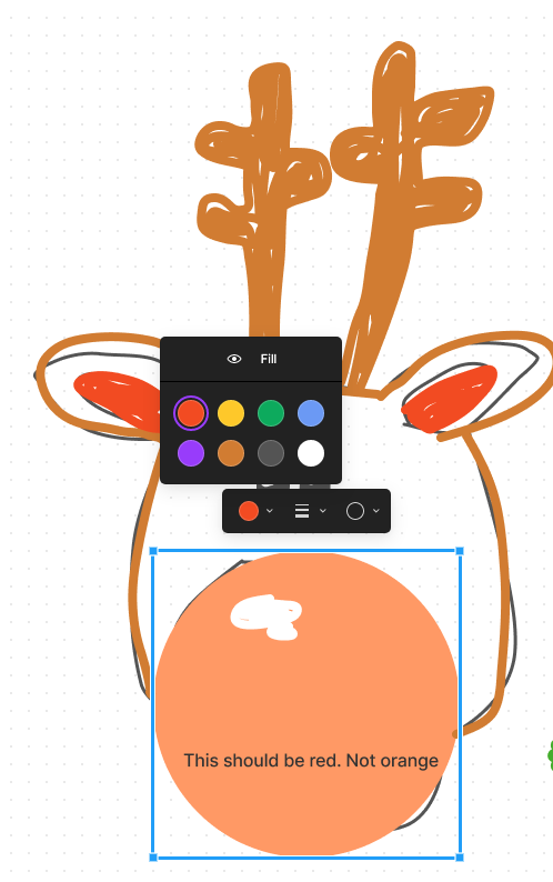
1. Describe the bug/issue you’re running into? I used an ellipse and changed the color to red. The red circle in color palette was red, but the actual object was orange.
2. Are you able to consistently reproduce it? If so what are the steps? Yes
3. Share a screenshot, recording, console log, link to the file, etc.
I have tested in 2 device the difference is there, it’s just a minor issue.
This Figma-Jam is great. I hope as the user base increase more tools in Figma-Jam will be added. Right now I am using Lucidchart. There web platform is very responsive and they have lots of tools to brain-storming technical ideas. I hope it will be availale in future.
I’d personally prefer red as I use that colour for “no” or “rejected” or other negatives. I think its as expected so that marker is still legible within it, but perhaps a pink hue instead of an orange hue would be more widely read is “red”
Hey @Cristian this is technically expected behavior and by design. When working through colors we needed to make sure that the different types of objects could all be overlapped and interact with each other. This isn’t just limited to the red colors.
The good news is that now that FigJam plugins are now in beta you can expect to see more options to customize the colors further. In fact @Gleb has created a plugin that does exactly this!
Hope this provides some more information. As always, we appreciate the feedback!
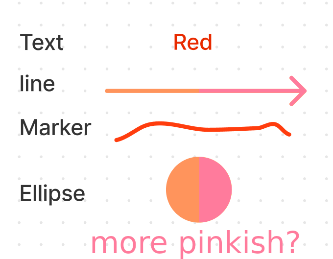
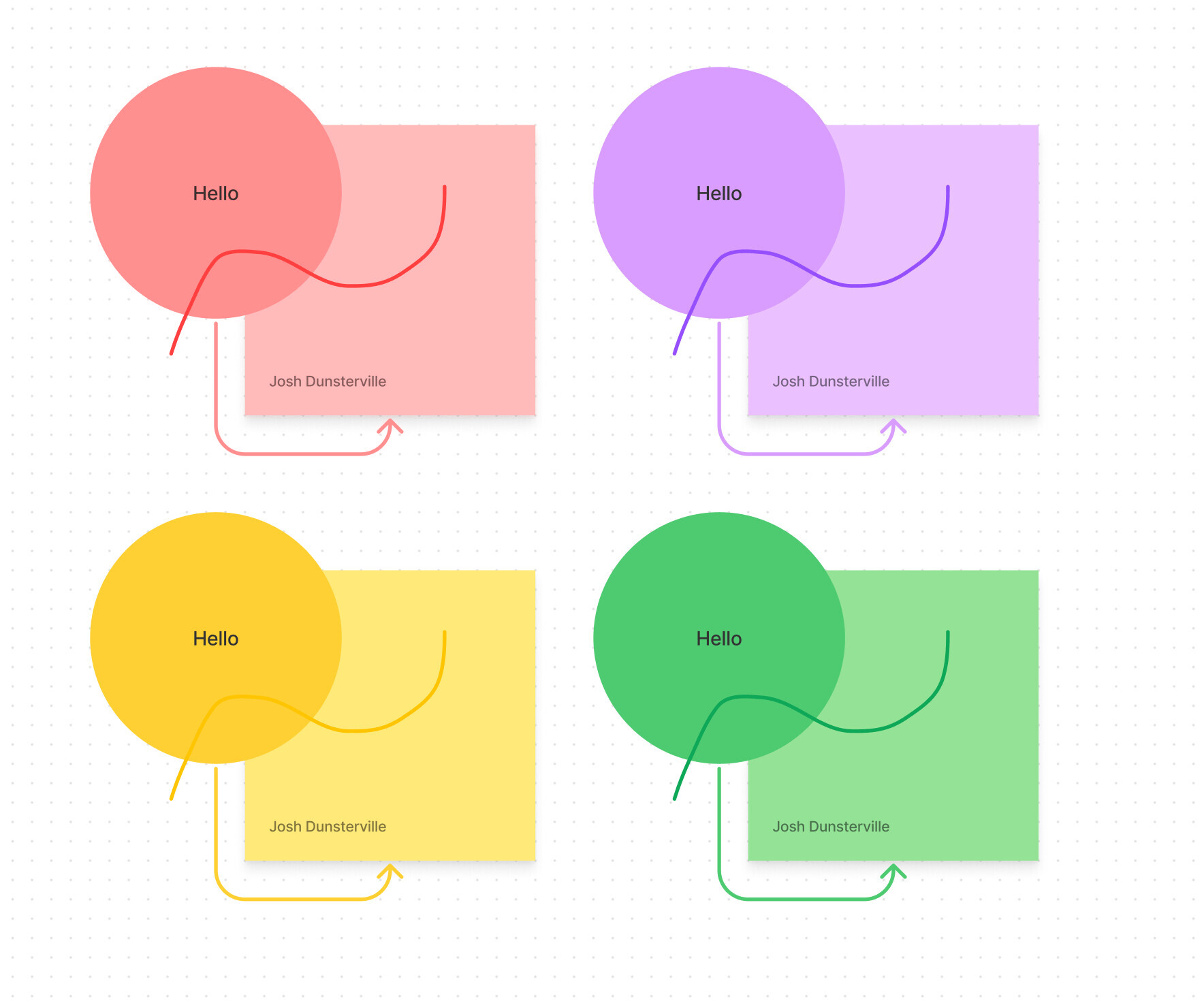
These other colors change lightness but not hue. Green doesn’t become blue, yellow doesn’t become green and even purple doesn’t become magenta. Here is what red should look like:
Good point @Gleb. Was just trying to provide some context around the initial decision. You’re right that the color could be improved. Which is why we’ll keep this post open to be voted on.
I completely agree that colors should change in lightness based on intended use for accessibility however this change in hue has caused communication issues on our team.
1. Describe the bug/issue you’re running into?
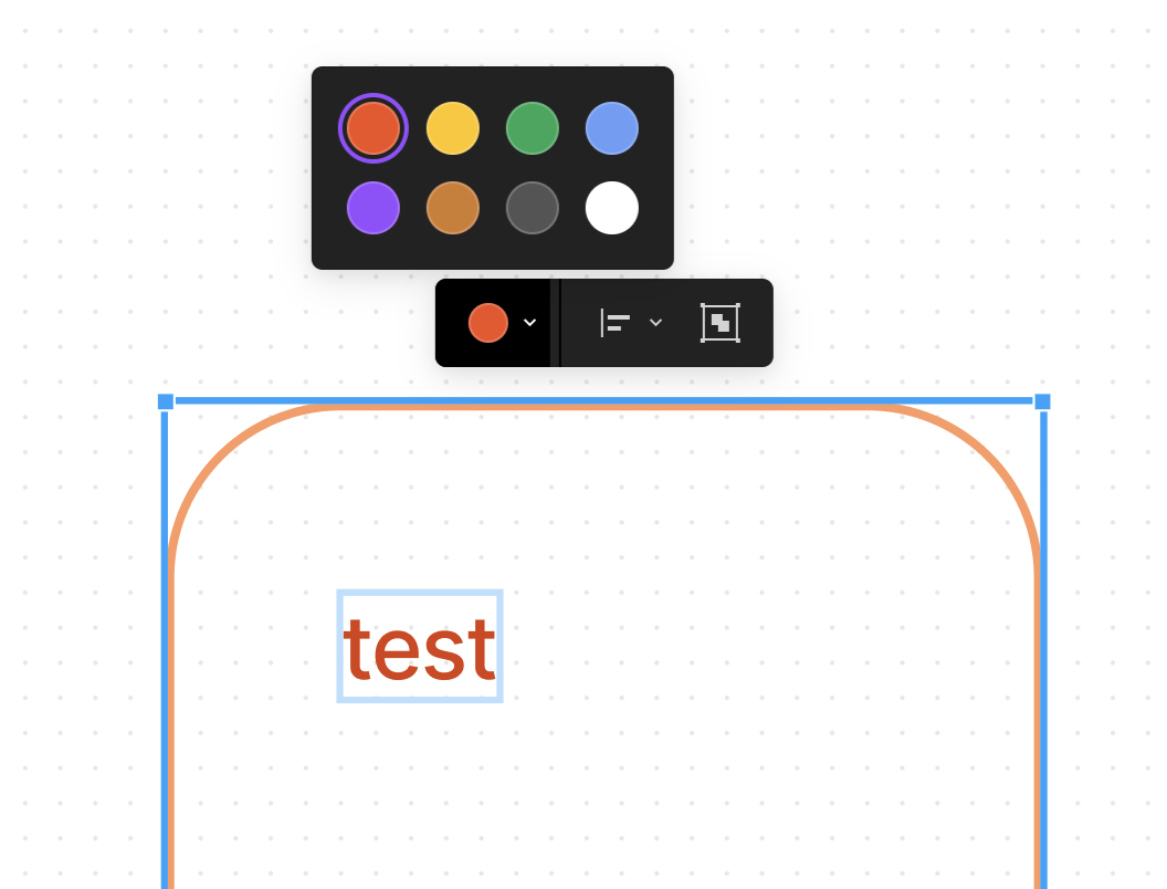
Colours look way different to the one in the toolbar to what gets filled. Almost feels different hue all together