Hi everyone.
I’m kinda confused with my current project. What I need to do is to create a tool for quick and comfortable menu editing and it should always be pretty and aligned and all the margins relatively equal to each other.
Everything works fine but one little thing. I have a column (marked blue) of several blocks (3 to 5) with menu positions in them. Positions count is more or less the same, but never exactly the same. So I need this blocks to adapt their heights relative to lines count inside them, while keeping fixed interblock margins (20px), while also filling 100% of column, and also keeping interposition margins equal.
So speaking short, I need to hug containers around their contents, then “space between” them inside the column, and then equalize spacing between content lines so the blocks proportionally expands till the interblock spacing is 20px.
Sorry for confusing text, but I already a week in this task and going mad =)

You’re looking to make it like this?
If so, here’s the example using autolayout
Note that the header and the elements are set to fill horizontally and hug vertically, thats the main concept
Hope that helps and cheers from Mexico
Thank you for your reply.
Your solution is almost there, but not quite. You see, the column needed to be fixed height (1670px), so that the menu have a header on top and two always equal height columns with blocks fitted in them. Thats the main problem here: how to fit these blocks in fixed column and keep all margins equal. I mean 20px between blocks and whatever adaptibility makes between lines

This is harder to explain than i thought =D
No. It should looks like your example 1, but it should look like that even if i add or remove positions. Blocks should fill the column and % of space they take should be proportional to the ammount of content inside them.
For example, if block-1 have 4 positions inside, block-2 have 8, block-3 and -4 have 2 positions, then block-1 should take 25% of space inside column, block-2 50%, and block-3 and -4 should split the rest between them. And all the spacings between positions should be the same, calculated automaticaly.
I roughly understand how to hardcode it, but my only option rn is to make it in figma. And I’m beginning to suspect that it’s impossible…
Don’t worry, we’ll find the solution. If you could illustrate what you want as to understand what do you mean by columns, or if you mean rows, that would greatly help
Here you go

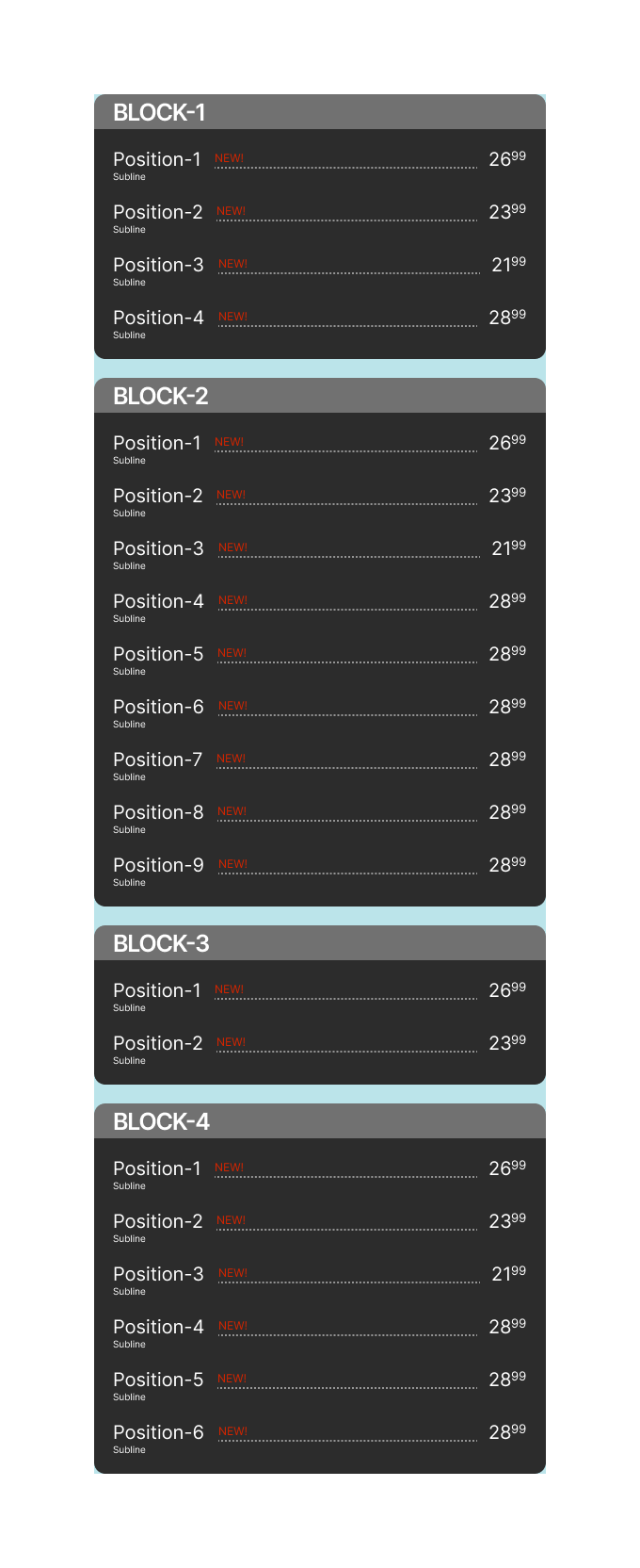
Thats the basic layout of my project.
“Position” is that line of text with name, dotted line and price (position 1, position 2 etc).
“Block” - that thing, that hugs around groups of “positions”
“Column” - vertical thingny with “blocks” inside. It should always be filled from top to bottom regardless of “positions” count.
In this particular example Block-1 should take 33% of space inside Column-1, while Block-2 takes the rest 66% of free space inside.

Yep. But it should fill the space relative to the content (positions). As I said previously, first block should be 1/3 of space in this case, and second block takes 2/3. And positions should spread evenly inside blocks.
The great idea here is to make it fool proof =) So that any junior manager can edit this layout to update menu “on the go” and it still looks ok.
Sorry for the late response.
Check out this video, it’s made with Autolayout and Layout Grids combined:
Its in the same file mentioned above
Wow, so close! =)
Still when I change ammount of positions inside block, blocks doesn’t adapt their size for a new conditions. For example if I change it to two blocks with 5 positions, blocks still stay 1/3 and 2/3 of the column size, when they should be 50/50.
Or when I try to add third block, it appears over existing ones.