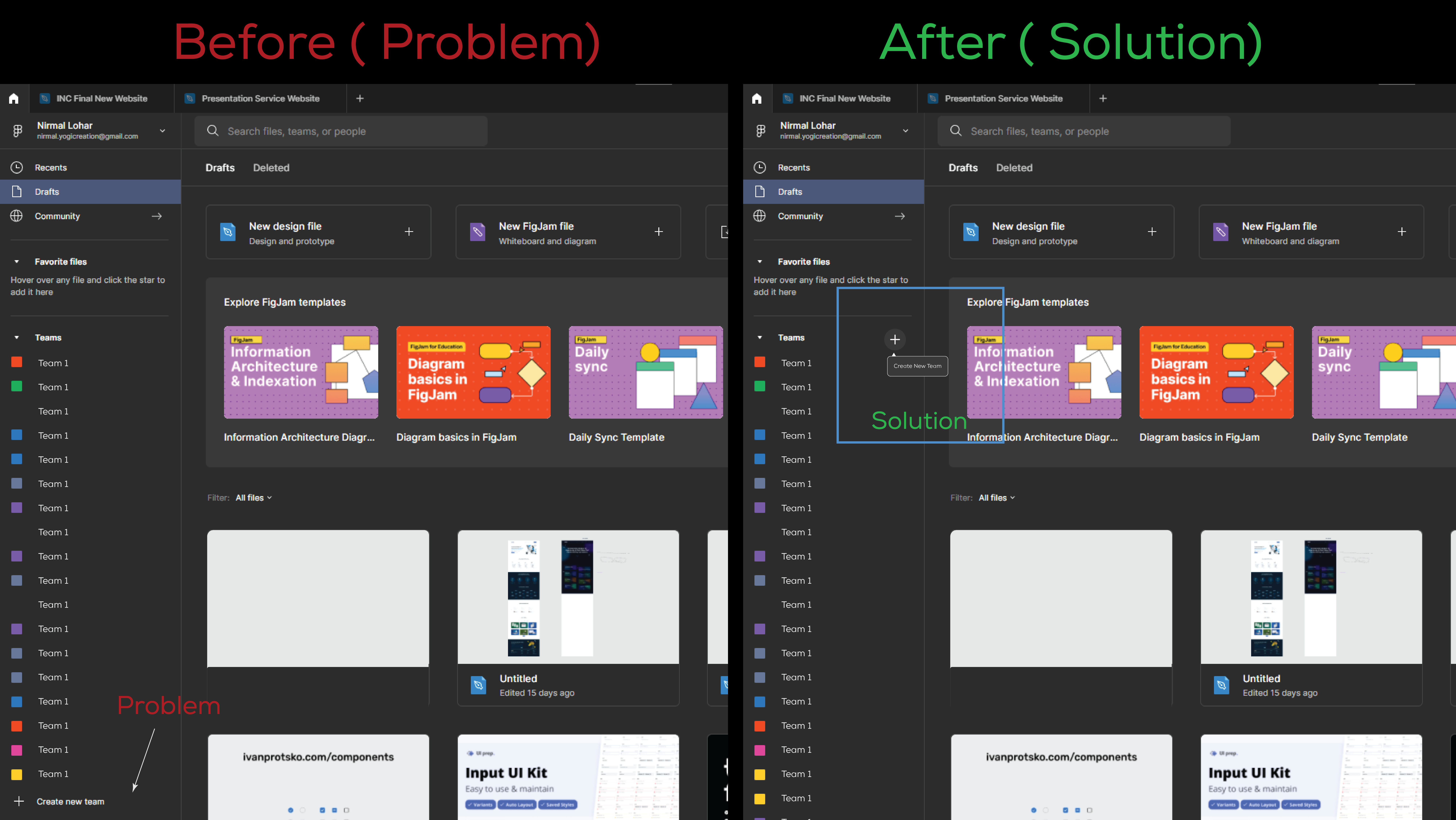
Hello, team @Figma. As an ux designer, I would advise you to rearrange some of the buttons in your Figma programme.
The issue is that if I already have multiple team projects or creative teams created, in order to access the “create new team” option, I must scroll down. This is a very time-consuming process for users.
Solution: If we position that button on top, it will be easier and more convenient for new users to create right away, as you can see in the Before and After images that I have provided.