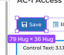
In general I like the changes and I get why things have to be streamlined so that newer users can get acquainted with Figma faster.
However, I find myself struggling to spot the vertical location of fields, especially the Width & Height Layout Fields.
It’s a struggle to locate these frequently-used fields, because they change their vertical location depending on the height of the Component Instance Subpanel, which is now located at the very top.
Now actually, I like the idea of the Component Instance Subpanel being at the very top. It’s the identity of the object you’ve selected. And below it are its additional properties. It’s not hard to spot Component Instance Subpanel, too – because it’s always at the top.
The caveat is that all subpanels & fields below it will have unpredictable vertical locations.
I cannot rely on motor memory anymore. Steve Krugg said, “Don’t make users think.” — and in this case, it always takes me extra seconds each time I look at the right panel and search for the width & height fields, as click on different component instances with varying number of Component Properties that push or pull the subpanels below.
My suggested solutions? Here are few ideas that come to mind:
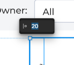
- Allow me to Ctrl+Click edges selected object, which activates a floating UI that lets me edit the object’s Width & Height in a floating UI near the click location. You are already doing this, whenever I click on the Paddings of selected frames.
Whenever selections change, please animate the changes of your right panel. It will give me information where certain panels went. Make this optional, because some users might not like this.
Give us a Quick Access Toolbar, where we can add any commonly-used fields we want. I want to put Width & Height there. Probably Position fields, too. They will always be there in a stable location.
Hey All, thanks for the feedback and sorry for the delayed reply!
We’ve merged a couple of topics together here with similar sentiment. We’ll pass this onto the UI3 team for future consideration.
I think that the Component Section, which has a varying length, should be configurable, so that it can have its own panel. Photoshop allows this. Two panels on the right. Customizable.
The makes the right panel more predictable. Position and Layout will always be at the top.