Question

Responsive text: hug content until it needs to wrap, then fill remaining space?

  • July 31, 2025
  • 5 replies
  • 491 views

Francesco_Fagioli2

I'm building a responsive alert banner and trying to achieve a behavior similar to fit-content in CSS. Here's what I need:

  • The banner container stretches to 100% width,

  • Inside, there's a button and a text label,

  • The text should stay on one line and hug its content until it reaches the limit of the container,

  • Once it can't fit anymore, it should wrap onto multiple lines (essentially behave like fill).

Think of it as:
"hug content until there's no space left → then behave like fill".

This should happen dynamically, depending on the container width,

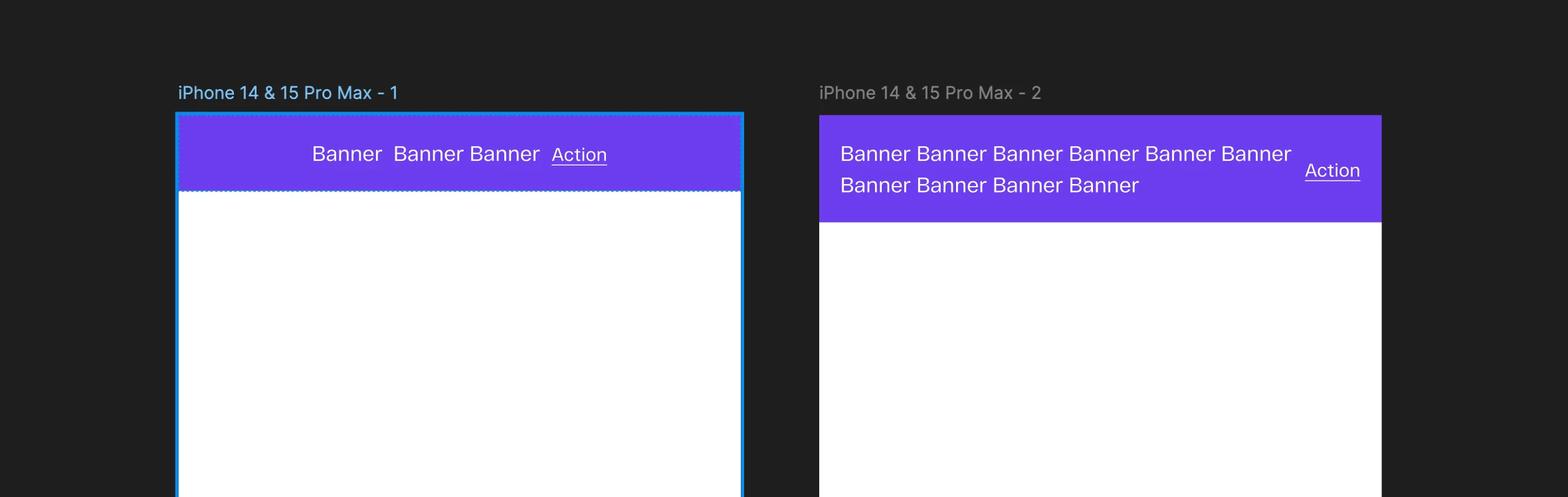
so no fixed max width.

Is there any way to simulate this behavior in Figma, maybe with some clever auto layout nesting or constraints?

Trying to avoid duplicating the component with two variants (hug and fill).

Thanks in advance for any ideas or workarounds!

5 replies

Stevie3
  • New Member
  • January 22, 2026

something like this? 


Narelle
  • New Participant
  • January 27, 2026

Stevie3, that example only supports the wrapping, not the hug required when only one line of text


Narelle
  • New Participant
  • January 27, 2026

Francesco, it appears to be a current limitation of Figma, as the container can either be fill or hug only. You can use the max-width to force a wrap on a container that hugs until it reaches that max-width, however the max-width is a fixed value so it can not be set to follow the parent container size.

There is this post that is related to this same topic 


Alina Peycheva

This functionality is essential!
The text should hug when short, and fill the parent container when it exceeds its width.

Figma add something like 
max-width: 100%;


HappyDance
  • New Member
  • April 22, 2026

As a developer trying to provide responsive components for the design team, I’m completely shocked that this isn’t supported.


This should be as simple as text defaulting to wrap… just like standard browser behavior. When the parent is smaller than the length of the text, the text wraps. That’s it. Done. Add a property to disable wrapping when you don’t want it.


Unless I’m mistaken (?), there isn’t anyway to wrap text in a responsive layout unless it, and all of its ancestors, are set to ‘fill’? This, combined with the lack of percentage-based widths, outside margins, and calc()-like functionality make it seemingly impossible to support truly responsive components.

Something as simple as positioning an icon at the end of text or expanding the height of the text when the width collapses should be essential behavior for responsive layouts. You shouldn’t be required to make a new fixed max-width variation for every breakpoint to support such basic, standard functionality.