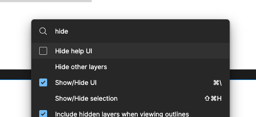
Improve the contrast of the highlighted menu item in the Quick Action Menu in dark mode. When keyboard navigating its hard for me to confidently select a quick action menu item bc I cant see the contrast between regular and highlighted menu items.
Enter your E-mail address. We'll send you an e-mail with instructions to reset your password.


