Looks like Figma doesn’t give you an option to chose dark mode colors when you assigning semantic tokens, in the menu only light mode colors even tho I have dark mode too in my primitives.
So that means I can’t use different color pallet for the dark theme (in case if I’m actually want to use different colors in my dark mode completely different pallet).
I’m I missing something? or It just feature they didn’t thought about yet? or never will?
Best answer by AlicePackard
Ah, I see! Those screenshots are extremely helpful, thanks for sharing those. Based on how you’re naming your variables, modes, and collections, I think I have a better idea of what your situation and what you’re trying to achieve:
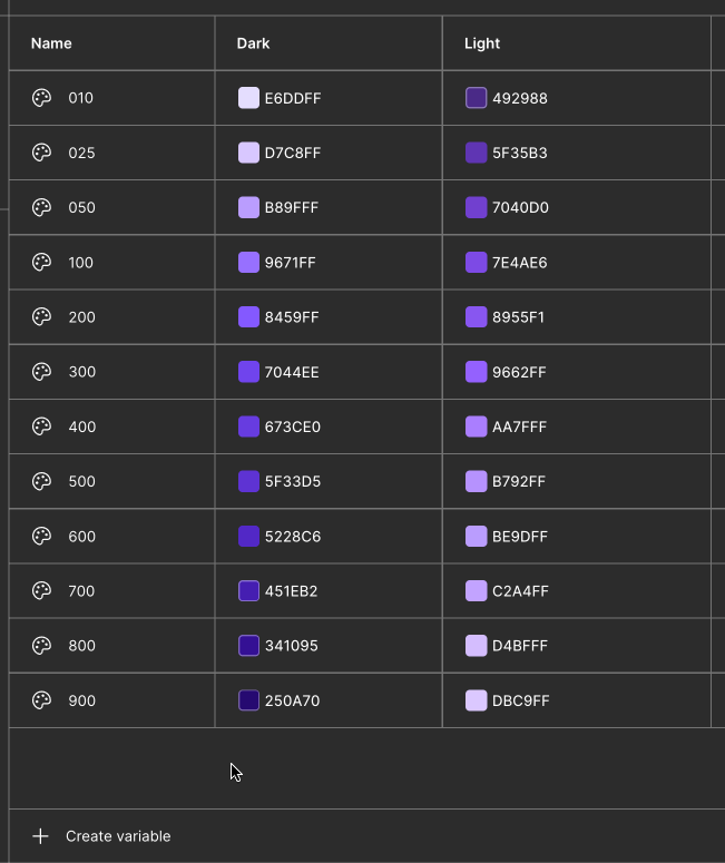
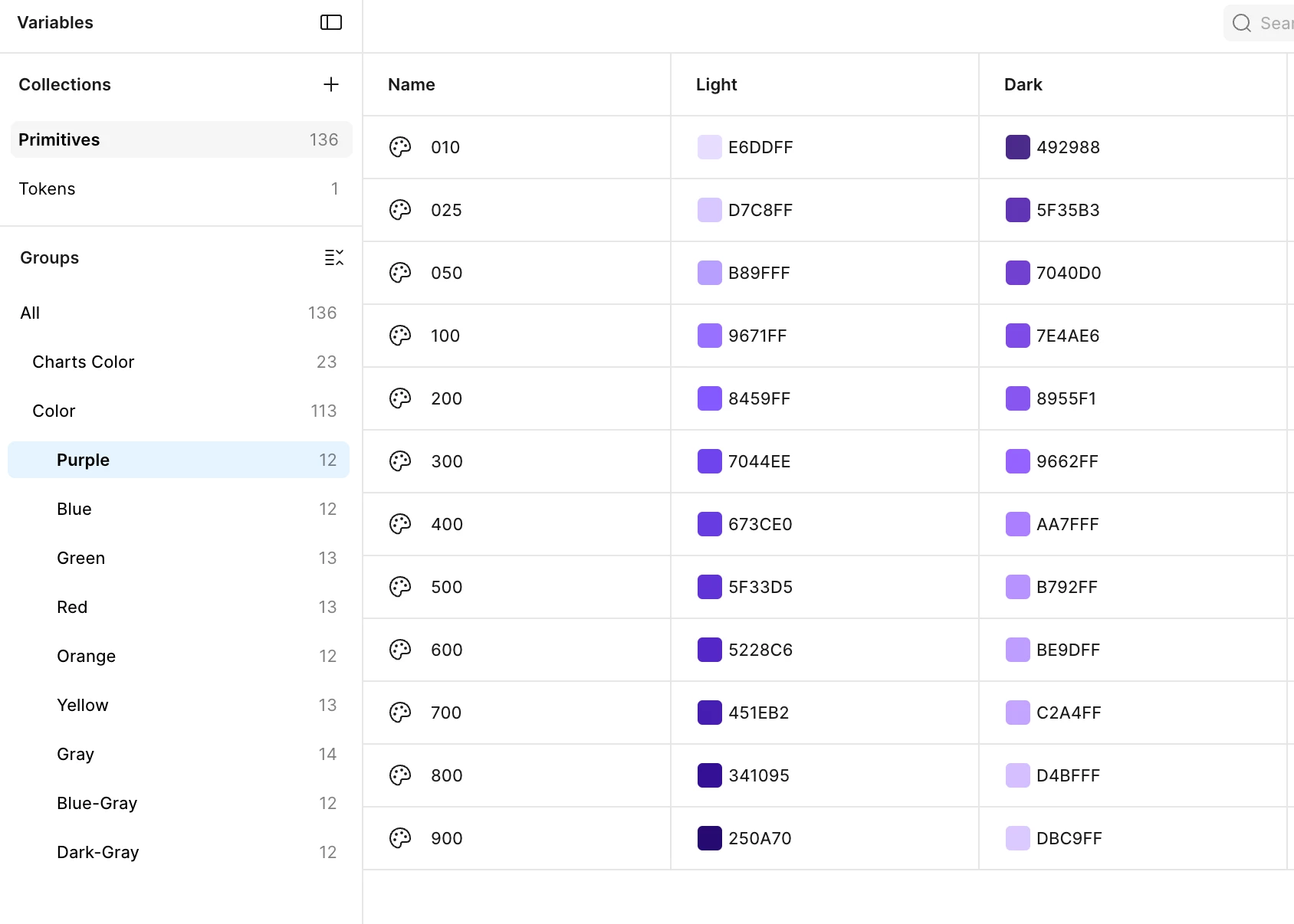
You have 24 unique color values within the hue of “purple”, represented as 12 color variables.
In light mode, the purple values skew a little “colder” (toward blue) than your dark mode, which skew “warmer” (toward pinks).
You need a logo whose color responds to changes in light and dark theming.
You want to handle theming with variable modes.
These are very achievable, it just means re-thinking where you describe those light and dark color themes.
Here’s my recommendation:
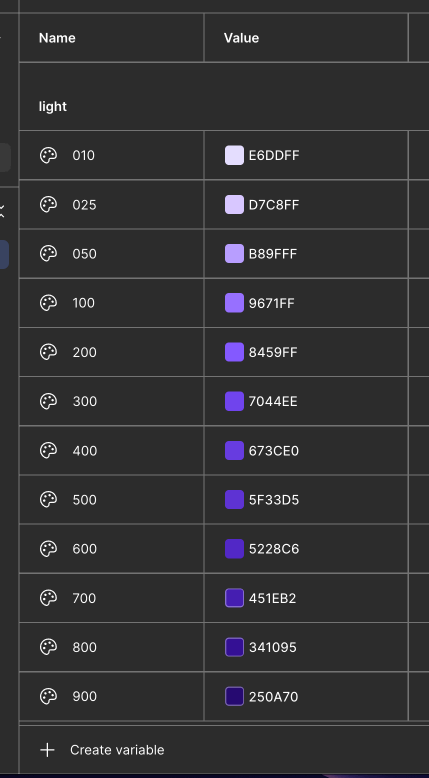
Take all of the unique color values you’ve described in the dark mode “Primitives” collection, and repeat their values in your Light mode. This means you have some naming decisions to make…. Do you create half-steps in your number-based naming system? Do you increase the ceiling of your numbers? This is up to you. In this example, I take the 900-value from dark mode (#DBC9FF) and place it between your 025 and 050, because it’s “between” those variables light mode color values in terms of brightness and saturation. Also I just realized I have the mode names flipped in this GIF 🤦 sorry
Eventually you end up with a list of 24 variables, like this. Again, the naming is up to you! I picked easy values that increment up by 10 for the sake of example:
010 - #E6DDFF
020 - #D7C8FF
030 - #DBC9FF
040 - #D4BFFF
050 - #C2A4FF
060 - #BE9DFF
070 - #B792FF
080 - #B89FFF
090 - #AA7FFF
100 - #9662FF
110 - #9671FF
120 - #8955F1
130 - #8459FF
140 - #7E4AE6
150 - #7044EE
160 - #7040D0
170 - #673CE0
180 - #5F35B3
190 - #5F33D5
200 - #5228C6
210 - #492988
220 - #451EB2
230 - #341095
240 - #250A70
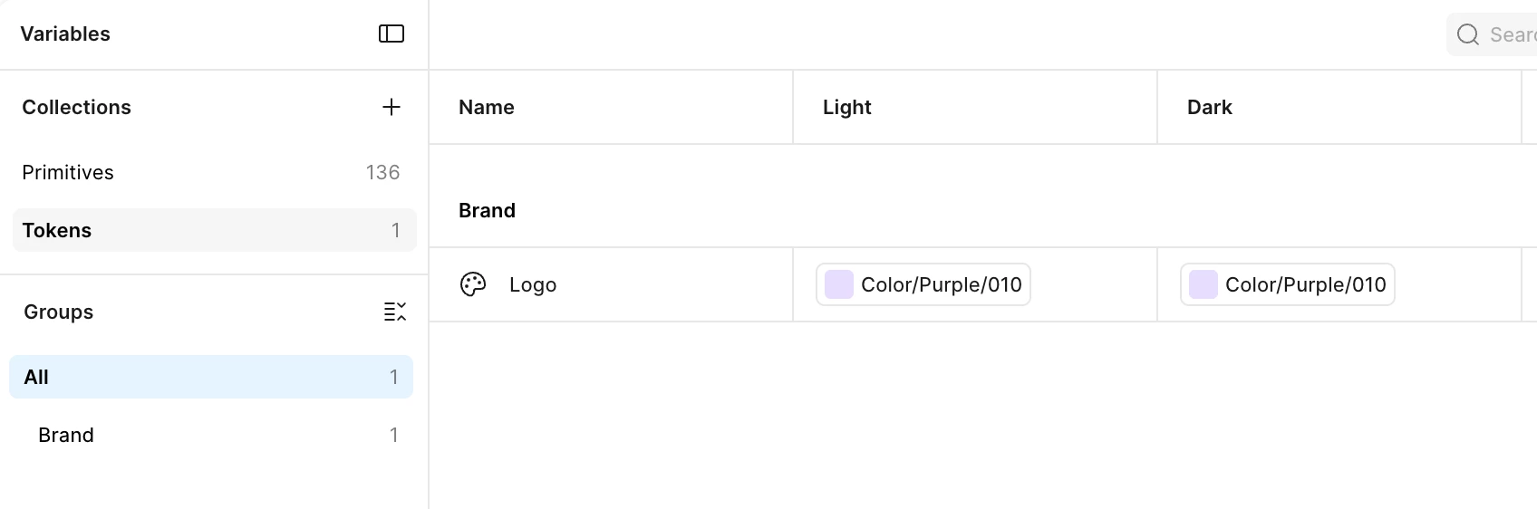
Once you have those 24 variables, you’ll delete the Dark mode from the primitives collection. I’d change the Light mode’s name to “Value”. A true primitive-level collection should only ever have 1 mode. Its job is to store store your root-level colors. It has no opinion on the contexts those colors might be used in.
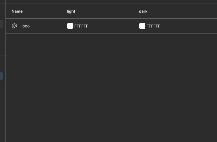
Add a Dark mode to your Tokens collection. That is your semantic level space. I also suggest using a more specific name to replace “Tokens” with; something like “Color theme” could be appropriate.
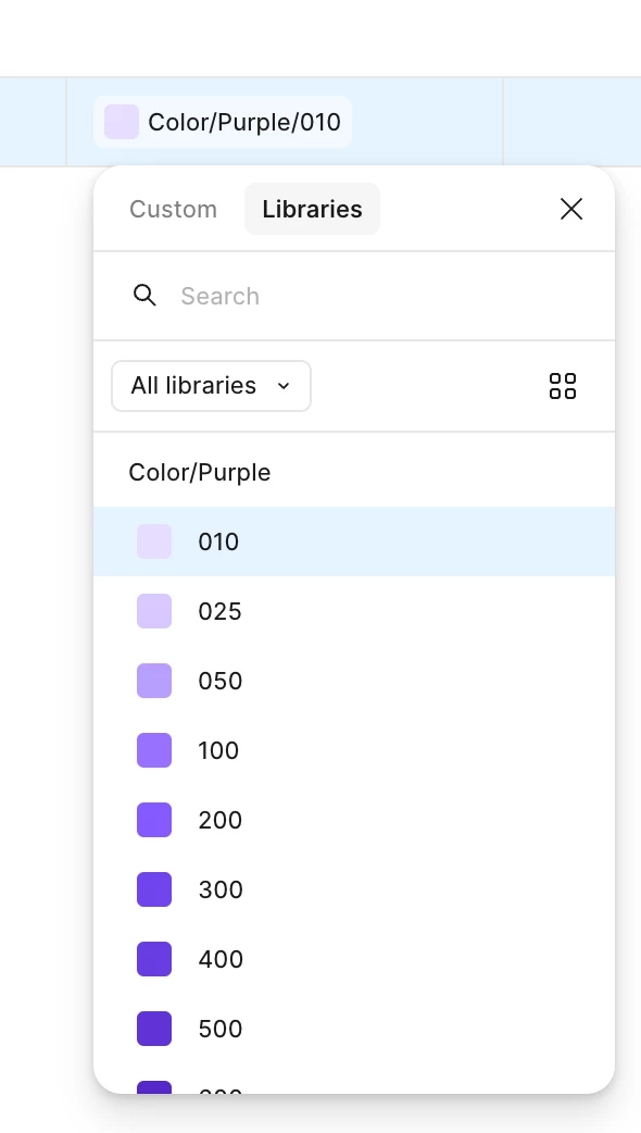
👉 NOW you will see the right values in the color picker! In this GIF you can see I select 010 (#E6DDFF) and 210 (#492988)
You could also group your variables in your primitive level collection into “Light” group and “Dark” group to make it easier to select the right values when you’re aliasing values into your logo variable in the Token collection:
Here’s how that improves the aliasing-selection experience in the Tokens collection:
Hey Johnny, could you share some screenshots of the part of Figma’s interface you're referring to? It would also be helpful to see how you’ve set up your variables and light/dark modes. I want to make sure I understand your set-up before offering advice.
So in the last screenshot, when I choose a color for the semantic token I can see only light theme colors but not dark theme colors. There is no option to see the dark theme colors at all.
Ah, I see! Those screenshots are extremely helpful, thanks for sharing those. Based on how you’re naming your variables, modes, and collections, I think I have a better idea of what your situation and what you’re trying to achieve:
You have 24 unique color values within the hue of “purple”, represented as 12 color variables.
In light mode, the purple values skew a little “colder” (toward blue) than your dark mode, which skew “warmer” (toward pinks).
You need a logo whose color responds to changes in light and dark theming.
You want to handle theming with variable modes.
These are very achievable, it just means re-thinking where you describe those light and dark color themes.
Here’s my recommendation:
Take all of the unique color values you’ve described in the dark mode “Primitives” collection, and repeat their values in your Light mode. This means you have some naming decisions to make…. Do you create half-steps in your number-based naming system? Do you increase the ceiling of your numbers? This is up to you. In this example, I take the 900-value from dark mode (#DBC9FF) and place it between your 025 and 050, because it’s “between” those variables light mode color values in terms of brightness and saturation. Also I just realized I have the mode names flipped in this GIF 🤦 sorry
Eventually you end up with a list of 24 variables, like this. Again, the naming is up to you! I picked easy values that increment up by 10 for the sake of example:
010 - #E6DDFF
020 - #D7C8FF
030 - #DBC9FF
040 - #D4BFFF
050 - #C2A4FF
060 - #BE9DFF
070 - #B792FF
080 - #B89FFF
090 - #AA7FFF
100 - #9662FF
110 - #9671FF
120 - #8955F1
130 - #8459FF
140 - #7E4AE6
150 - #7044EE
160 - #7040D0
170 - #673CE0
180 - #5F35B3
190 - #5F33D5
200 - #5228C6
210 - #492988
220 - #451EB2
230 - #341095
240 - #250A70
Once you have those 24 variables, you’ll delete the Dark mode from the primitives collection. I’d change the Light mode’s name to “Value”. A true primitive-level collection should only ever have 1 mode. Its job is to store store your root-level colors. It has no opinion on the contexts those colors might be used in.
Add a Dark mode to your Tokens collection. That is your semantic level space. I also suggest using a more specific name to replace “Tokens” with; something like “Color theme” could be appropriate.
👉 NOW you will see the right values in the color picker! In this GIF you can see I select 010 (#E6DDFF) and 210 (#492988)
You could also group your variables in your primitive level collection into “Light” group and “Dark” group to make it easier to select the right values when you’re aliasing values into your logo variable in the Token collection:
Here’s how that improves the aliasing-selection experience in the Tokens collection: