
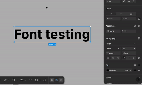
The hover area for the “click-and-drag to resize” functionality is only 1px wide, unlike all of the other inputs on the same panel that have a representative icon, and subsequently larger hover area.


2023-12-07 21-06-00


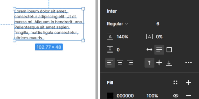
Can we add an icon or otherwise make the font size hover area consistent with its siblings?

Hi there,


Thank you for providing feedback! I will share this with our internal team. Your input is highly valued, and we will take it into consideration for future enhancements.


Thanks,

Toku


You know how you can change some of the values in the tool menus by positioning your mouse just so, so it turns into a double-sided arrow, and then dragging left or right? I want to do this alllllll the time with font size, but it’s so hard to position my mouse right on the tiny spot that lets me do it that I usually have to click into the box and use my up/down arrows instead. Would be great if the trigger area for making a quick change were just a few pixels bigger!!! Thank you!


Yes agreed!! No idea why they made it so small, I would prefer to slide all the time not manually click random input #'s. please fix asap


I kind of feel like the feature is pointless unless it’s expanded a bit - it’s almost unusable currently, having to spend up to a minute just trying to get the cursor in place and finally grabbing it to use it. As someone who uses this type of feature frequently on various software, I would really appreciate an amendment to this.


Oh my it’s gotten worse now since there’s literally 1px wide where we can position the cursor and even then, it won’t work most of the time for some reason.


I didn’t even know it was draggable. Came here to ask them to make it draggable! Anyway, +1 on making it consistent with the other values, and applying this to all numeric inputs for that matter.


If someone shipped a Chrome extension to modify these click targets, I’d probably pay a few bucks a month for it. That’s the amount of force I put into hitting the upvote button on this one.


There are so many click targets in Figma that are way too small to hit consistently. The rotation click target for active layers is another. It’s extremely hard to hit it on the first try.


How has this not been fixed after over a year? Resizing text is one of the most basic features and fixing this can’t be all that difficult...


Figma needs to fix this ASAP


I also want to voice my support for adding drag-to-resize for font size, and any other number inputs. When you set up muscle memory in one place it is frustrating/painful to have it be negated it in another place.


This feels like a complete no-brainer. Such a small detail, and still the one thing with the whole Figma experience that I dislike the most. (Rest is amazing). Adding an icon like in the other fields seems like the obvious solution. PLEASE Figma team.


Reply