
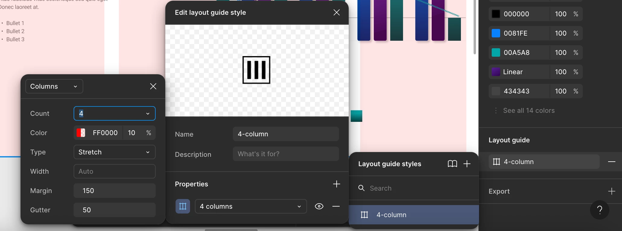
It’s kinda ridiculous. Why not nest these panels together? It takes up my whole laptop screen, and I have a large laptop. It’s super confusing every time I want to change an option, I have to go through all these panels to get what I need. Really needs redesigning. Please fix. And please add a color option for text styles. Why do I have to make a component or variable for everything?