The new icons look good, except for the “design file”-icon.

The design file icons are
1) bigger than the others
2) a bit misaligned in contrary to post-it’s and books.
3) very anti-aliased (Meaning it looks blurry, or smoothed out)
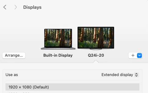
Keep in mind, this is a normal full hd-screen

My main wish is for you to
- make the pen more clear
- roll it back to previous iconography (it worked great - and was clearly a pen)
- Align things visually (keep in mind, this is different from aligning things technically)
Sorry for my bluntness, but it is oftentimes better to be blunt and clear than to be imprecise and kind.
