Hey guys,
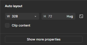
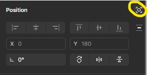
UI3 has come a long way, I remember it was absolute crap in the beginning, it’s actually pretty cool now. But somehow, it still feels like the UX is not perfect. Maybe because all the sections in the right side panel rely too much on text? The structure makes sense, but I often find myself editing the corner radius for example, when in fact I want to edit the auto layout padding. That’s just one example, I feel that in the previous version I didn’t rely on reading as much, but mostly on reaction, which was instant.
Question
Is the new UI a bit confusing?
This topic has been closed for replies.
Enter your E-mail address. We'll send you an e-mail with instructions to reset your password.


