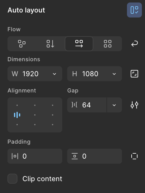
The new auto layout design seems unintuitive now that gap and alignment placement has been switched (alignment left, gap right). We would be far more likely to ‘set and forget’ the alignment, but often do tinker with spacing and gaps in auto layout. Every time I intuitively reach to edit gap in auto layout, I have to scan and mouse over alignment, something that just doesn't need to be in the way. Gap and alignment should be swapped back to what it was (alignment right, gap left). Anyone else experiencing this friction?
Otherwise, this auto layout update is a wonderful and welcome change!