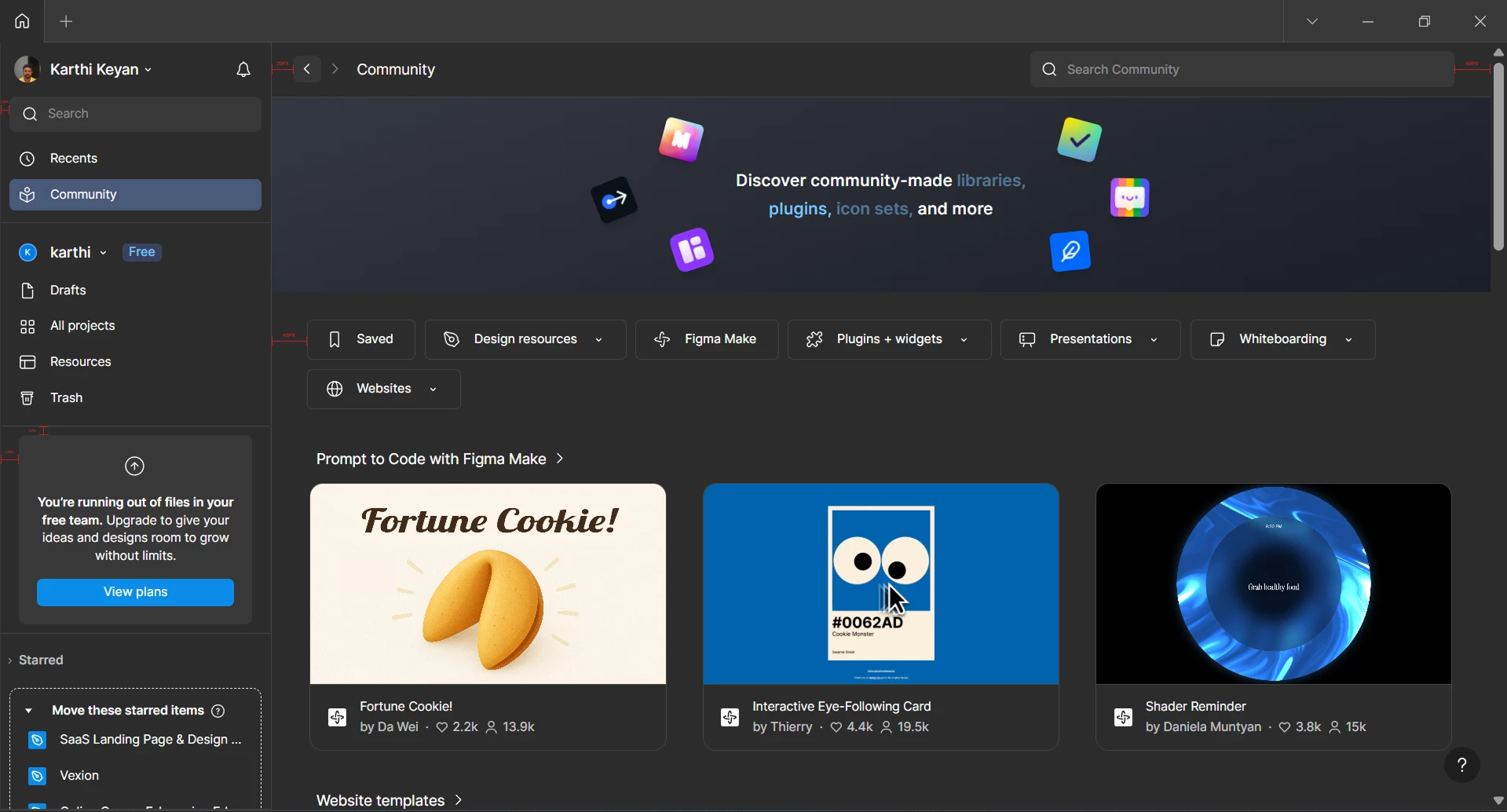
Hi Figma Team,
Hope you’re doing well. I just wanted to share a small UI detail I noticed while using Figma. It’s not a major issue, but as a designer, alignment and spacing really matter, so I thought it would be good to check if this was intentional or something that needs fixing.
1. Left Sidebar Padding
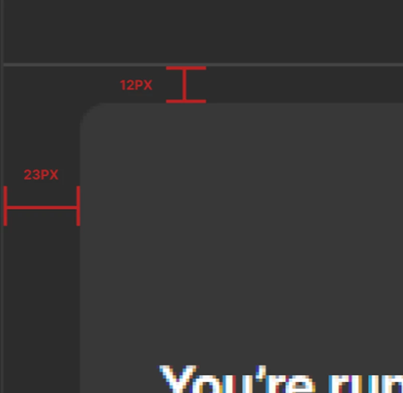
Most items in the left sidebar use around 12px padding, but the “Running out of plan” section seems to have about 23px padding. The plan details below it also use the same 23px spacing, which feels different from the rest of the menu.
2. Community Page Header
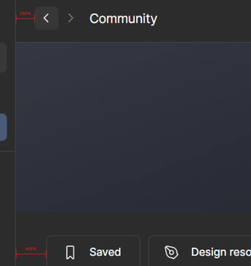
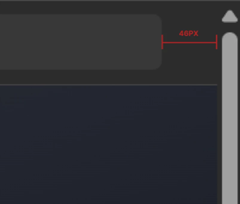
On the Community page, the left padding near the back arrow and page title looks like 28px. But the search bar on the right has around 46px padding.
Also, the tags below (like “Saved”, “Design Resources”) have around 45px left padding, which doesn’t align visually with the elements above.
I have attached the image for your reference as well.
Could you please let me know if these spacing differences are intentional? If not, I hope this feedback helps improve the experience.
I’m not posting this on social media because I’m a fan of Figma, so I wanted to share it directly with you.
Love, Figma.


