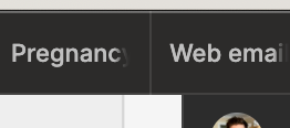
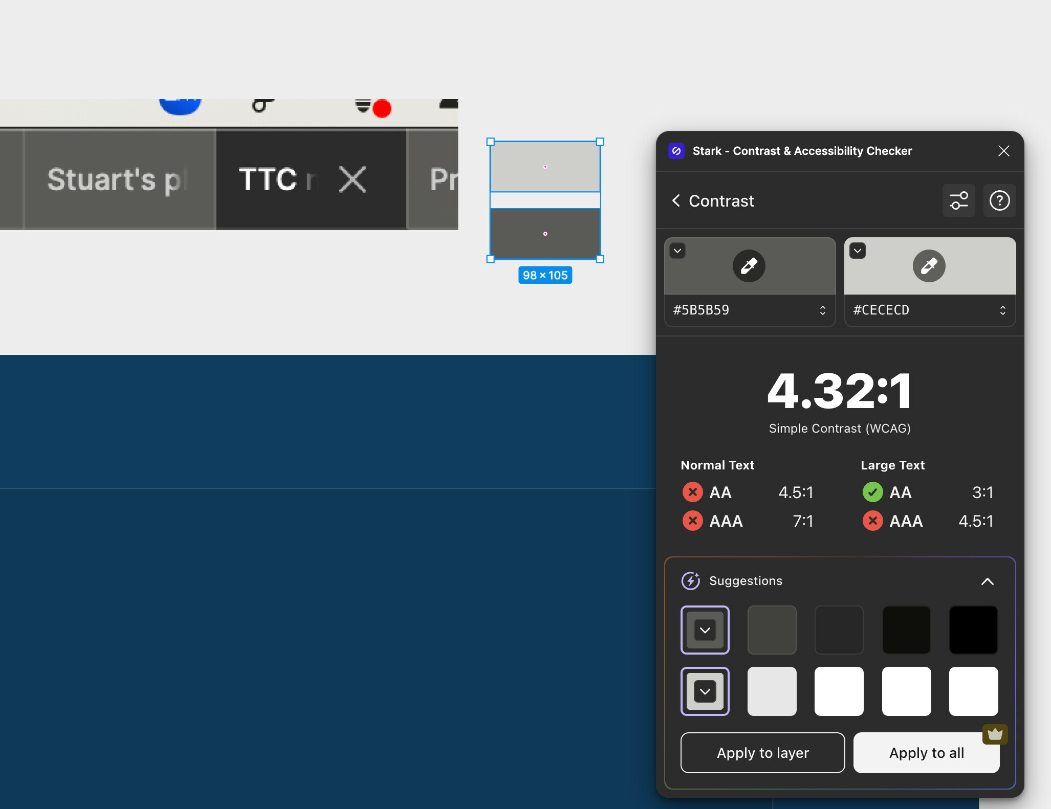
In dark mode, the color contrast for text on tab background doesn’t meet WCAG AA standards. I don’t personally struggle with any visual impairments but I find reading the tab bar difficult. For some reason when I switch context to a different screen, the tab bar becomes darker and the contrast is great. Is this a bug or a feature?
See screenshots for context.


