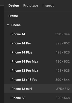
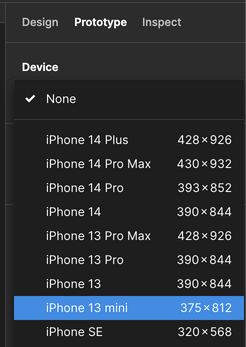
I Have used the default android frame size in Figma and developed a prototype. But when I used my design in a mobile mockup template, the design became cropped.

As a newbie here, so I have no idea what to do. I’m curious about what most designers do when creating mobile mockups for their Behance or portfolio profiles.

I have the same question. Can any seniors answer this?


You are experiencing this because the two frame sizes (design and mockup template) are different. If you have few design screens, you could resize them to match the mockup template.


An approach I use to prevent this scenario is that I employ a tool such as Viewport Size for Devices | Screen Sizes, Phone Dimensions and Device Resolution | YesViz.com to determine the phone corresponding to the frame size I have designed or wish to design for.


Afterwards, I use a tool such as https://www.freepik.com/ or https://www.google.com/ to search for a mockup for that particular phone. This mockup is what I then use for the project presentation on my portfolio, a pitch deck or any other platform.


However, if you have a particular mockup template in mind, you’ll need to confirm the frame size in pixels of its editable smart object using photoshop. This size is what you use for your design.


When you choose a frame size for your design, make sure you also use the same device for your prototype.

I tend to use a device with a smaller screen size as it is more likely that everything scales properly to a larger mobile screen size than the other way around.


image


image


Since the frame size really varies across different models of iPhones, I believe it would be rather helpful to have a screen size of 400 x 800. This could be especially helpful for embedding interactive images.


Reply