Question

Variable Buttons

  • April 10, 2026
  • 1 reply
  • 24 views

aiah

Hi! I’m struggling figuring out how to optimize some buttons/components with variables.

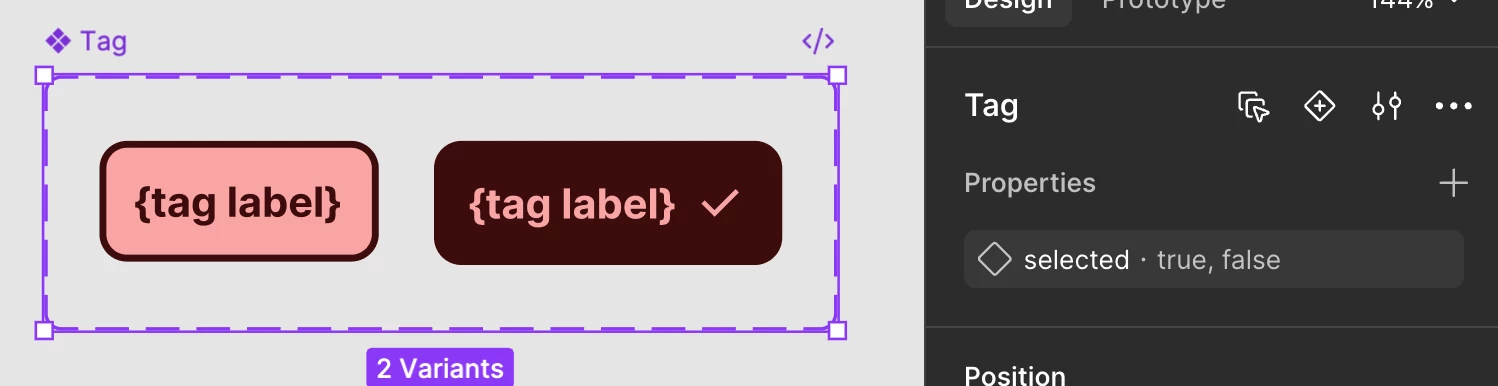
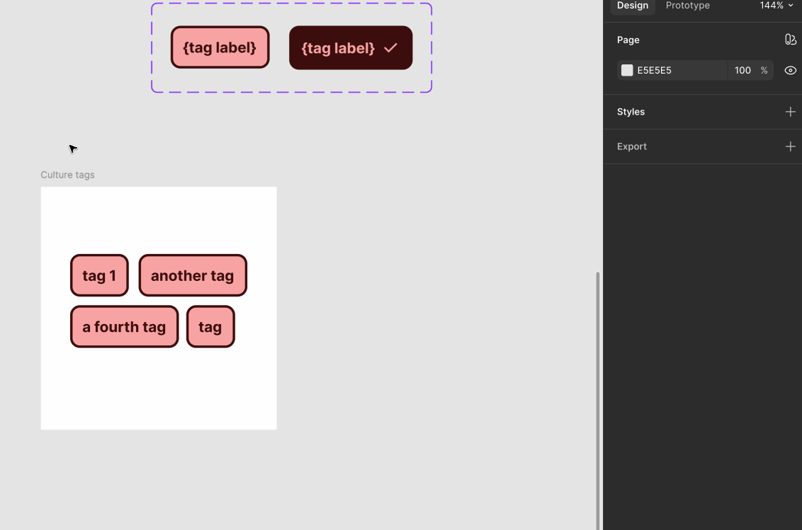
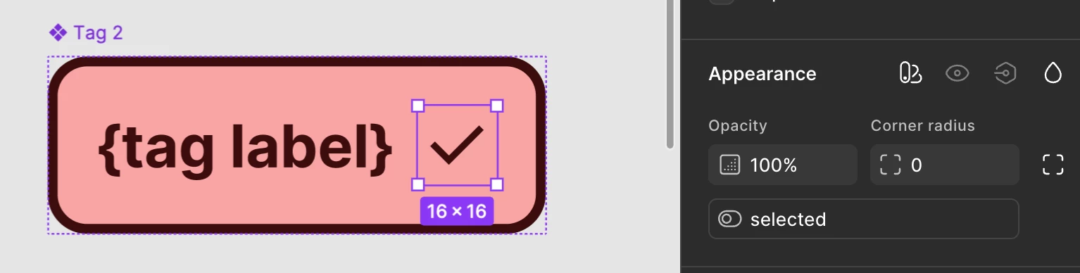
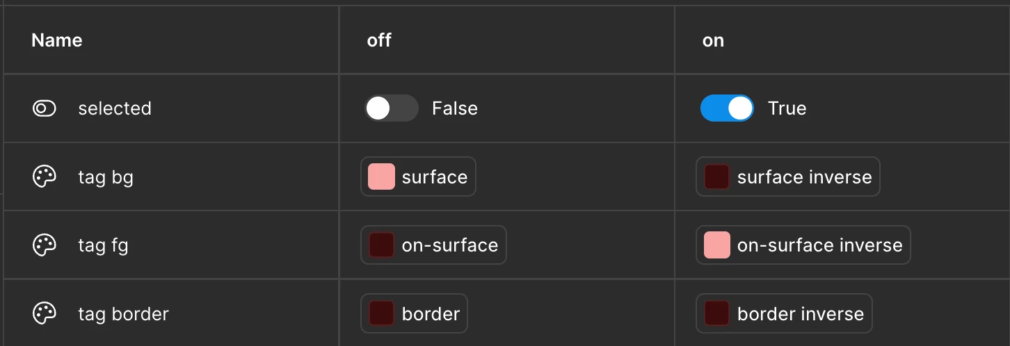
I’m trying to make tags with different sections. Essentially, I need to find a way to have the tag style change based on what tag section its in and if its been selected. 

I have tags for the following:

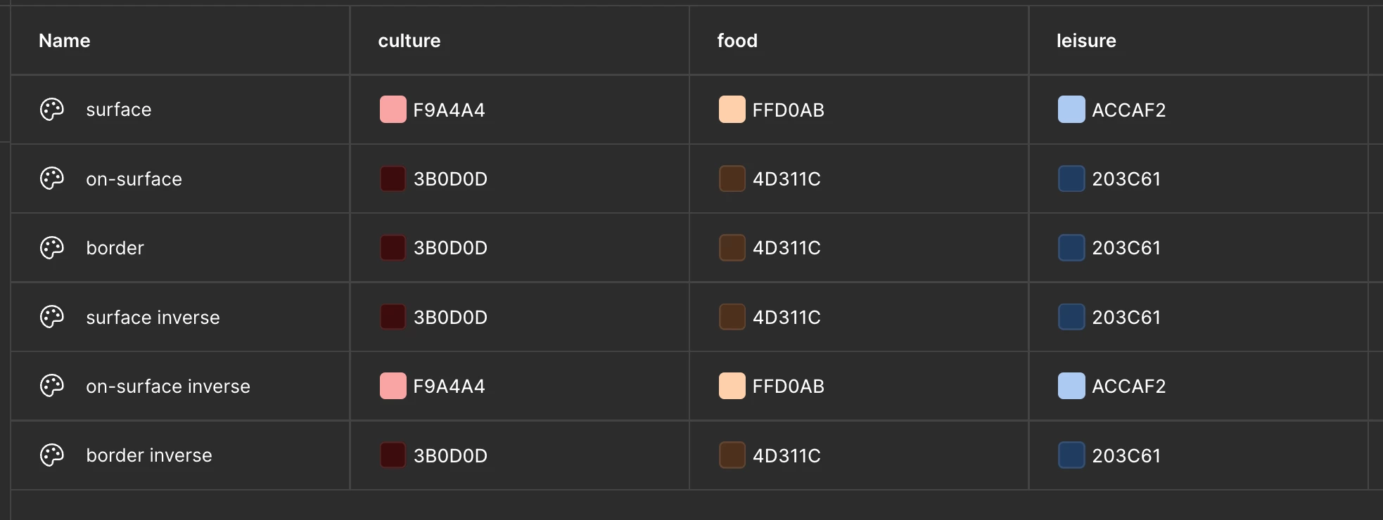
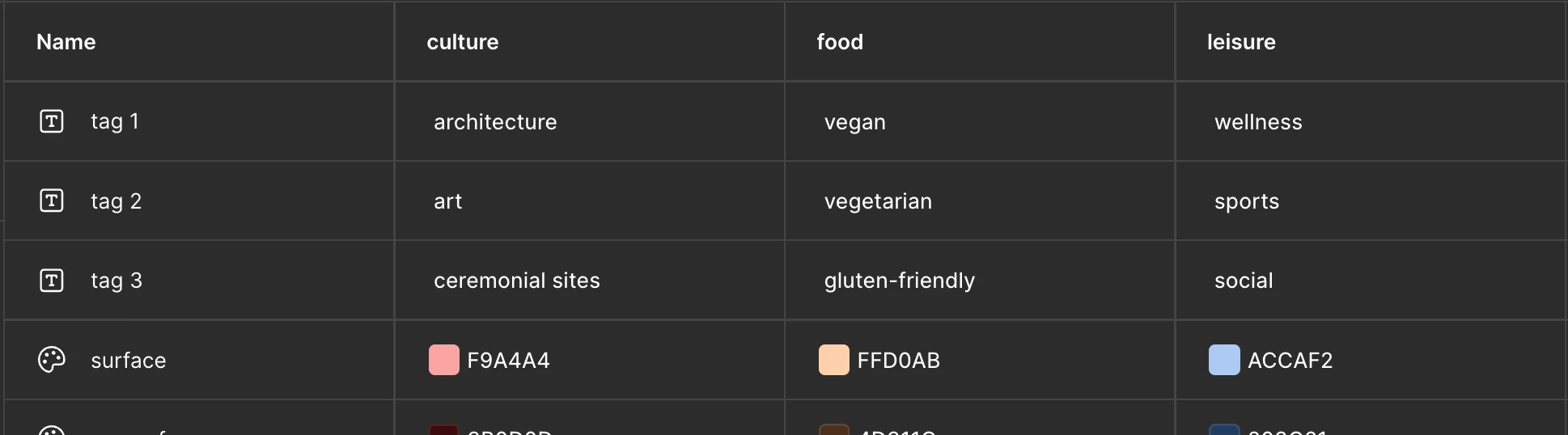
Culture (red), Food (orange), Adventure(green), and Leisure (blue).

They should all have two modes: selected and unselected.

Each category has 10 tags. So, for example, culture has:

architecture

art

ceremonial sites

historical 

museums

monuments

religious structures

sacred grounds

wrecks & ruins

viewpoints


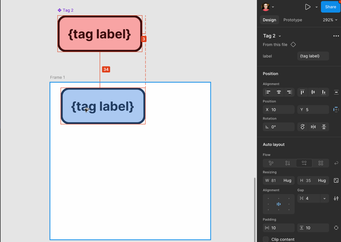
How do I use variables to change the following: tag contents (text), tag color (both depending on if its a culture, food, adventure, or wellness tag AND if it is/isnt selected). 

For context, I’m trying to optimize my prototype in figma so that I can then use the React extension and minimize the extra coding I have to do. 

1 reply

AlicePackard
  • Power Member
  • April 14, 2026

This is a great question!

I suggest handling the “selected” using a variant prop, and the colors as variables with modes.

First the component:

Figma’s prototyping features for component-level interactions will work best by describing them with variants. So if you want to be able to say “when clicking on an unselected tag, it becomes selected” (and vice versa), variants are your best bet for achieving that. I expect you’ll have other properties (like “state” to handle hovering and pressing), a string property for editing the label, and maybe even a disabled=true,false prop if you need tags to be unavailable for selecting.


Regarding variables, I expect that “culture”, “food”, and “leisure” are going to be applicable well beyond your tag component. I’ve found Donnie D’Amato’s framing of variable modes as “contexts” you might apply to a whole screen, or portion of a screen, to be really helpful. I don’t know what kind of product you’re building, but describing those categories as modes seems useful. This is what I mocked up, just to illustrate the idea:


What this allows you to do is apply a mode to change the color scheme:


What you actually asked for:

The set up you’re describing (handling tag labels with variables, as well as the selected state) requires a more complicated and harder-to-maintain variable set up, which is why I didn’t lead with it. But it’s definitely possible!

To achieve that, you’d strip the component back to just this:

Notice that if you want a layer, like that check icon, to only be visible in the selected state, you’ll need to include it in the component and hook it up to a boolean variable that makes sure it’s visible when selected=on and hidden when selected=off.

You’ll also need a variable collection to describe selected=true,false:

It aliases in the color variables from the “categories” collection I showed earlier. The “selected” boolean handles the check icon visibility, and the 3 color variables handle color changes between selected and unselected states. They “alias in” all the color changing from the previous collection.

Last thing to do is the string variables back in the categories collection:

You’d have more than this, and likely will name them differently! Just an example to illustrate.

So then, in mockups, you can apply each tag string var to the label, and change modes across category and selected state:

​​​​

I hope this is helpful!