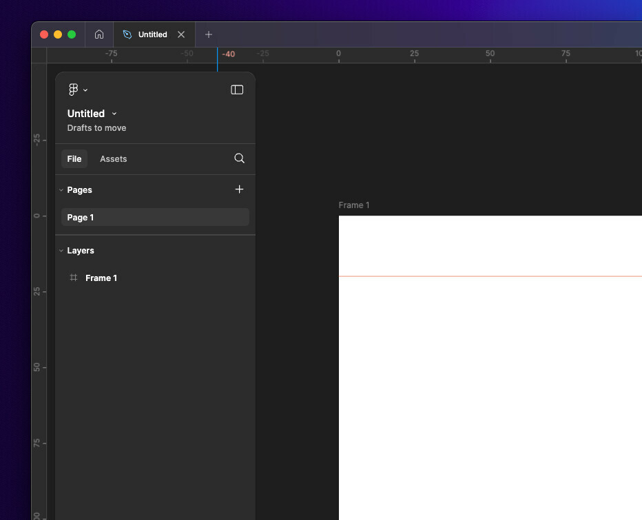
Having the vertical ruler on the leading edge of the layer panel makes it more difficult to parse and is comparatively less user friendly than the previous UI. Dragging guides under the panel feels bad.
Enter your E-mail address. We'll send you an e-mail with instructions to reset your password.

