This has been a repetitive topic, but I wanted to share my personal experience.
I have visual and cognitive impairment that keeps me from processing anything clustered, lacking contrast, simply tiny. My eyes have to dwell for a long time on a single point to process it; otherwise everything looks blurred and irrelevant.
I used Figma for the last 5 years without an issue, until the recent beta update. I had to revert it immediately, because my brain couldn’t “read” anything.
I think this could be just common method for everyone, but I use a digital interface via 1. Quick scanning of color difference, 2. Recognition of features, 3. Remembering the position of each feature. More decorations and complications means longer time to process.
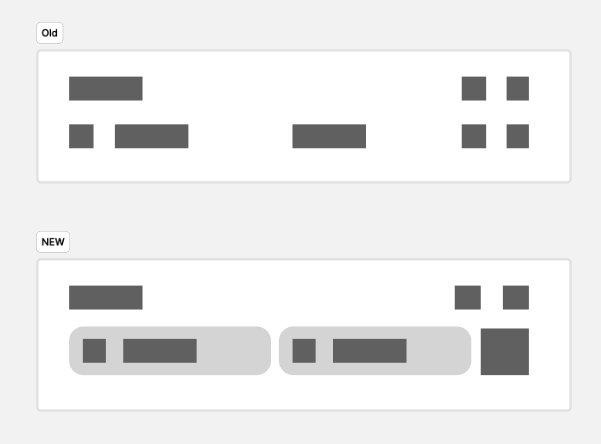
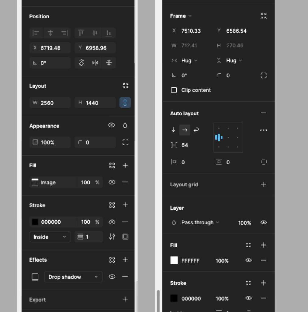
As you can see, the new UI uses more dynamic spacing and low contrast display(because of the semi-transparent background). The new line icon style looks clustered, and rounded semi-transparent boxes adds decorations that keeps me from scanning important elements.
There also appears to be lots of renaming and repositioning, and for me it means I need to memorize where everything is from the very beginning. I recognize the length of words rather than the actual letters, so changing “Layer” to “Appearance” for example means it’s completely different thing to my eyes.
The new UI could be more visually pleasing, it’s far more difficult to navigate. I think it’d already become so much better by simply removing the background though.

Please reconsider accessibility of the new UI 🙏

